7 posts tagged with graph.
Displaying 1 through 7 of 7. Subscribe:
What do favorites look like?
What does the slope of favorites look like for FPP or AskMe questions? [more inside]
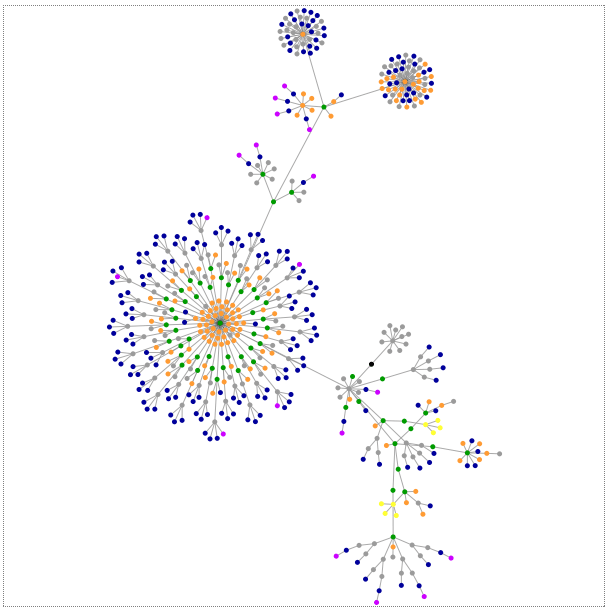
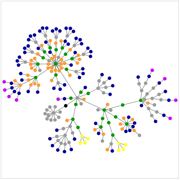
What a tangled web we weave
yourcelf's snazzy new GraphFi bookmarklet makes catching up with long threads a breeze. [more inside]
Infodump 2.0
The Metafilter Infodump is back, and moderately better than ever! Statistics nerds rejoice! [more inside]
Help me find a graph linked to on metafilter somewhat recently
Within the past few months someone posted a link to either a graph or (an article containing a graph) that showed that GDP calculated within a few months of the time period in question bears no relation (no statistical correlation) to GDP calculated with more complete non-estimated data two years down the line. I would like to find this graph. [more inside]
Textad about Hacker's Diet Graph?
A long while ago, when there were Textads that people could purchase down the right hand side of the front page, somebody here had taken out an ad and had a wonderful site which would generate a picture of a graph based on the information available in The Hacker's Diet. The website is long gone now but I wonder if I could either get the code for the site or if somebody could direct me to something to generate a picture dynamically to put on my blog? The site in question was www.weighttrends.com or maybe just one "t" www.weightrends.com .
A bit like a dandelion gone wrong.
Graphing Meta
A bit like a dandelion gone wrong.
Meta
Ask
Talk
Here is the site. Some results are definitely interesting though. I wish you could click on a node and see its address.
A bit like a dandelion gone wrong.
Meta
Ask
Talk
Here is the site. Some results are definitely interesting though. I wish you could click on a node and see its address.
Metafilter Statistics updated
Metafilter Statistics have finally been updated, and the top 20 charts are back. The big news here is that it looks like thread/comment traffic has slowly declined over the past few months, after a big spike in January. Also, the User Growth charts now show the number of new user signups per month, resulting in a cute graph (signups are on! signups are off!, signups are on!, etc). Now that I'm storing all the user/thread data in a database (instead of a flat file), expect these stats to be updated monthly again.
Page:
1