"fantastic post" page unreadable December 12, 2005 9:40 AM Subscribe
The last 50 questions and answered [answers, surely] marked as "fantastic post" by other members at Ask MetaFilter page is all but unreadable. Both lists need the short form of the question at the very least in order to add context.

I agree- having a summary of the question might help.
posted by ThePinkSuperhero at 9:56 AM on December 12, 2005 [1 favorite]
posted by ThePinkSuperhero at 9:56 AM on December 12, 2005 [1 favorite]
And a "previous 50" link so we can scroll back to the beginning.
posted by blue_beetle at 10:19 AM on December 12, 2005
posted by blue_beetle at 10:19 AM on December 12, 2005
There should be two columns, one for questions and one for answers.
Entries should be sorted by how many times they've been flagged, with the most flagged at the top. This list should reflect the most flagged posts in the last few days, updated frequently.
The post numbers are irrelevant, as are the flaggers' usernames. Maybe just use the first few words of the post.
The same thing should exist for the blue.
posted by driveler at 10:50 AM on December 12, 2005
Matt said in another thread that he put this quickly together and intends to improve it. I'm all for incremental improvements.
Or would we rather have Matt delay things until they reach a state of "perfection" and he doesnt have to endure several Metatalk threads telling him it sucks.
posted by vacapinta at 10:50 AM on December 12, 2005
Or would we rather have Matt delay things until they reach a state of "perfection" and he doesnt have to endure several Metatalk threads telling him it sucks.
posted by vacapinta at 10:50 AM on December 12, 2005
Here's the comment I was referring to:
There are many ways to improve that page. It was a two minute hack. But I've got loads of other stuff to get out first, so it'll be a while before I revisit that page (and extend it to metafilter as well, etc).
posted by mathowie at 9:36 PM PST on December 6 [!]
posted by vacapinta at 10:52 AM on December 12, 2005
I find the page useless anyway (as I pretty much do the "best answer" feature itself), but if I did want to use it, I'd certainly agree with the poster's complaint.
posted by languagehat at 10:52 AM on December 12, 2005
posted by languagehat at 10:52 AM on December 12, 2005
I've said before it's kind of a low priority, I only put it out because it took five minutes and appeased one user that asked for it. When I posted it, I said upfront that I know it sucked, and was a five minute hack, and that it could be improved greatly, and I've had to repeat that once a week for the past month. Perhaps I'll write a message on that page.
So here's what could really help me -- those of you with lots of ideas and suggestions, show me a mockup of what you think the page should look like. It doesn't have to be an exact copy of a ask mefi page, just plain text in HTML is fine.
I've been considering what queries I need to do and how to optimize them, but haven't put much thought into what features the page should have and how it should look. It seems that reprinting huge comments or entire threads would be sub-par. Would post titles be enough? Would first x characters be enough from a comment?
posted by mathowie (staff) at 11:07 AM on December 12, 2005
Well how long would it take to add the brief question description to each line as per my suggestion? I'm also all for incremental improvements, which is why I suggested what seemed to me a very simple improvement that would transform the page from, well, pretty much useless, to somewhat useful, in my opinion. At least we could read it. Links need context.
posted by nthdegx at 11:25 AM on December 12, 2005
posted by nthdegx at 11:25 AM on December 12, 2005

You mean the rest of you don't read metafilter like this?
posted by klangklangston at 11:34 AM on December 12, 2005
By posting inline images? No no. *Plenty* of people read MetaFilter like that.
posted by nthdegx at 11:42 AM on December 12, 2005
posted by nthdegx at 11:42 AM on December 12, 2005
nthdegx, in this case, putting any actual content from each question requires a new query, and as long as I'm grabbing stuff from a new query, I might as well think about what the page ultimately looks like before proceeding. This isn't really a project that could improve with five (or 10 or 30) more minutes of hacking. It'll require a bit more than that.
In other words, to go from what the page is now to listing the front page questions next to each post, it'd probably be an hour's worth of work, perhaps more, mostly optimizing the db query. Creating the final page version queries will likely take about that long as well, so in this case, I'd like to know what people ultimately want to see before I spent a good chunk of time on it.
posted by mathowie (staff) at 11:42 AM on December 12, 2005
Seriously, a simple mockup of what you'd like the page to look like would really help.
Anyone?
posted by mathowie (staff) at 1:33 PM on December 12, 2005
Anyone?
posted by mathowie (staff) at 1:33 PM on December 12, 2005
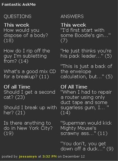
[the live preview, it lies, the screen capture, not so much...]
posted by jessamyn at 3:39 PM on December 12, 2005
and then I'd add some [see more] links on the bottom of every list, and maybe have each list have five instead of three items. The question titles would come from the RSS titles, I don't know how you'd find good excerpts for the answers, maybe just take the first 20 words or so.
posted by jessamyn at 3:52 PM on December 12, 2005
posted by jessamyn at 3:52 PM on December 12, 2005
My original request, for reference. I'd really like to see this globally, or at least on the Green and the Blue.
I'll try and mock something up if I have time today for what I'd love to see...
posted by stavrosthewonderchicken at 4:26 PM on December 12, 2005
I'll try and mock something up if I have time today for what I'd love to see...
posted by stavrosthewonderchicken at 4:26 PM on December 12, 2005
I like Jessamyn's better, but this might be quicker:
ANSWERS:
"First 50 characters of answer..."
posted by "answerer's name" to "html page title of question"
suggested by: "suggester's name"
Link the word "posted" to the comment, and the usernames to the user pages. That should be all the linking required.
posted by scarabic at 4:26 PM on December 12, 2005
OK, here's what I had in mind, more or less.
Two versions (which could be collapsed into one template, dynamically created, of course), one for AskMe, one for MeFi. It's debatable if it would be good/necessary for MeTa.
As I suggested in the original thread, I think the top 10 (say) posts and comments based on total number of 'fantastic' flags could make the list. That could be customizable, easily.
I also included dropdowns to list them in various ways, including your own posts and comments that have been flagged as 'fantastic'.
I've used the nicetitles javascript in a couple of places -- I think that hovering over a fantastic comment's link to the original question or thread could give the full text of the OP in the nicetitle hover.
Quick and roughish, but this would make me smile, anyway.
Without further ado, the links. Let me know if they don't work for you.
Fantastic Mefi
Fantastic AskMe
I'm sure many refinements could be done, if this kind of layout is acceptable. Like I said, just a couple of quick hacks (well, 2 or 3 hours work, but it's quiet time this month for me).
posted by stavrosthewonderchicken at 7:50 PM on December 12, 2005
Oh, I chose the fantastic posts and questions at random. No editorial commentary intended. Heh.
posted by stavrosthewonderchicken at 7:51 PM on December 12, 2005
posted by stavrosthewonderchicken at 7:51 PM on December 12, 2005
I like what scarabic said. I think the page should be the most recent flagged questions and answers, not the most flagged questions and answers as the latter page will be less dynamic. I'd still quite like to see who suggested the question.
Layout-wise, stavrosthrwonderchicken's suggestion looks great. It doesn't need to be at all complicated. I think the more other pages look like the front pages the easier and more intuitive it is for the user.
posted by nthdegx at 11:47 PM on December 12, 2005
Layout-wise, stavrosthrwonderchicken's suggestion looks great. It doesn't need to be at all complicated. I think the more other pages look like the front pages the easier and more intuitive it is for the user.
posted by nthdegx at 11:47 PM on December 12, 2005
Don't all rush in at once to give an opinion or nuthin'...
posted by stavrosthewonderchicken at 3:35 PM on December 13, 2005
posted by stavrosthewonderchicken at 3:35 PM on December 13, 2005
I like jessamyn/scarabic's metadata suggestions, and I was envisioning something as simple or simpler than stavros' layout. I kind of think # of votes is the only thing needed to any of these mockups, because frequently, even in a most recent list, three people marked the same thing as fantastic.
I'll work on this in the next week or so.
posted by mathowie (staff) at 3:39 PM on December 13, 2005
I'll work on this in the next week or so.
posted by mathowie (staff) at 3:39 PM on December 13, 2005
For what little it's worth, and I'm not sure I understand exactly what you mean about # of votes, but one of the key things I'd thought from the beginning was that raw number of votes should be hidden, as a conscious design decision. Displaying them would achieve nothing, I don't think, and instead focus attention on that number (and start people playing the vote-for-my-favorites game), on the voting, where keeping in hidden inclines people to think mainly about the quality of the post/comment itself.
posted by stavrosthewonderchicken at 4:16 PM on December 13, 2005
posted by stavrosthewonderchicken at 4:16 PM on December 13, 2005
To clarify a little, maybe -- I think default view of the best should still be ranked by number of 'votes' (although I'd love to see the other listing styles I mocked up, too), but I think showing the actual number of fantastic flags would be counterproductive to the spirit of the thing.
posted by stavrosthewonderchicken at 4:30 PM on December 13, 2005
posted by stavrosthewonderchicken at 4:30 PM on December 13, 2005
frequently, even in a most recent list, three people marked the same thing as fantastic.
Ah, OK, sorry, the coffee's kicking in now, and I see your point, I think. On a most recent list, you're saying, if I understand, several people might have marked the same comment or post as fantastic, and that would keep it bubbled up to the top.
This would be a feature, more than a bug, I reckon, though. It's a realtime zeitgeist thing. What's popular this afternoon/today, kind of thing. It also provides a balance to the fact that the 'most votes' list would end up pretty static after a while.
In fact, that latter might be a problem. It might be better to approach it this way, then : the list is only ranked according to the number of 'fantastic's, but you can use a dropdown to filter out to votes registered today, this week, this month, and forever (expensive database queries, probably, though). That would get cover both the longterm accretion of votes and give us a 'zeitgeist' view as well.
Then all we'd need to get the full functionality that I'd like to see would be a tickbox to toggle a filter on whatever time-frame view we're at to 'My Posts and Comments marked Fantastic Only".
Tickety-boo.
posted by stavrosthewonderchicken at 4:37 PM on December 13, 2005
not bubbled to the top per se, but I'd like to avoid listing the same comment/post more than once on the page, rather instead showing number of multiple votes. Currently, the page just shows the same post each time someone votes on it.
posted by mathowie (staff) at 8:37 PM on December 13, 2005
posted by mathowie (staff) at 8:37 PM on December 13, 2005
Ah-hah... I think have a different understanding of the mechanics. What I've been suggesting all along is that a given post or comment will receive multiple 'fantastic' flags. It might be 1, it might be 100 -- a running tally would accrue over time.
Top of the lists (ie, like I was suggesting above, lists covering different time frames, selectable) would be the posts/comments with the greatest number of flags. Each post/comment would carry a running tally of 'fantastic' flags. (Most posts and comments wouldn't get any, of course. ) Thus, for example, you'd have a week (or month or all-time view), and the top ten comments might have, say, 25, 13, 9, 9, 5, 3, 1,1,1, and 1 flag each as 'fantastic'. We wouldn't display those counts -- they'd only be used to order the list (in the case of items having the same number of flags, they could be sub-ordered chronological) that's shown, from 'most popular' to least.
If a user on AskMe or MeFi flagged one of the comments (or posts) that's already in the list as fantastic, it wouldn't necessary move it up the list -- it would only move up only if that flagging action bumped up its tally to the next notch, above the next most 'popular'. In other words the main criterion for appearing and positioning in the list is not chronological, it's COUNT(flags).
Which is why it would make sense to have different time frame views, like I was talking about above. And which is why, I think, the continuous view of 'this is the list of items flagged, as they're flagged' the way the page currently looks isn't really very useful at all.
That's what I meant by 'bubbling up'. Does that make sense? I'm waving my hands around like mad over here...
posted by stavrosthewonderchicken at 9:44 PM on December 13, 2005
Which is to say, I totally agree with what you said about 'avoid[ing] listing the same comment/post more than once on the page'.
posted by stavrosthewonderchicken at 9:45 PM on December 13, 2005
posted by stavrosthewonderchicken at 9:45 PM on December 13, 2005
You are not logged in, either login or create an account to post comments
posted by smackfu at 9:43 AM on December 12, 2005