Related questions are awesome. June 4, 2008 3:37 PM Subscribe
Related questions are awesome.
See the bottom of all AskMe questions for those who haven't noticed yet.
See the bottom of all AskMe questions for those who haven't noticed yet.
Agreed. Very nice.
posted by chrisamiller at 3:41 PM on June 4, 2008
posted by chrisamiller at 3:41 PM on June 4, 2008
That was pitch-perfect. Close this one up and let's move on to the next callout.
posted by GuyZero at 3:42 PM on June 4, 2008
posted by GuyZero at 3:42 PM on June 4, 2008
I love it too.
posted by The Esteemed Doctor Bunsen Honeydew at 3:44 PM on June 4, 2008
posted by The Esteemed Doctor Bunsen Honeydew at 3:44 PM on June 4, 2008
Holy shit. What a fantastic pony. How does it work? Because some of the related questions in this askme do not seem very related, but in other askmes they do. Are. You know what I mean.
posted by rtha at 3:46 PM on June 4, 2008
posted by rtha at 3:46 PM on June 4, 2008
rtha, you're on my wave.... I just decided to field-test "Related Questions," on that exact AskMe,
and now all I want to know is whether whales have testicles.
posted by pineapple at 3:49 PM on June 4, 2008
and now all I want to know is whether whales have testicles.
posted by pineapple at 3:49 PM on June 4, 2008
Okay, I'll delete the post I was about to make and stick it here instead.
Neat idea. But two minor quibbles.
First off, whatever metric of relatedness it's using is a tad off. For example:
Second, it's in an odd place. It's between the most recent comment and the text box. For really short threads, that weights it as very important (and again, possibly inaccurate). For really long threads, you never see the related questions until after wading through 70+ answers about why being in a relationship with a noisy, heroin addicted male of the Martian animal kingdom is a bad idea. (Despite, or because of, the REALLY BIG BALLS.)
I understand that the code thingy is probably searching tags, keywords, and categories for near matches, so maybe mismatched questions will be common.
Could that box be moved, though? Maybe to the side? Otherwise, it's just a bit of a distraction (for me).
posted by mudpuppie at 3:49 PM on June 4, 2008 [1 favorite]
Neat idea. But two minor quibbles.
First off, whatever metric of relatedness it's using is a tad off. For example:
What land animal has the largest testicles?Unless the testicle question is really about noisy, heroin addicted males of the Martian animal kingdom -- with REALLY BIG BALLS -- the related questions box is a distraction.
Related questions:
Binaural sound generation.
Upcoming research topics
Heroin sensitivity
A cubic world?
Questions About Mars
Second, it's in an odd place. It's between the most recent comment and the text box. For really short threads, that weights it as very important (and again, possibly inaccurate). For really long threads, you never see the related questions until after wading through 70+ answers about why being in a relationship with a noisy, heroin addicted male of the Martian animal kingdom is a bad idea. (Despite, or because of, the REALLY BIG BALLS.)
I understand that the code thingy is probably searching tags, keywords, and categories for near matches, so maybe mismatched questions will be common.
Could that box be moved, though? Maybe to the side? Otherwise, it's just a bit of a distraction (for me).
posted by mudpuppie at 3:49 PM on June 4, 2008 [1 favorite]
Last I heard from pb, it's using some of the same category and tag weighting stuff we're using in the My Ask sidebar. There's probably a lot of tweaking to be done yet.
posted by cortex (staff) at 3:50 PM on June 4, 2008
posted by cortex (staff) at 3:50 PM on June 4, 2008
Indeed. I just found it in the largest testicles question. That was ten kinds of "Wha? Wha? Whattt?"
posted by Ufez Jones at 3:51 PM on June 4, 2008
posted by Ufez Jones at 3:51 PM on June 4, 2008
Another example:
I'm researching a very specific time period in American history for a paper and I need some help finding sources of information!posted by mudpuppie at 3:52 PM on June 4, 2008
Related questions:
Paper or pixels? October 27, 2005
Gimme back the necklace, whitey. September 18, 2005
What's that "Shaman" song/artist? September 10, 2005
Looking for Cornell-lined notepads. August 1, 2005
Know any good paperweights? May 3, 2005
Also, I'm betting that the weirder the question, the more scattershot the related stuff; and how the question was tagged may have a pretty profound effect on the accuracy or topicality of the related selections, as well.
posted by cortex (staff) at 3:52 PM on June 4, 2008
posted by cortex (staff) at 3:52 PM on June 4, 2008
It actually worked OK for every question I checked OTHER than the big balls question. As for moving the box, I personally think it work better on the right side of the page, above the fold. Tags are useful for searching, but once you're at the article they're not really as important. Push the tags down and put the related q's where they are now.
posted by GuyZero at 3:52 PM on June 4, 2008
posted by GuyZero at 3:52 PM on June 4, 2008
I personally think it work better on the right side of the page, above the fold.
Hear hear.
posted by mudpuppie at 3:54 PM on June 4, 2008
Hear hear.
posted by mudpuppie at 3:54 PM on June 4, 2008
I'd prefer that tags not move down actually. They're important for finding related questions too. Related questions should probably be in the side, under the tags. Yes? Was that where they just were?
posted by jessamyn (staff) at 3:55 PM on June 4, 2008
posted by jessamyn (staff) at 3:55 PM on June 4, 2008
Wait, is the little bar next to comments made by the OP new, too? Because that is also awesome.
posted by muddgirl at 3:56 PM on June 4, 2008 [1 favorite]
posted by muddgirl at 3:56 PM on June 4, 2008 [1 favorite]
So mudpuppie, your example has the tags "paper", "jungle", "books", and "UptonSinclair". Matching tags to tags:
paper -> "Paper or pixels", "notepads"
paper, books -> "paperweights"
jungle -> "Shaman", "necklace"
Depending on tags for the relatedness may always yeild some weirdness; we could totally look into some other way to try and handle relatedness, but that might require some kind of indexing (or maybe we could tie in the internal search engine code) beyond just tag matching or maybe title matching.
posted by cortex (staff) at 3:58 PM on June 4, 2008
Yeah, I understand cortex. Makes sense. I think my main problem is the combination of the disconnect and the location. It seems to be a matter of great import when it's placed immediately above the comment box -- like something you should read before you post.
It's sorta like the sponsored google ads in gmail. They're never spot on, and they're often quite entertaining, but they're placed to the side, so as not to distract from the real business at hand.
posted by mudpuppie at 4:02 PM on June 4, 2008
It's sorta like the sponsored google ads in gmail. They're never spot on, and they're often quite entertaining, but they're placed to the side, so as not to distract from the real business at hand.
posted by mudpuppie at 4:02 PM on June 4, 2008
Yep, mudpuppie is right, it's using a combination of tags and categories to come up with suggestions. It won't be perfect, but it's a way to point out possibly similar questions in the archive. We started with "Possibly Related Questions" as the headline, but ended up thinking that was too wishy-washy. (Though it is a more accurate title.) I've found questions with more specific tags get more accurate related questions—to a point. If something has completely unique tags that have never been used before, Related Questions relies on the category, which can be very broad.
posted by pb (staff) at 4:03 PM on June 4, 2008
posted by pb (staff) at 4:03 PM on June 4, 2008
Mefi giveth, and Mefi taketh away.
I am still irritated by the removal of the longitude and latitude in profiles, but did you put that back? Nooooooooooooooooooo. Instead, we get Related Questions, which is surely what tags are for anyway.
Grump grump grum GRUMP.
posted by DarlingBri at 4:09 PM on June 4, 2008
I am still irritated by the removal of the longitude and latitude in profiles, but did you put that back? Nooooooooooooooooooo. Instead, we get Related Questions, which is surely what tags are for anyway.
Grump grump grum GRUMP.
posted by DarlingBri at 4:09 PM on June 4, 2008
Should be under the Tags: box. It serves a similar purpose.
posted by signal at 4:09 PM on June 4, 2008
posted by signal at 4:09 PM on June 4, 2008
Almost a ll the related questions seem to be from 2005, or, sometimes, 2004. Yes, there are some exceptions to this, but it seems very weighted toward older questions.
Also, I agree with those who suggest it should be on the side of the page rather than in its current location.
posted by dersins at 4:10 PM on June 4, 2008
Also, I agree with those who suggest it should be on the side of the page rather than in its current location.
posted by dersins at 4:10 PM on June 4, 2008
I am still irritated by the removal of the longitude and latitude in profiles...
Click on the little globe in my profile and you'll have my longitude and latitude. It's there!
posted by pb (staff) at 4:11 PM on June 4, 2008
Click on the little globe in my profile and you'll have my longitude and latitude. It's there!
posted by pb (staff) at 4:11 PM on June 4, 2008
Yeah, it's never going to be exact (what ever is, on this site?) but in testing for the past few days we found usually 3 out of 5 were closely related and while you get the oddball related question every now and then, I actually like that kind of weird serendipity of discovering an old thread that I would have missed.
posted by mathowie (staff) at 4:13 PM on June 4, 2008
posted by mathowie (staff) at 4:13 PM on June 4, 2008
Agree with mudpuppie - it's in a ... well, to be blunt about it, dumb ... place. Top right, under the tags, in a similarly small font would be better*.
Of course, the real trick will be in displaying a list of related questions while the poster is asking the question in the first place, thus obviating the need for half of all AskMe posts...
(* Actually, I think the whole thing's dumb - "If you liked Product X, maybe you'll also like Product Y"-style suggestions always turn out to be 'meh' or 'lulz!', but rarely 'hmmm, never thought of that!'. But I don't want to be accused of killing ponies, so let's just get it out of the way instead.)
posted by Pinback at 4:14 PM on June 4, 2008
Very cool feature. It has the potential to be very helpful AND to be comedy gold.
posted by amyms at 4:15 PM on June 4, 2008
posted by amyms at 4:15 PM on June 4, 2008
Top right, under the tags, in a similarly small font would be better
I considered it, as well as other places, but it needs quite a bit of width to make any sense. If you look at the box, there is the first 100 or so characters of a question title along with the date. If you look at the tags box, you'll see single words, with up to 25 or so characters showing.
There's a big difference there in terms of the layout between the two. I'm still considering where to place it, but for now it's in a spot that doesn't compete with anything else. I'll test other positions but the current one had the good compromise of not being IN YOUR FACE and just being a "hey, here are some possibly related things that might help" at the end of a thread.
posted by mathowie (staff) at 4:18 PM on June 4, 2008
Actually, I think the whole thing's dumb - "If you liked Product X, maybe you'll also like Product Y"-style suggestions always turn out to be 'meh' or 'lulz!', but rarely 'hmmm, never thought of that!'.
It's been live for what, 20 minutes? Give it a day or two and I'm sure you'll stumble onto useful related stuff like I have over the past couple days.
posted by mathowie (staff) at 4:21 PM on June 4, 2008
It's been live for what, 20 minutes? Give it a day or two and I'm sure you'll stumble onto useful related stuff like I have over the past couple days.
posted by mathowie (staff) at 4:21 PM on June 4, 2008
We could just call it "More Questions" and transform the vagueness into amazing prescience.
posted by cortex (staff) at 4:23 PM on June 4, 2008 [1 favorite]
posted by cortex (staff) at 4:23 PM on June 4, 2008 [1 favorite]
Maybe there could be a picture of Johnny Carson in a turban holding an envelope up to his head too.
posted by GuyZero at 4:24 PM on June 4, 2008
posted by GuyZero at 4:24 PM on June 4, 2008
I clicked on the little globe in your profile, pb, and found that you live/work in an intersection of Pacific Highway and NW Monroe Ave. WiFi?
posted by Cranberry at 4:27 PM on June 4, 2008
posted by Cranberry at 4:27 PM on June 4, 2008
Cranberry, that's where I happened to be when I last updated my profile.
posted by pb (staff) at 4:32 PM on June 4, 2008
posted by pb (staff) at 4:32 PM on June 4, 2008
Holy crap.
posted by turgid dahlia at 4:32 PM on June 4, 2008
posted by turgid dahlia at 4:32 PM on June 4, 2008
I'm still considering where to place it, but for now it's in a spot that doesn't compete with anything else.
Due respect, that's not entirely true. It competes for the user's attention. It totally interrupts the flow of any given thread. With the box where it is now, reading/contemplating/answering a question goes like this:
Read question. Formulate initial answer. Read first comment. Shake head vigorously and laugh at commenter's idiocy. Mentally refine the Best Answer you're about to type. Read answers 2 through 7. Be grateful that they're more informed than commenter #1, but refine future Best Answer further so as to address their point. Read most recent comment, #8, and put your fingers on the home keys so as to type future Best Ans --- O HAI LOOK HERE'S A LINK TO A QUESTION ABOUT MARS OMG I WONDER WHAT THAT'S ALL ABOUT??? *click*
It's a speed bump and a distraction. I understand the width thing, but could the related questions at least go beneath the text entry box?
posted by mudpuppie at 4:33 PM on June 4, 2008
I like it conceptually, but really dislike its location. (And the portions! So small!) Put it beneath the text box and perhaps make it a skosh smaller, and you kids should have a hit on your hands.
posted by scody at 4:36 PM on June 4, 2008
posted by scody at 4:36 PM on June 4, 2008
I agree that it should move down below the comment box, along with the <<Older and Newer>> navigation.
posted by carsonb at 4:37 PM on June 4, 2008
posted by carsonb at 4:37 PM on June 4, 2008
It competes for the user's attention.
Everything on the page competes for a user's attention. I said it wasn't competing with anything else -- meaning that we didn't put it where an existing feature once was and it's not hogging space from a tag listing or something. It's in the same place that we list the previous and next questions, which aren't related to the post you're reading (aside from the posting date) and thousands of other blogs put a related posts area in just about the same place that it has become a design convention on blogs these days.
I suspect in a day or two if you still don't find it at all useful, you'll be able to easily ignore it, like like the next and back links. We even set it off in a colored background so it can be ignored like banner ads often are.
posted by mathowie (staff) at 4:39 PM on June 4, 2008
I really like it. It related "help me teach my cats to use the toilet" with "can dogs smile" which is way cool. Thanks, pb!
posted by owhydididoit at 4:41 PM on June 4, 2008
posted by owhydididoit at 4:41 PM on June 4, 2008
pb: Click on the little globe in my profile and you'll have my longitude and latitude. It's there!
Yeah, I mean I know the data is still there, but the actual coordinates used to be displayed. I liked that. It made us look smarterer.
posted by DarlingBri at 4:43 PM on June 4, 2008
Yeah, I mean I know the data is still there, but the actual coordinates used to be displayed. I liked that. It made us look smarterer.
posted by DarlingBri at 4:43 PM on June 4, 2008
I guess I can see this being annoying on brand new questions. I tested it on lots and lots of older threads and found it useful, especially when scanning through archives. But on stuff with less than 10 or 20 answers, it does kind of jump out and can be in the way.
Lemme see if I can suppress it on recent questions with few answers.
posted by mathowie (staff) at 4:47 PM on June 4, 2008
Lemme see if I can suppress it on recent questions with few answers.
posted by mathowie (staff) at 4:47 PM on June 4, 2008
Screw the haters. Leave it on everything. I may have an opinion on where it belongs on the page, but it belongs SOMEWHERE. Those who complain about bad matches can, as has been suggested, ignore it.
posted by GuyZero at 4:49 PM on June 4, 2008
posted by GuyZero at 4:49 PM on June 4, 2008
Hate the location. It's a conversation, going down the page, and the place you participate is at the end, right after the last previous comment. Except now there's other crap in the way, that is at best a diversion.
It's in the same place that we list the previous and next questions, which aren't related to the post you're reading (aside from the posting date)
True, but those are a smaller font and don't have a different background, so they just fade into the background. (So much that I never ever use those links, in fact, and didn't believe they were there until I checked.) If this related links was subtle instead of in-your-face, it might work in that location, but it's not.
posted by smackfu at 4:56 PM on June 4, 2008
Nthing the "please move to below comment box" requests.
posted by LionIndex at 5:14 PM on June 4, 2008
posted by LionIndex at 5:14 PM on June 4, 2008
After you get the Related Questions box in AskMe fine-tuned, you should implement the technology in MetaTalk.
For meetups, the box could show "Related Meetups" (grouped by proximity to the current meetup's location).
For the Why was my post/comment/question deleted? crowd, it could be "Related Whining."
For ponies, it could show "Related Requests."
As so on and so forth.
posted by amyms at 5:16 PM on June 4, 2008
No, related questions are not awesome. I waste enough time on Metafilter already without it suggesting additional, interesting questions on which I can waste my time!
posted by Anonymous at 5:24 PM on June 4, 2008
posted by Anonymous at 5:24 PM on June 4, 2008
Newer questions were where I most liked seeing "Related" links. But agree on the placement -- thought I had been logged out and was seeing a Google ad for a moment there.
posted by subbes at 5:31 PM on June 4, 2008
posted by subbes at 5:31 PM on June 4, 2008
mathowie writes "Lemme see if I can suppress it on recent questions with few answers."
Done apparently, I thought I was going crazy or had some misbehaving greasemonkey script.
posted by Mitheral at 5:45 PM on June 4, 2008
Done apparently, I thought I was going crazy or had some misbehaving greasemonkey script.
posted by Mitheral at 5:45 PM on June 4, 2008
I am here to report that, while neat-o, the related questions feature is a time-suck. That is all.
posted by Pax at 5:59 PM on June 4, 2008
posted by Pax at 5:59 PM on June 4, 2008
Dandy!
posted by The Light Fantastic at 6:49 PM on June 4, 2008
posted by The Light Fantastic at 6:49 PM on June 4, 2008
Ok, I moved it below the comment forms. I think it kinda works pretty good there actually.
posted by mathowie (staff) at 6:57 PM on June 4, 2008
posted by mathowie (staff) at 6:57 PM on June 4, 2008
I like that position much better. Thanks.
posted by oneirodynia at 7:01 PM on June 4, 2008
posted by oneirodynia at 7:01 PM on June 4, 2008
I was reading a Human Relations question when I noticed the Related Questions box. My first thought was that the special snowflake era was over. The second was to wonder when Related Answers (DTMFA) would be implemented.
posted by ersatz at 7:05 PM on June 4, 2008
posted by ersatz at 7:05 PM on June 4, 2008
C'est magnifique!
Except it'd be nice if the left border of the Related Comments aligned with the left border of the comment form.
I'm here for all your nitpicking needs. I work cheap.
posted by mudpuppie at 7:07 PM on June 4, 2008
Except it'd be nice if the left border of the Related Comments aligned with the left border of the comment form.
I'm here for all your nitpicking needs. I work cheap.
posted by mudpuppie at 7:07 PM on June 4, 2008
Yay! My overreaction leads to the result I want! That will show me.
posted by smackfu at 7:18 PM on June 4, 2008
posted by smackfu at 7:18 PM on June 4, 2008
These are great! I was just coming on the MeTa to ask were they new, or had I just never scrolled down far enough! Now I can waste EVEN MORE TIME enrich my learning even more here.
posted by nax at 7:21 PM on June 4, 2008
posted by nax at 7:21 PM on June 4, 2008
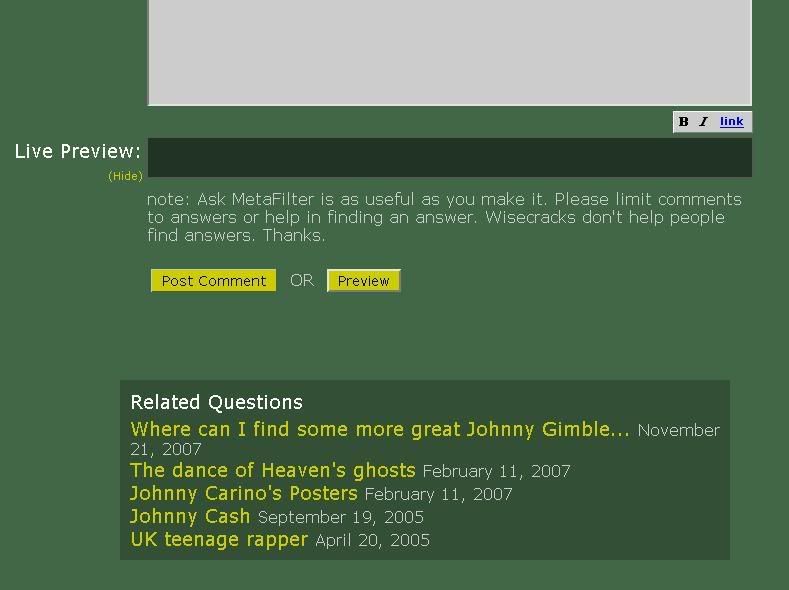
it'd be nice if the left border of the Related Comments aligned with the left border of the comment form.
Here's a screenshot of what I see, it lines up to me (that's a pixel ruler floating over the top to make sure).
posted by mathowie (staff) at 7:56 PM on June 4, 2008
Here's a screenshot of what I see, it lines up to me (that's a pixel ruler floating over the top to make sure).
posted by mathowie (staff) at 7:56 PM on June 4, 2008
This is great! Now can we get a "related-by-marriage" feature to round it out?
posted by flapjax at midnite at 8:11 PM on June 4, 2008
posted by flapjax at midnite at 8:11 PM on June 4, 2008
Here's a screenshot of what I see, it lines up to me (that's a pixel ruler floating over the top to make sure).
It's a little off for FF users on Windows; here's what it looks like. With a black line because I'm too cool for pixel rulers.
posted by carsonb at 9:12 PM on June 4, 2008
It's a little off for FF users on Windows; here's what it looks like. With a black line because I'm too cool for pixel rulers.
posted by carsonb at 9:12 PM on June 4, 2008
Dude, you have a myspace bookmark in your toolbar?
posted by mathowie (staff) at 9:41 PM on June 4, 2008 [6 favorites]
posted by mathowie (staff) at 9:41 PM on June 4, 2008 [6 favorites]
On carsonb's screenshot, the Related Questions box is to the right of the comment field.
On mine, it's to the left. (Draw your own line, dammit.)
FF/WinXP, FWIW, etc, HTH, LOL.
posted by mudpuppie at 9:48 PM on June 4, 2008
On mine, it's to the left. (Draw your own line, dammit.)
FF/WinXP, FWIW, etc, HTH, LOL.
posted by mudpuppie at 9:48 PM on June 4, 2008
I demand to see the links contained in the "cool shit" folder! PONY PONY PONY.
posted by SassHat at 10:18 PM on June 4, 2008
posted by SassHat at 10:18 PM on June 4, 2008
This, combined with the random question feature, tags and other "data churning" mechanisms brings AskMe close to what I was trying to describe in some MeTa thread years ago, which was essentially "Make it more like Everything2.com" and "Make it less like a linear stream of threads."
Love 'em or hate 'em, E2 knows something about how to tangent across and through a database.
posted by loquacious at 10:54 PM on June 4, 2008
Love 'em or hate 'em, E2 knows something about how to tangent across and through a database.
posted by loquacious at 10:54 PM on June 4, 2008
I am so glad I re-did the screen shot without any other tabs open.
I demand to see the links contained in the "cool shit" folder!
I use it in conjunction with the 'blog' shortcut; forever in search of petrified dog poop on the ints.
posted by carsonb at 10:59 PM on June 4, 2008
I demand to see the links contained in the "cool shit" folder!
I use it in conjunction with the 'blog' shortcut; forever in search of petrified dog poop on the ints.
posted by carsonb at 10:59 PM on June 4, 2008
urgh, am I the only one who hates the new placement? If I have nothing personally to add, I read till the comment box and then stop. I completely missed the box a few times.
How about putting it NEXT to the comment box (since there's tons of space), or just above it?
posted by divabat at 11:37 PM on June 4, 2008
How about putting it NEXT to the comment box (since there's tons of space), or just above it?
posted by divabat at 11:37 PM on June 4, 2008
Several scripts fix the too narrow comments box; adjusting it on the fly depending on the width of the browser. There is less space to the right of my comment box than there is to the left of it.
posted by Mitheral at 11:44 PM on June 4, 2008
posted by Mitheral at 11:44 PM on June 4, 2008
I just noticed the related questions this morning. Far-fracking-out.
posted by Thorzdad at 4:54 AM on June 5, 2008
posted by Thorzdad at 4:54 AM on June 5, 2008
While we're on the subject of stuff that's sandwiched between the thread and the text box for some reason, why is that older/newer stuff there?
I think that should go wherever this new thing goes.
posted by Sys Rq at 8:54 AM on June 5, 2008
I think that should go wherever this new thing goes.
posted by Sys Rq at 8:54 AM on June 5, 2008
Related questions appears to include deleted questions. This is one of the related questions to that "Should I quit working for my father" question.
posted by ND¢ at 11:22 AM on June 5, 2008
posted by ND¢ at 11:22 AM on June 5, 2008
So I just noticed here at work that the line that distinguishes the OP in AskMe was invisible, and any subsequent comments from the OP were slightly to the left of everything. Then I disabled AdblockPlus for Firefox on Metafilter, and the line is back. Just in case anyone else has that problem.
posted by chiababe at 12:36 PM on June 5, 2008
posted by chiababe at 12:36 PM on June 5, 2008
I think it's a terrible idea because, if I've posted an answer to a question and people look at the related questions, then they might see my other replies and realise that, out of my 1005 AskMe answers, I only actually know about four things, but rehash them endlessly. My aura of omniscience will be destroyed.
Stop this now. Won't someone please, please think of the know-alls.
posted by essexjan at 1:27 PM on June 5, 2008
Stop this now. Won't someone please, please think of the know-alls.
posted by essexjan at 1:27 PM on June 5, 2008
I hardly ever visit MeTa, but I felt inclined to stop on over because I wanted to say exactly--I mean, word-for-word--the topic of this post.
Thanks, Matt et. al.
posted by Civil_Disobedient at 2:50 PM on June 5, 2008
Thanks, Matt et. al.
posted by Civil_Disobedient at 2:50 PM on June 5, 2008
You are not logged in, either login or create an account to post comments
posted by found missing at 3:40 PM on June 4, 2008 [1 favorite]