CSS Halp! June 22, 2010 4:58 PM Subscribe
We're getting ready to launch that event site we talked about earlier, but could use some CSS help.
Each "post" slug on the front page will look something like this:
It's kind of tricky to do as all CSS and my browser-independent CSS knowledge is rusty. Could anyone take a crack at getting this layout to line up reliably on modern browsers? Ideally, I'd like the center text description column to expand as needed, while the left side date and right side attending info would be fixed in width.
<div class="my-left-column" />
<div class="my-right-column" />
<div class="my-center-column" />
Then make the left column float left with a fixed width, the right column float right with a fixed width, and the center column gets a margin on either side that matches those fixed widths (possibly with a smidge of extra to allow the gaps.)
Unfortunately I don't have time to write it today, but if you're still stuck tomorrow, holler and I'll write it for ya.
posted by davejay at 5:14 PM on June 22, 2010
and maybe the left and right order should swap. one of those things I'd normally play with for a few minutes to determine.
posted by davejay at 5:14 PM on June 22, 2010
posted by davejay at 5:14 PM on June 22, 2010
Eh, I took the time anyway:
<!DOCTYPE HTML PUBLIC "-//W3C//DTD HTML 4.0 Transitional//EN">
<html>
<head>
<style type="text/css">
.my-right-panel {float:right;width:100px;background-color:red;}
.my-left-panel {float:left;width:100px;background-color:green;}
.my-center-panel {margin-left:110px;margin-right:110px;background-color:blue;}
</style>
</head>
<body>
<div class="my-right-panel">god</div>
<div class="my-left-panel">oh</div>
<div class="my-center-panel">my</div>
</body>
</html>
Not fully browser-tested, and I don't want to hear complaints about it being non-semantically classed from the peanut gallery. It's just an example.
posted by davejay at 5:20 PM on June 22, 2010 [1 favorite]
heading out now, but happy to work on the detail stuff tomorrow if you're stuck
posted by davejay at 5:25 PM on June 22, 2010
posted by davejay at 5:25 PM on June 22, 2010
I missed the earlier thread, but just wanted to say I'm really excited about this!
posted by lunasol at 5:32 PM on June 22, 2010
posted by lunasol at 5:32 PM on June 22, 2010
The traditional problem that you run into when doing columns with CSS is that the height of each div is only as tall as the content in that div, which means that a column that's much longer than the others will hang down below them and it will no longer look like columns but boxes. But that may not be an issue here since you're essentially starting the columns over with each row, so you could very well just need something simple like a fixed width div floated left and a fixed width div floated right as davejay said.
posted by Rhomboid at 5:34 PM on June 22, 2010
posted by Rhomboid at 5:34 PM on June 22, 2010
I've been in a site-launching frenzy lately (3 in the last couple of weeks), and I have finally decided to totally ignore IE6 and non-phone resolutions below 1024x768. It is so liberating. I recommend it to everyone.
Which is to say that cross-browser stuff is a lot easier now that it was only 2 or 3 years ago. Thank god.
posted by stavrosthewonderchicken at 5:39 PM on June 22, 2010
Which is to say that cross-browser stuff is a lot easier now that it was only 2 or 3 years ago. Thank god.
posted by stavrosthewonderchicken at 5:39 PM on June 22, 2010
<strong><strong><strong><font size=64><font face="Futura"><BLINK>I'm really excited too! </BLINK></strong></font></small></taters></strong>
posted by special-k at 5:57 PM on June 22, 2010 [7 favorites]
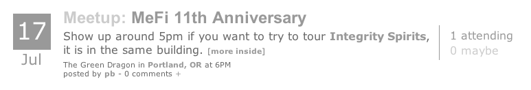
Thanks for the quick help, davejay. I guess I was overthinking it and starting with crazy complicated nested floats. Your simple HTML/CSS got us 95% of the way there. Here's how it looks in HTML now:
This is pretty close to pixel-perfect on Chrome/Mac for me now. Thanks!
posted by mathowie (staff) at 6:00 PM on June 22, 2010 [1 favorite]
This is pretty close to pixel-perfect on Chrome/Mac for me now. Thanks!
posted by mathowie (staff) at 6:00 PM on June 22, 2010 [1 favorite]
That is some crisp stuff, mathowie.
posted by boo_radley at 7:59 PM on June 22, 2010
posted by boo_radley at 7:59 PM on June 22, 2010
If you can wait to 8:30am CST tomorrow, I'll hook that up in a sweet definition list for you.
posted by mimi at 8:03 PM on June 22, 2010
posted by mimi at 8:03 PM on June 22, 2010
I PARTICULARLY ENJOY THE PROFESSIONAL WHITE BACKGROUND but seriously, that looks pretty nice and I'm excited about the site.
posted by Nattie at 8:07 PM on June 22, 2010
posted by Nattie at 8:07 PM on June 22, 2010
White background is fine but I hope we are not sticking with gray text... it's hard on the eyes.
posted by IndigoRain at 8:25 PM on June 22, 2010 [2 favorites]
posted by IndigoRain at 8:25 PM on June 22, 2010 [2 favorites]
Just embed a gif of the text. PRESTO, pixel perfect.
Embedded PDFs anyone?
posted by blue_beetle at 8:32 PM on June 22, 2010
Embedded PDFs anyone?
posted by blue_beetle at 8:32 PM on June 22, 2010
I KNEW sooner or later they'd take away the taters tag. We just can't have nice things, dammit.
posted by yhbc at 8:46 PM on June 22, 2010
posted by yhbc at 8:46 PM on June 22, 2010
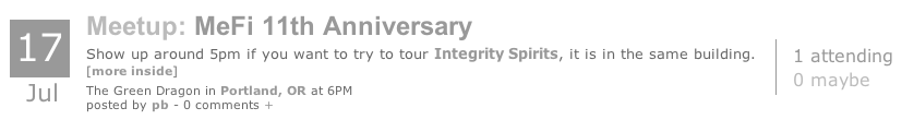
it's in the same building
"it is" just sounds too formal. IT IS bugging me.
posted by desjardins at 8:57 PM on June 22, 2010
"it is" just sounds too formal. IT IS bugging me.
posted by desjardins at 8:57 PM on June 22, 2010
Any chance of using a slightly darker color for the text? In the larger sizes (the date, the word "Meetup" and the event title) it's fine, but I found myself squinting a little at the copy text ("show up at 5pm..."). Something about the anti-aliasing and the low contrast makes it look fuzzy to me.
Although maybe that's just an artifact of viewing a screenshot of the thing rather than one that's actually rendered by my browser directly.
posted by Kadin2048 at 8:59 PM on June 22, 2010 [3 favorites]
Although maybe that's just an artifact of viewing a screenshot of the thing rather than one that's actually rendered by my browser directly.
posted by Kadin2048 at 8:59 PM on June 22, 2010 [3 favorites]
Please use (a) no Arial and (b) correct semantics (“Meetup: MeFi 11th anniversary” is
Microformats for dates and events.
posted by joeclark at 9:20 PM on June 22, 2010 [3 favorites]
H2 if “MetaFilter” is H1; dek is a P; each line is not a DIV).Microformats for dates and events.
posted by joeclark at 9:20 PM on June 22, 2010 [3 favorites]
it's in the same building
"it is" just sounds too formal. IT IS bugging me.
"it is" reads better to me; it lends emphasis to "it" as the subject. What bugs me is the use of a comma where a semicolon would be more appropriate.
posted by explosion at 9:21 PM on June 22, 2010
"it is" just sounds too formal. IT IS bugging me.
"it is" reads better to me; it lends emphasis to "it" as the subject. What bugs me is the use of a comma where a semicolon would be more appropriate.
posted by explosion at 9:21 PM on June 22, 2010
I'm more bugged by the "if you want to try to tour" part. Too many T sounds I think.
And yeah, after a day starting at a computer screen the grey is hard on my eyes now too. It was fine this morning when I first saw it.
posted by shelleycat at 9:37 PM on June 22, 2010
And yeah, after a day starting at a computer screen the grey is hard on my eyes now too. It was fine this morning when I first saw it.
posted by shelleycat at 9:37 PM on June 22, 2010
Glad I could be useful for once. I'm really looking forward to the new site!
Microformats for dates and events.
And for my pants.
posted by davejay at 10:43 PM on June 22, 2010 [1 favorite]
Microformats for dates and events.
And for my pants.
posted by davejay at 10:43 PM on June 22, 2010 [1 favorite]
I have finally decided to totally ignore IE6
Yeah, we just did that. And the next three things I built, I looked at 'em in IE6 anyway for fun, and they worked fine without tweaking. Which is three more things than had ever done that in the past. It annoyed me slightly more than it amused me.
posted by davejay at 10:46 PM on June 22, 2010
Yeah, we just did that. And the next three things I built, I looked at 'em in IE6 anyway for fun, and they worked fine without tweaking. Which is three more things than had ever done that in the past. It annoyed me slightly more than it amused me.
posted by davejay at 10:46 PM on June 22, 2010
I think I've got a copy of Dreamweaver UltraDev around here somewhere, gimme a minute.A friend and I were trying to decide if this was a burn on matthowie, or not. Plz advise.
posted by cortex at 5:01 PM on June 22 [+] [!]
posted by !Jim at 10:58 PM on June 22, 2010
I dunno if it was meant to be or not, but it made me throw up in my mouth a little.
posted by davejay at 11:10 PM on June 22, 2010
posted by davejay at 11:10 PM on June 22, 2010
A friend and I were trying to decide if this was a burn on matthowie, or not. Plz advise.
No, it was generalized absurdist bad-design humor in lieu of any capacity on my part to be genuinely helpful.
I dunno if it was meant to be or not, but it made me throw up in my mouth a little.
That is approximately the result I was aiming for.
posted by cortex (staff) at 11:13 PM on June 22, 2010 [2 favorites]
it was generalized absurdist bad-design humor in lieu of any capacity on my part to be genuinely helpful.
If it weren't for the word "design" in there, I'd be suing you for plagiarizing the motto on my business cards.
posted by Uppity Pigeon #2 at 12:09 AM on June 23, 2010 [1 favorite]
If it weren't for the word "design" in there, I'd be suing you for plagiarizing the motto on my business cards.
posted by Uppity Pigeon #2 at 12:09 AM on June 23, 2010 [1 favorite]
Please use (a) no Arial and (b) correct semantics (“Meetup: MeFi 11th anniversary” is H2 if “MetaFilter” is H1; dek is a P; each line is not a DIV).
I love building websites.
This is why I hate building websites.
posted by stavrosthewonderchicken at 5:00 AM on June 23, 2010 [3 favorites]
I love building websites.
This is why I hate building websites.
posted by stavrosthewonderchicken at 5:00 AM on June 23, 2010 [3 favorites]
MetaMeet? MMm, tasty. Sounds like something that wants dark soy sauce.
posted by seanmpuckett at 5:19 AM on June 23, 2010
posted by seanmpuckett at 5:19 AM on June 23, 2010
Looks great, mathowie! I can probably speak for most of the New York contingency (and our hundreds of meetups) when I say that we're stoked.
posted by functionequalsform at 5:30 AM on June 23, 2010
posted by functionequalsform at 5:30 AM on June 23, 2010
joeclark: "Please use (a) no Arial"
Please go (a) jump in a lake
posted by Plutor at 5:55 AM on June 23, 2010 [2 favorites]
Please go (a) jump in a lake
posted by Plutor at 5:55 AM on June 23, 2010 [2 favorites]
joeclark: "Please use (a) no Arial and (b) lots of COMIC SANS"
FTFY
posted by charred husk at 6:07 AM on June 23, 2010 [2 favorites]
FTFY
posted by charred husk at 6:07 AM on June 23, 2010 [2 favorites]
"Please use (a) no Arial"
Well, regardless of principle and the whole being-pointlessly-annoying-thing, it's just a kinda silly thing to say, because we can all set our preferred fonts in our preferences, anyway.
I've been Verdana here since I can't remember when, but I'm inclined to change it to Arial and just send Cranky Ol' Joe screenshots of that once in a while to get him exercised.
posted by stavrosthewonderchicken at 6:08 AM on June 23, 2010
Wait, shouldn't you be using tables?!
posted by Brandon Blatcher at 6:09 AM on June 23, 2010 [1 favorite]
posted by Brandon Blatcher at 6:09 AM on June 23, 2010 [1 favorite]
stavrosthewonderchicken: "we can all set our preferred fonts in our preferences, anyway."
I am now rocking MetaFilter with IMPACT.
Wait, WTF did I just type? I can't read anything!
posted by charred husk at 6:24 AM on June 23, 2010 [1 favorite]
I am now rocking MetaFilter with IMPACT.
Wait, WTF did I just type? I can't read anything!
posted by charred husk at 6:24 AM on June 23, 2010 [1 favorite]
It looks good but the light grey foreground is a concern. Try running your page through a color contrast analyzer to see if it meets accessibility guidelines - speaking as one of the many specky-eyed folks here, onscreen text gets incredibly hard to read if it's too small or too faint.
I don't have any beef with using Arial. It's not pretty, especially at large sizes, but it's more readable onscreen than most fonts (including Helvetica) at small and medium sizes.
posted by ardgedee at 6:28 AM on June 23, 2010 [1 favorite]
I don't have any beef with using Arial. It's not pretty, especially at large sizes, but it's more readable onscreen than most fonts (including Helvetica) at small and medium sizes.
posted by ardgedee at 6:28 AM on June 23, 2010 [1 favorite]
Just the extension for joeclark's installation of Safari: ComicSanagic
posted by ardgedee at 6:31 AM on June 23, 2010
posted by ardgedee at 6:31 AM on June 23, 2010
I didn't realize that the "CS" in "CSS" stands for "comma splice."
posted by DevilsAdvocate at 6:36 AM on June 23, 2010 [2 favorites]
posted by DevilsAdvocate at 6:36 AM on June 23, 2010 [2 favorites]
Please use (a) no Arial and (b) correct semantics (“Meetup: MeFi 11th anniversary” is H2 if “MetaFilter” is H1; dek is a P; each line is not a DIV).
Dude, have you seen how the rest of the site has been done? Lord save 'em, there's pretty much no respect for semantics (or even valid HTML!) on this site, and it works anyway. As much as people moan about the unprofessional background and everything else, people keep coming back. I love making web pages that validate, that have semantic markup, I even have put microformats in some of my pages!
But ultimately, it's about workability. Let's just have them do what works for now and worry about "correctness" later on.
Also, I hate P tags. You can't put hardly anything in them, and they can seriously mess up your layout.
posted by Deathalicious at 6:52 AM on June 23, 2010
I ask you, if our web isn't semantic then what separates us from the animals?
posted by chunking express at 6:56 AM on June 23, 2010 [2 favorites]
posted by chunking express at 6:56 AM on June 23, 2010 [2 favorites]
The marquee tag.
posted by ardgedee at 7:06 AM on June 23, 2010 [1 favorite]
posted by ardgedee at 7:06 AM on June 23, 2010 [1 favorite]
Hopefully a fence.
posted by Brandon Blatcher at 7:11 AM on June 23, 2010 [2 favorites]
posted by Brandon Blatcher at 7:11 AM on June 23, 2010 [2 favorites]
I dunno if it was meant to be or not, but it made me throw up in my mouth a little.
That is approximately the result I was aiming for.
Clearly we need a way to show this intent.
Something like
I think I've got a copy of Dreamweaver UltraDev around here somewhere, gimme a minute. {\} {\} {\} {\} {\} {\} {\} {\} Om nom nom urgle burgle urp
posted by xorry at 7:15 AM on June 23, 2010
That is approximately the result I was aiming for.
Clearly we need a way to show this intent.
Something like
I think I've got a copy of Dreamweaver UltraDev around here somewhere, gimme a minute. {\} {\} {\} {\} {\} {\} {\} {\} Om nom nom urgle burgle urp
posted by xorry at 7:15 AM on June 23, 2010
ardgedee writes "The marquee tag."
So we're animals then? Marquee tag doesn't work here
posted by Mitheral at 7:33 AM on June 23, 2010
So we're animals then? Marquee tag doesn't work here
posted by Mitheral at 7:33 AM on June 23, 2010
Lord save 'em, there's pretty much no respect for semantics
When, as a young boy, I stood in a dark alley with the steaming blood of my mother and father pooling on the ground and reddening the tips of my dress-up shoes, I vowed never to rest until I'd avenged their deaths upon the semantic constructs that so violently ripped them away from me, and on all other low creatures likewise semantic.
posted by cortex (staff) at 7:43 AM on June 23, 2010
You cannot properly avenge with a run-on sentence, my good man.
posted by cashman at 7:52 AM on June 23, 2010 [1 favorite]
posted by cashman at 7:52 AM on June 23, 2010 [1 favorite]
Every time I see "FTFY" I look for the minus sign next to the plus sign, and it's never there.
posted by norm at 7:54 AM on June 23, 2010
posted by norm at 7:54 AM on June 23, 2010
Every time I see "FTFY" I look for the minus super-awesome-mega-plus sign next to the plus sign, and it's never there.
FTFY.
posted by DevilsAdvocate at 8:02 AM on June 23, 2010 [2 favorites]
FTFY.
posted by DevilsAdvocate at 8:02 AM on June 23, 2010 [2 favorites]
My MetaFilter is set to dingbats. And I didn't even have to set it to that. It just came like that: full of digbats OOH BURN.
posted by Astro Zombie at 8:20 AM on June 23, 2010 [5 favorites]
posted by Astro Zombie at 8:20 AM on June 23, 2010 [5 favorites]
font humor. how droll.
posted by crunchland at 9:20 AM on June 23, 2010
posted by crunchland at 9:20 AM on June 23, 2010
font humor. how droll.
Who invited Courier to the party?
posted by Hiker at 9:37 AM on June 23, 2010 [6 favorites]
Who invited Courier to the party?
posted by Hiker at 9:37 AM on June 23, 2010 [6 favorites]
For reals, it has no impact, it's behind the times, seems like it's stuck in Georgia.
posted by Brandon Blatcher at 9:51 AM on June 23, 2010 [1 favorite]
posted by Brandon Blatcher at 9:51 AM on June 23, 2010 [1 favorite]
super-awesome-mega-plus sign next to the plus sign
it's also styled using an adjacent sibling selector
posted by cowbellemoo at 10:04 AM on June 23, 2010
it's also styled using an adjacent sibling selector
posted by cowbellemoo at 10:04 AM on June 23, 2010
crunchland : font humor. how droll.
We do tend to be non-comedic in our approach.
posted by quin at 10:09 AM on June 23, 2010
We do tend to be non-comedic in our approach.
posted by quin at 10:09 AM on June 23, 2010
While this site will no doubt be a great addition and will make it much easier to meet other MeFites, I can't help thinking that once it's up and running I'll spend at least one Saturday afternoon alone sitting behind a Dungeon Master's screen caressing my polyhedral dice and waiting in vain for a knock on the door....
posted by BitterOldPunk at 10:40 AM on June 23, 2010
posted by BitterOldPunk at 10:40 AM on June 23, 2010
Hiker: "Who invited Courier to the party?"
he's just dropping something off, he won't be staying.
posted by boo_radley at 11:01 AM on June 23, 2010 [4 favorites]
he's just dropping something off, he won't be staying.
posted by boo_radley at 11:01 AM on June 23, 2010 [4 favorites]
Lord save 'em, there's pretty much no respect for semantics (or even valid HTML!) on this site, and it works anyway.
At least until their innernets license gets pulled.
posted by Alvy Ampersand at 11:11 AM on June 23, 2010
At least until their innernets license gets pulled.
posted by Alvy Ampersand at 11:11 AM on June 23, 2010
Looks nice! I like the monochromatic look but wonder if you considered using any blue links for consistency with the other white sites (Jobs/Shop).
posted by empyrean at 11:35 AM on June 23, 2010
posted by empyrean at 11:35 AM on June 23, 2010
It looks good; I wonder if the city name could be a little more prominent.
Would it be hard to put the city name at the left edge, like so?:
With the current layout, the city name will move around depending how long the name of the venue is, which makes skimming down the page looking for city names just a little trickier. Here's an example if the city names are not at the left edge (this is the current layout):
posted by LobsterMitten at 2:43 PM on June 23, 2010
Would it be hard to put the city name at the left edge, like so?:
Portland OR at the Green Dragon at 6 pmIf the page fills up with lots of events in different places, we'll want to be able to skim down the page quickly looking for cities near us, right? So having the city names line up vertically (by being at left edge) would be nice.
With the current layout, the city name will move around depending how long the name of the venue is, which makes skimming down the page looking for city names just a little trickier. Here's an example if the city names are not at the left edge (this is the current layout):
The Green Dragon in Portland OR at 6 pmSame examples if the city name is at the left edge (I think this way is easier to skim for locations):
The Met in New York NY at 9 am
Yo Mama's Coffee and Biscuits and Fine Things in Jersey City NJ at 1 am
Gupper's Roadside Bait and Tackle in Corvallis OR at 8 pm
Tastee Freez in Athens GA at 7:30 pm
Portland OR at the Green Dragon at 6 pm(Obviously, this isn't a huge issue, but I mention it in case it's easier to address this now rather than later.)
New York NY at The Met at 9 am
Jersey City NJ at Yo Mama's Coffee and Biscuits and Fine Things at 1 am
Corvallis OR at Gupper's Roadside Bait and Tackle at 8 pm
Athens GA at Tastee Freez at 7:30 pm
posted by LobsterMitten at 2:43 PM on June 23, 2010
Good call LobsterMitten. It's tough to envision how the site will look and act with just a handful of test posts, so we'll probably make the city change as you noted, that's a good idea. I think I'll also be changing link colors to match other white sites.
It looks like we'll be launching this tomorrow as a test for just scheduled meetups at first until we work the bugs out, then we'll add in other events. I'll make a new MetaTalk post about it when it goes public.
posted by mathowie (staff) at 5:09 PM on June 23, 2010 [1 favorite]
It looks like we'll be launching this tomorrow as a test for just scheduled meetups at first until we work the bugs out, then we'll add in other events. I'll make a new MetaTalk post about it when it goes public.
posted by mathowie (staff) at 5:09 PM on June 23, 2010 [1 favorite]
It looks like we'll be launching this tomorrow...
But wait! We have lots more unrequested design feedback for you!
Hey, where ya goin'?
come back
posted by davejay at 5:21 PM on June 23, 2010 [2 favorites]
But wait! We have lots more unrequested design feedback for you!
Hey, where ya goin'?
come back
posted by davejay at 5:21 PM on June 23, 2010 [2 favorites]
If we actually had something like this fine establishment in J.C. I'd be ecstatic, Lobster Mitten.
posted by stagewhisper at 5:28 PM on June 23, 2010
posted by stagewhisper at 5:28 PM on June 23, 2010
I'm imagining mathowie and pb, diligently coding, while a herd of ponies watches anxiously.
posted by rtha at 6:16 PM on June 23, 2010 [4 favorites]
posted by rtha at 6:16 PM on June 23, 2010 [4 favorites]
[in a whisper from behind you, in one of the room's corners, you hear...]
I almost understood some of that...
posted by Drasher at 7:59 PM on June 23, 2010
I almost understood some of that...
posted by Drasher at 7:59 PM on June 23, 2010
You are not logged in, either login or create an account to post comments
posted by cortex (staff) at 5:01 PM on June 22, 2010 [2 favorites]