Testing New HTML Buttons in the Modern Theme February 20, 2015 1:39 PM Subscribe
Since we launched the modern theme, we've heard many times that the HTML bold, italic, and link buttons below comment forms don't seem to fit the new design. We're testing out some new buttons in this thread.
The goal was to get buttons that are a bigger target both on the desktop and on small screens. We wanted them to look good on high resolution monitors and phones. We also didn't want their bigger size to be a distraction so they only appear when you're writing a comment.
The new buttons are only available in this MetaTalk thread. We'd like to get your help shoring them up before we push them out across the sites. Please report any problems you run into here, along with your browser and OS versions.
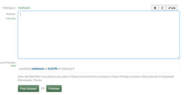
Here's what the buttons should look like on desktop and mobile in case they aren't showing up for you.
The goal was to get buttons that are a bigger target both on the desktop and on small screens. We wanted them to look good on high resolution monitors and phones. We also didn't want their bigger size to be a distraction so they only appear when you're writing a comment.
The new buttons are only available in this MetaTalk thread. We'd like to get your help shoring them up before we push them out across the sites. Please report any problems you run into here, along with your browser and OS versions.
Here's what the buttons should look like on desktop and mobile in case they aren't showing up for you.
I had no problem with the old buttons in the new theme, but I like the way these appear above the textbox. The only thing I'd change is the font for the bold and italic buttons; Maybe it's just me, but my first impression was that it looks too round, almost Comic Sans-ish.
posted by Strange Interlude at 1:52 PM on February 20, 2015 [3 favorites]
posted by Strange Interlude at 1:52 PM on February 20, 2015 [3 favorites]
In Chrome for Windows, Version 40.0.2214.115 m, the buttons are still in the bottom right corner of the comment window. Not a big deal in my opinion, but FYI.
posted by Brandon Blatcher at 1:53 PM on February 20, 2015
posted by Brandon Blatcher at 1:53 PM on February 20, 2015
Ah, no.
posted by Brandon Blatcher at 1:59 PM on February 20, 2015
posted by Brandon Blatcher at 1:59 PM on February 20, 2015
So, old buttons still appear when I hit preview, and they fall below the comment box. Supposed to be like that?
posted by rtha at 2:25 PM on February 20, 2015
posted by rtha at 2:25 PM on February 20, 2015
Supposed to be like that?
Yep, no new buttons in the preview yet. We'll add those when they go out everywhere.
posted by pb (staff) at 2:26 PM on February 20, 2015
Yep, no new buttons in the preview yet. We'll add those when they go out everywhere.
posted by pb (staff) at 2:26 PM on February 20, 2015
They look Great In mobile.
On preview: is small tag disabled!!? Or is it my preview. Let's find out.
posted by rtha at 2:28 PM on February 20, 2015
On preview: is small tag disabled!!? Or is it my preview. Let's find out.
posted by rtha at 2:28 PM on February 20, 2015
I'm neutral on the buttons' design, aesthetically speaking, but I really like that they're bigger on mobile. Yay!
posted by Metroid Baby at 2:36 PM on February 20, 2015
posted by Metroid Baby at 2:36 PM on February 20, 2015
I really like that they're bigger on mobile
Yeah, the human interface guidelines that Apple publishes says touch targets should be about 32px square, which is actually kind of big (double the size of a favicon), and in the past the mobile buttons we had were less than half that height, so tougher to tap with a finger.
posted by mathowie (staff) at 2:56 PM on February 20, 2015
Ohhhh, another thumbs up for mobile!
posted by lizjohn at 3:00 PM on February 20, 2015 [1 favorite]
posted by lizjohn at 3:00 PM on February 20, 2015 [1 favorite]
Looks good.
Am I the only one who types out the tags?
posted by Justinian at 3:21 PM on February 20, 2015 [2 favorites]
Am I the only one who types out the tags?
posted by Justinian at 3:21 PM on February 20, 2015 [2 favorites]
They're so big! I like them, works great over here on Android/Chrome!
posted by phunniemee at 3:34 PM on February 20, 2015
posted by phunniemee at 3:34 PM on February 20, 2015
I have been known to type a tag or two from time to time.
Preview doesn't show my link, but it works on post.
Also, the HTML help and Show Preview texts are teeeeeny
And I LOVE BIG BUTTONS
posted by Jesse the K at 3:38 PM on February 20, 2015 [1 favorite]
Preview doesn't show my link, but it works on post.
Also, the HTML help and Show Preview texts are teeeeeny
And I LOVE BIG BUTTONS
posted by Jesse the K at 3:38 PM on February 20, 2015 [1 favorite]
If you wail on the buttons you end up selecting the Posting as: text.
posted by jeffamaphone at 3:42 PM on February 20, 2015
posted by jeffamaphone at 3:42 PM on February 20, 2015
On Chrome on my work PC and they look kind of blurry, I love the size but is there any way to sharpen the icons up?
posted by arcticseal at 4:10 PM on February 20, 2015
posted by arcticseal at 4:10 PM on February 20, 2015
Ooh, pretty in mobile (iOS Safari). Makes the desktop ones look very Web -2.0.
posted by arcticseal at 4:12 PM on February 20, 2015
posted by arcticseal at 4:12 PM on February 20, 2015
Oh god. So great. Please press go across all platforms.
Both the size and the aesthetics are great. The old mobile ones were t'urble.
posted by chasles at 4:20 PM on February 20, 2015
Both the size and the aesthetics are great. The old mobile ones were t'urble.
posted by chasles at 4:20 PM on February 20, 2015
They look great for me! Also, it's been bothering me that the slash button and the italic button looked so similar, so I'm glad to see that the new buttons rectify that.
Huzzah!
posted by ocherdraco at 4:49 PM on February 20, 2015
Huzzah!
posted by ocherdraco at 4:49 PM on February 20, 2015
Not sure why they're showing up blurry for you, arcticseal. They've been sharp in all my tests. Can you let me know which version of Windows you're running? I'll see if I can duplicate it.
posted by pb (staff) at 5:18 PM on February 20, 2015
posted by pb (staff) at 5:18 PM on February 20, 2015
I'll just continue to <b>type my tags by hand</b>
posted by double block and bleed at 6:19 PM on February 20, 2015
posted by double block and bleed at 6:19 PM on February 20, 2015
bloop bleep owl cam
They seem nice & work okay for me.
posted by Going To Maine at 6:29 PM on February 20, 2015
They seem nice & work okay for me.
posted by Going To Maine at 6:29 PM on February 20, 2015
Pb, this is a work installation of W7, so might be messed with. That said, they look lovely on Android!
posted by arcticseal at 8:39 PM on February 20, 2015
posted by arcticseal at 8:39 PM on February 20, 2015
They look a little blurry for me too. Chrome on Windows 7. Not superblurry, but I instinctively moved my head closer to the screen to look at them.
posted by Kattullus at 12:10 AM on February 21, 2015
posted by Kattullus at 12:10 AM on February 21, 2015
Android / Chrome / spot on.
Especially in contrast with the old buttons when they appear in the preview!
posted by emilyw at 5:08 AM on February 21, 2015
Especially in contrast with the old buttons when they appear in the preview!
posted by emilyw at 5:08 AM on February 21, 2015
I kind of wish the background behind the buttons was somehow different. It looks good in your screenshots with light mode on, but I run in dark mode. It's making weird contrast issues with the edges of the buttons against the gray background.
I'm not sure if I'm making any sense.
posted by royalsong at 5:43 AM on February 21, 2015
I'm not sure if I'm making any sense.
posted by royalsong at 5:43 AM on February 21, 2015
I like it, I have dull fingers so this is nice. Then again, I am nobody so what do I know?
posted by Literaryhero at 6:00 AM on February 21, 2015
posted by Literaryhero at 6:00 AM on February 21, 2015
This is a very nice tweak.
I am only seeing 3 buttons.
It is good to have them at the top, good choice.
There is an earlier comment about the font of the B and the I. I agree. The Link letters look perfect though.
Last thought: the buttons are hidden unless I'm in the typing mode, then they pop up with the keyboard. This makes it feel like they are part of the operating system and seems very weird.
I'm on an iPad 2 with iOS6
posted by SLC Mom at 6:14 AM on February 21, 2015
I find the new buttons much easier to use on my iPhone (5S, Safari, iOS 8.1.3). Thank you!
posted by Songdog at 6:19 AM on February 21, 2015
posted by Songdog at 6:19 AM on February 21, 2015
Thank you, thank you, thank you for choosing not to "improve" the old theme at the same time.
posted by flabdablet at 8:22 AM on February 21, 2015
posted by flabdablet at 8:22 AM on February 21, 2015
It looks good in your screenshots with light mode on, but I run in dark mode. It's making weird contrast issues with the edges of the buttons against the gray background.
I agree. I also use dark mode, and it doesn't look as good as when I use light mode. But, functionally, it's way better than the old buttons. Thanks!
posted by bluefly at 9:12 AM on February 21, 2015
I agree. I also use dark mode, and it doesn't look as good as when I use light mode. But, functionally, it's way better than the old buttons. Thanks!
posted by bluefly at 9:12 AM on February 21, 2015
Any chance we could get the buttons, when nothing is selected, to insert the tags with a space inbetween instead of right next to each other? My phone insists on selecting one character instead of just setting the cursor inbetween when I try to use these buttons.
posted by Mitheral at 10:40 AM on February 21, 2015
posted by Mitheral at 10:40 AM on February 21, 2015
I do not like how the buttons hide when i don't have the cursor in the text box. I like to know what my options are, I don't want to have to click around to make what i want to happen magically appear. What possible functionality could be gained by having the buttons hidden from view?
Additionally, i frequently have link URL copied to clipboard, highlight the link text, and click the "link" button, only to misclick. Under the new system, this would hide the buttons, forcing me to take the additional step of re-highlighting the link text again. Very tedious.
In conclusion, please do not make the options auto-hide.
Otherwise: I like them.
posted by rebent at 11:14 AM on February 21, 2015 [2 favorites]
Oh hey, I was one of the folks who commented to y'all (and my continued thanks to pb for being a speedy and responsive dude). I just tested this thread on mobile and it looks great and answers my original concern neatly. Thank you!
posted by librarylis at 11:23 AM on February 21, 2015
posted by librarylis at 11:23 AM on February 21, 2015
testing
123 testing
count me as a fan
123testlink.com
posted by Michele in California at 12:56 PM on February 21, 2015
123 testing
count me as a fan
123testlink.com
posted by Michele in California at 12:56 PM on February 21, 2015
So it looks like you're supporting control-I for italic and control-B for bold. How about control-K for URL as well? (as used in lots of apple/google/microsoft/etc apps).
posted by effbot at 3:10 PM on February 21, 2015
posted by effbot at 3:10 PM on February 21, 2015
Oh, control-U does that. Guess underline isn't used much, so I guess I can live with the inconsistency...
posted by effbot at 3:14 PM on February 21, 2015
posted by effbot at 3:14 PM on February 21, 2015
As long as we're playing with HTML tag options, how about buttons for small, sup & sub? I'd ask for img but that might get me banhammered :)
posted by pjern at 8:47 PM on February 21, 2015
posted by pjern at 8:47 PM on February 21, 2015
Do we need the word "Link" on the button, or are we at a point where the chain icon is pretty well understood?
posted by Sweetie Darling at 7:16 AM on February 22, 2015
posted by Sweetie Darling at 7:16 AM on February 22, 2015
I use dark mode and agree that more contrast between the buttons and there background would be nice. (I'd also prefer that buttons stay visible above the comment box instead of vanishing and appearing.)
posted by Margalo Epps at 8:50 AM on February 22, 2015
posted by Margalo Epps at 8:50 AM on February 22, 2015
What does this button do?
Edit: dang, gets edited out. How can we have frank and honest discussions without a marquee tag?
posted by Joe in Australia at 4:05 PM on February 22, 2015
Edit: dang, gets edited out. How can we have frank and honest discussions without a marquee tag?
posted by Joe in Australia at 4:05 PM on February 22, 2015
These are great on mobile, I heartily approve.
posted by Happy Dave at 2:44 AM on February 23, 2015
posted by Happy Dave at 2:44 AM on February 23, 2015
Scrolling in a textarea is janky on just about every mobile platform. It's not related to the HTML buttons, no. It's just one of those annoyances on a small screen. If you feel a long comment brewing, you might use a note-taking app to compose it and then cut and paste.
Thanks everyone for the testing and feedback so far!
posted by pb (staff) at 8:15 AM on February 23, 2015 [1 favorite]
Thanks everyone for the testing and feedback so far!
posted by pb (staff) at 8:15 AM on February 23, 2015 [1 favorite]
I'm now ruined in every other thread because I just think "where are the good buttons?"
posted by knapah at 2:52 PM on February 23, 2015 [2 favorites]
posted by knapah at 2:52 PM on February 23, 2015 [2 favorites]
Approved. Please distribute to all platforms, including the MeFi app ASAP.
works fine for me on WinXP/Chrome and iOS8/Chrome, Safari (iPhone 5s + iPad 3). Thought I should try it on IE while I was at it and it doesn't work at all. Then realised my desktop has IE8 and that would explain it.
posted by dg at 1:25 AM on February 24, 2015
works fine for me on WinXP/Chrome and iOS8/Chrome, Safari (iPhone 5s + iPad 3). Thought I should try it on IE while I was at it and it doesn't work at all. Then realised my desktop has IE8 and that would explain it.
posted by dg at 1:25 AM on February 24, 2015
You are not logged in, either login or create an account to post comments
posted by pb (staff) at 1:45 PM on February 20, 2015