a small button shaped pony March 10, 2022 5:11 AM Subscribe
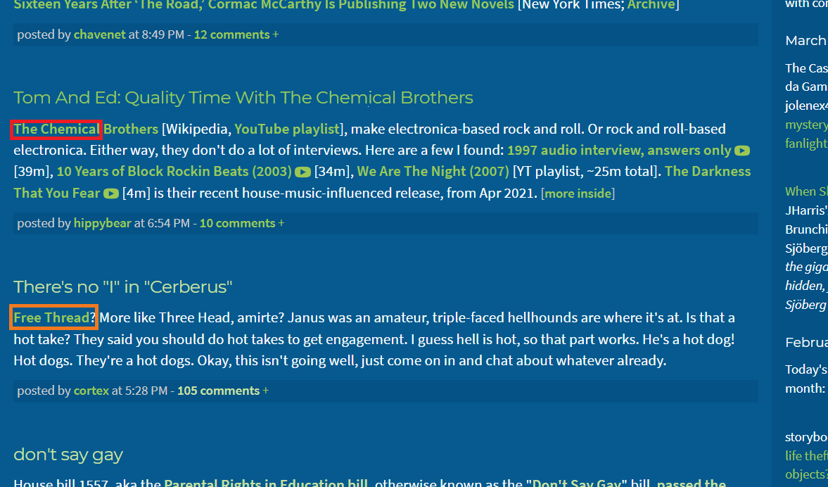
This is a very small idea/request. Would it be possible to add a button/flair/visual or text icon to things like the Free Thread and live news/megathreads (such as the ones for the ongoing Ukraine conflict) to make them visually distinct and easy to find as one scans down the front page of the Blue? I think the Free Thread has definitely taken off as an idea and the megathreads are clearly very useful, so it would be good to make it easier to spot them.
I have created a very quick mockup here using the power of Microsoft Paint (colours/shapes/style tbd obviously, this is just an example of how it works to distinguish posts from others around them). I'm imagining something like post flairs on Reddit or the already existing moderator flair, only within the title or first line of the post. This would be something only mods could add to a post to make sure it's only used sparingly and correctly, for the Free Thread, and for other important "live" threads of ongoing situations. This isn't to say that other posts are less important or interesting, but it feels as though the Free Thread and "live" threads are a different kind of post altogether and it feels useful, imo, to distinguish them.
I have created a very quick mockup here using the power of Microsoft Paint (colours/shapes/style tbd obviously, this is just an example of how it works to distinguish posts from others around them). I'm imagining something like post flairs on Reddit or the already existing moderator flair, only within the title or first line of the post. This would be something only mods could add to a post to make sure it's only used sparingly and correctly, for the Free Thread, and for other important "live" threads of ongoing situations. This isn't to say that other posts are less important or interesting, but it feels as though the Free Thread and "live" threads are a different kind of post altogether and it feels useful, imo, to distinguish them.
This is a brilliant idea!
posted by mochapickle at 5:41 AM on March 10, 2022
posted by mochapickle at 5:41 AM on March 10, 2022
Can't the free threads just have some emojis added? 🙃
posted by tiny frying pan at 5:45 AM on March 10, 2022 [2 favorites]
posted by tiny frying pan at 5:45 AM on March 10, 2022 [2 favorites]
We use common emojis for highlighting things at work and at first I found it horribly twee, but it really is a good way to add visual identity within a text-based medium. Chosen carefully, they have very broad coverage (sorry Lynx users).
Free threads could be 🌱🌱 seedlings, and 🐙 for megathreads... or more practically a value for high-volume threads (X posts/6-hours) that would add ✨✨ sparkles.
posted by dorothyisunderwood at 5:58 AM on March 10, 2022 [4 favorites]
Free threads could be 🌱🌱 seedlings, and 🐙 for megathreads... or more practically a value for high-volume threads (X posts/6-hours) that would add ✨✨ sparkles.
posted by dorothyisunderwood at 5:58 AM on March 10, 2022 [4 favorites]
Thanks, Eyebrows McGee!
Emojis would also be a good solution, but I think a key part of it would be it remaining something only moderators can add/use in order to keep these sorts of posts officially distinct and universally labelled, whereas any post can have emojis in it.
I also wonder at whether using emojis would be confusing for users with screen readers and so on?
This mostly comes from missing new Ukraine megathread posts going up, it just makes it that little bit easier to quickly scan down the page and see, aha, there's the place to go, rather than requiring all posters use the same titles or formatting. I love the simple style of the Blue, but having every post look the same does have its drawbacks in terms of visual landing opportunities. I don't imagine any sort of megathread labelling would be used often, only in cases of ongoing "active" situations.
posted by fight or flight at 6:01 AM on March 10, 2022 [1 favorite]
Screen readers is an excellent consideration but I'm not sure how a graphical solution created by frimble would read any better than an emoji.
Mostly I commented because I want frimble to focus on the projects already in play, not new flourishes.
posted by tiny frying pan at 6:06 AM on March 10, 2022 [1 favorite]
Mostly I commented because I want frimble to focus on the projects already in play, not new flourishes.
posted by tiny frying pan at 6:06 AM on March 10, 2022 [1 favorite]
I favor this idea, and limiting it to something moderators can do.
posted by NotLost at 6:19 AM on March 10, 2022
posted by NotLost at 6:19 AM on March 10, 2022
Mod note: "This mostly comes from missing new Ukraine megathread posts going up"
Fair point. I've just now added the latest Ukraine post to the sideblog, and added the current Free Thread to the banner, since those are tools we already have!
posted by Eyebrows McGee (staff) at 6:34 AM on March 10, 2022 [2 favorites]
Fair point. I've just now added the latest Ukraine post to the sideblog, and added the current Free Thread to the banner, since those are tools we already have!
posted by Eyebrows McGee (staff) at 6:34 AM on March 10, 2022 [2 favorites]
Just out of curiosity - in dorothysunderwood's comment, is the suggested emoji for the megathreads a fire or a Cthulhu?
(Honestly, either one is appropriate.)
posted by EmpressCallipygos at 9:18 AM on March 10, 2022 [1 favorite]
(Honestly, either one is appropriate.)
posted by EmpressCallipygos at 9:18 AM on March 10, 2022 [1 favorite]
Can't the free threads just have some emojis added?
I nominate the ones for various currencies, in round-robin fashion (all 180 of 'em, should last us a while).
posted by Greg_Ace at 9:53 AM on March 10, 2022
I nominate the ones for various currencies, in round-robin fashion (all 180 of 'em, should last us a while).
posted by Greg_Ace at 9:53 AM on March 10, 2022
Just out of curiosity - in dorothysunderwood's comment, is the suggested emoji for the megathreads a fire or a Cthulhu?
It's a red octopus.
posted by dobbs at 10:17 AM on March 10, 2022
It's a red octopus.
posted by dobbs at 10:17 AM on March 10, 2022
Fun fact, in the staff slack, we have a custom slackmoji of the king's head from Katamari Damacy vomiting rainbows, because when the Trump megathreads started burning us out, we were calling them "Threadamari Damacy" for the way they rolled up everything in their path.
(We also have a red shower slackmoji for those moments when you think it's quiet and you go to the bathroom real quick, come back, and the flag window is on fire with the eponymous "red shower" of flags.)
posted by Eyebrows McGee (staff) at 10:27 AM on March 10, 2022 [9 favorites]
(We also have a red shower slackmoji for those moments when you think it's quiet and you go to the bathroom real quick, come back, and the flag window is on fire with the eponymous "red shower" of flags.)
posted by Eyebrows McGee (staff) at 10:27 AM on March 10, 2022 [9 favorites]
Octopus, though color and depiction depend on what OS and/or app you're using them on. Only Joypixel and Samsung depict all eight octopus tentacles in their emoji versions, for example. And Twitter's octopus (hexapus?) is purple.
posted by Pandora Kouti at 1:48 PM on March 10, 2022
posted by Pandora Kouti at 1:48 PM on March 10, 2022
Screen readers is an excellent consideration but I'm not sure how a graphical solution created by frimble would read any better than an emoji.
I don't know how emojis are handled but images result in something like "image description alt text". If the alt text was something like "free thread" or "Russian shitshow" it would probably have the same effect of highlighting those posts.
posted by Mitheral at 7:45 AM on March 11, 2022
I don't know how emojis are handled but images result in something like "image description alt text". If the alt text was something like "free thread" or "Russian shitshow" it would probably have the same effect of highlighting those posts.
posted by Mitheral at 7:45 AM on March 11, 2022
This is on a side note:
I have been on the Plain mode no frills black text on white background for years and only rarely log off. But when I do, it comes up as the yellow text on the old #9622 blue.
Is that still the default for non-members? Well, then -- why, God, why!? In the words of my late father: JesusFuckingH.Christ! Are you crazy!? That is absolutely unreadable on a phone. How can you ever get new members with that!?
Do we know many people access MetaFilter primarily by phone? If so, ehat do they see? I strong recommend Plain if it is not -- all the other choices suck so hard in retrospect comparison. In my humble opinion. You want new members? Make it reader friendly.
My apologies if I am in error but still... It just horrifies me to think the blue is the first thing people see in the 2020s.
Tag: WhyIcan'tevenjustshootmealready.
posted by y2karl at 8:43 AM on March 11, 2022 [1 favorite]
moderator flair
Wait, has this been a Chotchkie's all along?
posted by zamboni at 8:55 AM on March 11, 2022
Wait, has this been a Chotchkie's all along?
posted by zamboni at 8:55 AM on March 11, 2022
Tag: WhyIcan'tevenjustshootmealready.
#professionalwhitebackground
posted by zamboni at 8:57 AM on March 11, 2022 [1 favorite]
#professionalwhitebackground
posted by zamboni at 8:57 AM on March 11, 2022 [1 favorite]
I have been on the Plain mode no frills black text on white background for years and only rarely log off. But when I do, it comes up as the yellow text on the old #9622 blue.
The logged-out default isn't the old Classic theme blue, it's the new slightly different Modern theme blue. There was a stretch of years where the default was instead the new Modern theme white, but I decided to bring it back to the actual site identity a while back and default to a color scheme that said anything at all about where the reader was. Can't please all the people all the time, though, which is why theme switching is an option even for logged-out readers; folks who abhor a colored background can switch to bright white, and vice versa.
posted by cortex (staff) at 9:36 AM on March 11, 2022 [1 favorite]
I stand gratefully albeit embarrassedly provisionally corrected.
posted by y2karl at 10:20 AM on March 11, 2022
posted by y2karl at 10:20 AM on March 11, 2022
Would it be okay to make a MeTa about y2karl's comment (to avoid further derail). Here is what I see logged out. I get that same greenish look for links in Chrome and IE/Edge. The lack of contrast makes it hard to read and want me to close the tab asap. Now, I have seen it with yellow links and that was much better, but I agree with y2karl that seeing that doesn't inspire signing up. If it were my first visit, I would not be looking for a way to change the theme. Is it maybe time to revisit?
ETA: Just tried in private window in FF with same results.
posted by a non mouse, a cow herd at 11:45 AM on March 11, 2022
ETA: Just tried in private window in FF with same results.
posted by a non mouse, a cow herd at 11:45 AM on March 11, 2022
Like the idea of buttons, I rarely see the sidebar because I'm usually on my phone.
Contributing to the derail: it looks like the default view for people not signed in is Dark Mode which I personally love. As someone prone to chronic migraines, a text- heavy site that's black text on a white background would have me nope out almost immediately.
Which is to say, YMMV.
posted by Athanassiel at 12:36 PM on March 11, 2022 [1 favorite]
Yeah, I'm not against a MetaTalk discussion about e.g. ways to tune up the colors/contrast on Modern Dark—something we've talked about before (and that green instead of yellow is an artifact of Matt's decision-making back in the day and not something I've ever personally loved)—but the decision to go to a colored background again vs. plain white wasn't idle or quick in the coming and I don't see reversing yet again on that. I'm not being glib when I say you can't satisfy all the people all the time: both times it has switched in the past it made a bunch of people happy and a bunch of people annoyed, and there's no way to do a superposition of both states that avoids that problem.
posted by cortex (staff) at 3:15 PM on March 11, 2022 [3 favorites]
posted by cortex (staff) at 3:15 PM on March 11, 2022 [3 favorites]
Hey, I agree that that situation was awful, and I'm with you in that I hope the people who were directly concerned are taking the time to fully address it, either privately or in a future conversation. Your concerns are valid.
But just a reminder that there are lots of us here who totally steer clear of those particular threads because we just don't have the health, spoons, or personal bandwidth to deal with them. (Y'all know my situation medically, and I'm also dealing right now with some big scary family health stuff. )
I'd still like to participate in more straightforward threads like feature requests, so I'm grateful and relieved to keep site technology threads separate from ongoing site management discussions. For me, it doesn't feel like "business as usual." The issue doesn't go away; it's just tuning in to a different channel.
posted by mochapickle at 9:24 PM on March 11, 2022 [2 favorites]
Question: why do the MetaTalkTail Hour posts still exist on MetaTalk now that Free Threads are allowed on the blue? I bet they'd get more traction and comments on the Blue than here.
posted by tiny frying pan at 4:28 AM on March 12, 2022
posted by tiny frying pan at 4:28 AM on March 12, 2022
Given that this request is being derailed in three or four different directions now: I assume it's not going ahead?
posted by fight or flight at 4:54 AM on March 12, 2022
posted by fight or flight at 4:54 AM on March 12, 2022
Given that this request is being derailed in three or four different directions now: I assume it's not going ahead?
Well allow me to re-rail it. I think this is a fine idea!
posted by Literaryhero at 6:24 AM on March 13, 2022
Well allow me to re-rail it. I think this is a fine idea!
posted by Literaryhero at 6:24 AM on March 13, 2022
« Older Restrictions have been lifted for Ask Metafilter... | Metatalktail Hour: If this thread is rockin'... Newer »
You are not logged in, either login or create an account to post comments
posted by Eyebrows McGee (staff) at 5:14 AM on March 10, 2022 [3 favorites]