New Features January 17, 2006 6:56 PM Subscribe
I did a bunch of tweaks to the site today and just wanted to give a heads up in case some bugs are found in these pages: Projects history added to user pages. Pagination added to tags pages (MeFi/AskMeFi). Fixed post/comment page pagination issues by completely rewriting the link/comment history pages (all). Removed "posted by" spoofing "hack" (all).
BTW, I'm still tweaking the user history pages, so you might see weird sort orders or the page broken over the next couple hours.
posted by mathowie (staff) at 7:09 PM on January 17, 2006
posted by mathowie (staff) at 7:09 PM on January 17, 2006
Keep up the good work, sir!
posted by Faint of Butt at 7:14 PM on January 17, 2006
posted by Faint of Butt at 7:14 PM on January 17, 2006
Ok, done with user post/comment history pages. I added in date/time stamps (corrected for timezones) for everything.
posted by mathowie (staff) at 7:40 PM on January 17, 2006
posted by mathowie (staff) at 7:40 PM on January 17, 2006
the old joke where you make a post that sorta looks like a comment from someone you don't like saying something they never would...
posted by scarabic at 7:48 PM PST on January 17 [!]
and it used to look almost convincing and fooled a few people, but now I block extra text that can mimic how it used to look, so it's more unconvincing like the result above.
posted by mathowie (staff) at 7:51 PM on January 17, 2006
posted by scarabic at 7:48 PM PST on January 17 [!]
and it used to look almost convincing and fooled a few people, but now I block extra text that can mimic how it used to look, so it's more unconvincing like the result above.
posted by mathowie (staff) at 7:51 PM on January 17, 2006
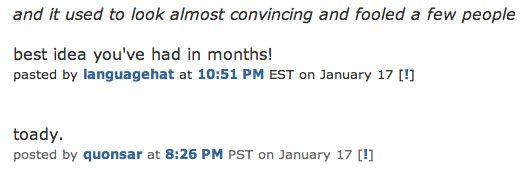
and it used to look almost convincing and fooled a few people
best idea you've had in months!
pasted by languagehat at 10:51 PM EST on January 17 [!]
toady.
posted by quonsar at 8:26 PM on January 17, 2006
best idea you've had in months!
pasted by languagehat at 10:51 PM EST on January 17 [!]
toady.
posted by quonsar at 8:26 PM on January 17, 2006
is anyone fooled by the above? It looks fake to me.
posted by mathowie (staff) at 8:32 PM on January 17, 2006
posted by mathowie (staff) at 8:32 PM on January 17, 2006
My impersonation of quonsar was the best, ever. Too bad it was so mild and I immediately told on myself. I'm stupid.
posted by Ethereal Bligh at 8:32 PM on January 17, 2006
posted by Ethereal Bligh at 8:32 PM on January 17, 2006
If you've got fonts and sizes customized as I do, spoofs never have looked quite right. Not to mention the timezone problem.
posted by Ethereal Bligh at 8:33 PM on January 17, 2006
posted by Ethereal Bligh at 8:33 PM on January 17, 2006
q's languagehat comment is real close - the only difference I see is the font color for "posted by", "at", and "EST on January 17". And the brackets, too. They're all a little brighter white than they should be.
posted by yhbc at 8:38 PM on January 17, 2006
posted by yhbc at 8:38 PM on January 17, 2006
None of the prior spoofs looked right either, so I'm still unclear on why it needed to be "fixed" in the first place.
posted by mr_crash_davis at 8:44 PM on January 17, 2006
posted by mr_crash_davis at 8:44 PM on January 17, 2006
quonsar's spoof looks as convincing as previous spoofs did to me. I didn't even notice 'pasted' at first.
posted by tellurian at 8:49 PM on January 17, 2006
posted by tellurian at 8:49 PM on January 17, 2006
Here's a screenshot of how q's spoof looks to me. As tellurian says, with my settings, it's pretty hard indeed to see the difference, unless you're actually paying attention. I may have to change my default font for the site, though I don't much want to, set in my ways as I am.
----------

----------
posted by stavrosthewonderchicken at 9:09 PM on January 17, 2006
----------
----------
posted by stavrosthewonderchicken at 9:09 PM on January 17, 2006
Yeah, I don't think it was broken in the first place, but I wonder if the timestamp issue has something to do with the differences that people see - to me, the different timestamp (in the case above, EST instead of AEST). if you have the same time zone setting that the spoofer has used, it may stand out less. Perhaps.
posted by dg at 9:14 PM on January 17, 2006
posted by dg at 9:14 PM on January 17, 2006
Matt, your scarabic one is obviously fake, but quonsar's looks as good as any of 'em ever did, so whatever the fix was it didn't take into account whatever quonsar did that you didn't counter-code for.
(Personally, I didn't think we needed a fix, as it's a pretty clearly accountable form of prankery that is usually spotted fairly soon, but whatever)
posted by soyjoy at 9:37 PM on January 17, 2006
(Personally, I didn't think we needed a fix, as it's a pretty clearly accountable form of prankery that is usually spotted fairly soon, but whatever)
posted by soyjoy at 9:37 PM on January 17, 2006
quonsar wrote "pasted by" soyjoy. I don't think this is a real crisis either, I could easily get around this by doing the very subtle alternating background colors thing which no one could replicate.
If it becomes a problem, I'll do that.
posted by mathowie (staff) at 10:09 PM on January 17, 2006
If it becomes a problem, I'll do that.
posted by mathowie (staff) at 10:09 PM on January 17, 2006
quonsar wrote "pasted by" soyjoy.
OK, but here's the thing - I missed that until someone pointed it out. As I probably would have psoted by or posetd by, etc. Just saying that it did the trick until examined, just like the previous ones have. But again, I was glad to be fooled for a half a minute before getting to where it was (inevitably) pointed out.
On the other hand, that alternating background colors thing sounds groovy. Do that anyway, man!
posted by soyjoy at 10:15 PM on January 17, 2006
If I squint, if I'm actually reading with the intent to detect a fake comment, then I can tell. But if I'm just browsing a thread, it looks real and I don't glance twice.
Having said that, I'm in the "Who cares?" camp. I'm surprised you actually spent time coding to mollify the folks who were mewling about this "problem." Surely you have better things to do, even if they don't.
posted by cribcage at 10:37 PM on January 17, 2006
Having said that, I'm in the "Who cares?" camp. I'm surprised you actually spent time coding to mollify the folks who were mewling about this "problem." Surely you have better things to do, even if they don't.
posted by cribcage at 10:37 PM on January 17, 2006
the old joke where you make a post that sorta looks like a comment from someone you don't like saying something they never would...
Um, that was not me posting above. I get the joke now, though I rather wish I didn't - I don't know what you THINK you fixed, Matt, but clearly someone has found a way through your meager little preventative measures RIGHT QUICK.
posted by scarabic at 10:48 PM on January 17, 2006
Um, that was not me posting above. I get the joke now, though I rather wish I didn't - I don't know what you THINK you fixed, Matt, but clearly someone has found a way through your meager little preventative measures RIGHT QUICK.
posted by scarabic at 10:48 PM on January 17, 2006
Matt, don't know if this was just introduced or not, but I noticed if I put a < less than sign in my comment, it screws up the BR tag at the end of the paragraph. Example.
posted by knave at 10:56 PM on January 17, 2006
posted by knave at 10:56 PM on January 17, 2006
See now? with colors, it's way easier to spot the hack (force a refresh on your CSS file).
posted by mathowie (staff) at 12:11 AM on January 18, 2006
posted by mathowie (staff) at 12:11 AM on January 18, 2006
Whoah. </keanu>
posted by stavrosthewonderchicken at 12:39 AM on January 18, 2006
posted by stavrosthewonderchicken at 12:39 AM on January 18, 2006
This is shaking the foundations of my world. Matt, these alternating background colours are messing with powers you cannot possibly comprehend.
Hides in closet
posted by Jimbob at 12:46 AM on January 18, 2006
Hides in closet
posted by Jimbob at 12:46 AM on January 18, 2006
Ok, I totally love the alternating background colors. I've never posted on MeTa before, but as soon as I saw that I knew I had to get over here and give someone some props.
Awesome.
posted by thethirdman at 12:54 AM on January 18, 2006
Awesome.
posted by thethirdman at 12:54 AM on January 18, 2006
I dunno if I like it yet. For threads with many short comments, it gets kind of stripey and looks vaguely circus like. I should lessen the margins between posts and up the padding so it's more cohesive looking. And the colors might be too subtle.
posted by mathowie (staff) at 12:56 AM on January 18, 2006
posted by mathowie (staff) at 12:56 AM on January 18, 2006
Whoah, an excellent solution that didn't have a problem to begin with.
*starts taking bets on how long it takes for someone to get around this*
posted by dg at 1:12 AM on January 18, 2006
*starts taking bets on how long it takes for someone to get around this*
posted by dg at 1:12 AM on January 18, 2006
I like the colors thing. Cool beans.
The "fake comments"? Ridiculously easy to spot. Plus, any time that anyone said something out of character for them, I just looked at the comment a little closer and noticed the fakery. God, people. It ain't that hard.
posted by graventy at 1:24 AM on January 18, 2006
The "fake comments"? Ridiculously easy to spot. Plus, any time that anyone said something out of character for them, I just looked at the comment a little closer and noticed the fakery. God, people. It ain't that hard.
posted by graventy at 1:24 AM on January 18, 2006
*starts another pool on when someone posts a new MeTa thread asking "why does MeTa have the alternating colours and not the rest of the site?"*
posted by dg at 1:26 AM on January 18, 2006
posted by dg at 1:26 AM on January 18, 2006
Ow, the alternating colors make my eyes hurt. For some reason they make Metafilter look more like Invision Power Board and its ilk (which of course have strongly delimited user posts).
Please consider getting rid of this "enhancement."
posted by killdevil at 1:32 AM on January 18, 2006
Please consider getting rid of this "enhancement."
posted by killdevil at 1:32 AM on January 18, 2006
The alternating colors make it look like half of my comments are "best answers." It's worth it for the ego trip.
posted by Saucy Intruder at 1:35 AM on January 18, 2006
posted by Saucy Intruder at 1:35 AM on January 18, 2006
I can see the point of it, but the problem is that doesn't look so much like alternating colours, as it looks like every second comment is "highlighted". Some adjusting of visual effects is required I think.
posted by Jimbob at 3:11 AM on January 18, 2006
posted by Jimbob at 3:11 AM on January 18, 2006
(I don't know - maybe just a very faint "border- bottom: 1px dashed" on each post DIV - it would mess with the traditional design of the site less, and still be unspoofable.)
posted by Jimbob at 3:14 AM on January 18, 2006
posted by Jimbob at 3:14 AM on January 18, 2006
Here's some CSS to add to your Firefox userContent.css to turn it off.
posted by sjvilla79 at 3:38 AM on January 18, 2006
/* Action: metafilter.com */
/* ---------------------------------------- */
@-moz-document url-prefix(http://www.metafilter.com) {
	div[class="comments row2"] {
		background: #069 !important;
	}
}
@-moz-document url-prefix(http://metatalk.metafilter.com) {
	div[class="comments row2"] {
		background: #666 !important;
	}
}
@-moz-document url-prefix(http://ask.metafilter.com) {
	div[class="comments row2"] {
		background: #426746 !important;
	}
}
Is working nicely for me. FF 1.5.posted by sjvilla79 at 3:38 AM on January 18, 2006
// marks sjvilla79's comment as best answer.
posted by TimeFactor at 3:43 AM on January 18, 2006
posted by TimeFactor at 3:43 AM on January 18, 2006
So, every other comment is a best answer? Please make it an option to swith off, at least.
posted by Orange Goblin at 3:44 AM on January 18, 2006
posted by Orange Goblin at 3:44 AM on January 18, 2006
I'm with jimbob. I like the idea of distinguishing comments. But this isn't alternating colours, it's just highlighting every other comment. For it to look like alternating colours, both background colours need to extend horizontally to the same width, and/or be different colours to the overall page background colour.
posted by chrismear at 4:12 AM on January 18, 2006
posted by chrismear at 4:12 AM on January 18, 2006
this wacky alternate-best-answer page layout makes the Baby Jesus cry.
posted by matteo at 4:18 AM on January 18, 2006
posted by matteo at 4:18 AM on January 18, 2006
Stop with the stripes, please! It may 'solve' the spoofing problems, but it's as ugly as hell...
posted by metaxa at 5:02 AM on January 18, 2006
posted by metaxa at 5:02 AM on January 18, 2006
Please take it away, please. Set an option in Preferences so that zebraphiliacs can turn it on if they like.
posted by Gator at 5:10 AM on January 18, 2006
posted by Gator at 5:10 AM on January 18, 2006
It may 'solve' the spoofing problems
THERE IS NO SPOOF.
posted by quonsar at 5:12 AM on January 18, 2006
THERE IS NO SPOOF.
posted by quonsar at 5:12 AM on January 18, 2006
hmmmm... the stripes do nothing for me except make my eyes hurt.
posted by Frasermoo at 5:24 AM on January 18, 2006
posted by Frasermoo at 5:24 AM on January 18, 2006
It does indeed break Plutor's MeFiPost script. I dislike that. It was easier to spot the fakes when they were missing the little "quote" link at the end. Now, everything is missing them. Does this mean that the links are all fake?
posted by caution live frogs at 5:43 AM on January 18, 2006
posted by caution live frogs at 5:43 AM on January 18, 2006
Hater here.
posted by mr_crash_davis at 6:25 AM on January 18, 2006
posted by mr_crash_davis at 6:25 AM on January 18, 2006
Wow, this looks awful. However, at least I have the pleasure of being able to say I predicted it.
I'm still unclear on why it needed to be "fixed" in the first place.
You and me both.
posted by quonsar at 6:27 AM on January 18
posted by languagehat at 6:33 AM on January 18, 2006
I'm still unclear on why it needed to be "fixed" in the first place.
You and me both.
posted by quonsar at 6:27 AM on January 18
posted by languagehat at 6:33 AM on January 18, 2006
I'm pretty sure Matt had been planning stripeys before the spoofing became an issue this week. So, while the spoofing debate may have speeded his experiment along, it doesn't seem to have been the impetus behind the idea.
And I agree with Jimbob and chrismear; if the stripeys stay, something should probably be done to set off the background from both striped and unstriped comments.
posted by mediareport at 6:37 AM on January 18, 2006
And I agree with Jimbob and chrismear; if the stripeys stay, something should probably be done to set off the background from both striped and unstriped comments.
posted by mediareport at 6:37 AM on January 18, 2006
I hate the alternating colours. It has the effect of highlighting half the posts, so it gives the impression that some are more improtant than others.
posted by raedyn at 6:40 AM on January 18, 2006
posted by raedyn at 6:40 AM on January 18, 2006
Another vote against alternating color stripes. It's ugly and provides little value, unlike when it's used to mark a best answer.
posted by pmurray63 at 7:00 AM on January 18, 2006
posted by pmurray63 at 7:00 AM on January 18, 2006
Balrog hate stripes.
posted by Baby_Balrog at 7:02 AM on January 18, 2006
posted by Baby_Balrog at 7:02 AM on January 18, 2006
Yeah, alternating comments ugly. Don't faked comments pretty much instantly get called out anyway? Just say "post spoofing=instaban" and get $5 when someone does it anyway.
posted by fvw at 7:07 AM on January 18, 2006
posted by fvw at 7:07 AM on January 18, 2006
Thanks for implementing my suggestion, Matt. It makes the comments much easier to parse.
posted by Rothko at 7:08 AM on January 18, 2006
posted by Rothko at 7:08 AM on January 18, 2006
Im siding with the strip haters as well.
posted by wheelieman at 7:12 AM on January 18, 2006
posted by wheelieman at 7:12 AM on January 18, 2006
I've tried applying sjvilla79's fix in my chrome folder but I still have stripes. Should it matter that I'm using an older version of firefox?
posted by Zetetics at 7:12 AM on January 18, 2006
posted by Zetetics at 7:12 AM on January 18, 2006
Alternating colors bad. As mentioned above, it makes comments seem unequal, which they may be, but not in an alternating pattern. And just distracting.
posted by gsteff at 7:18 AM on January 18, 2006
posted by gsteff at 7:18 AM on January 18, 2006
I hate it too. Please make it stop. :(
posted by youarenothere at 7:21 AM on January 18, 2006
posted by youarenothere at 7:21 AM on January 18, 2006
Furthermore, the spoofing attacks are still possible; you just have to spoof an even number of sequential comments.
posted by gsteff at 7:22 AM on January 18, 2006
posted by gsteff at 7:22 AM on January 18, 2006
Uh... remember when I said "do that anyway" about the alternating colors? I take that back. I assumed this was something that would only go behind the "posted by" portion of the comment. As everybody else has pointed out, this "highlights" every other (entire) comment and looks carnivalesque. Not to mention, once again, that we really didn't need a "fix."
posted by soyjoy at 7:32 AM on January 18, 2006
posted by soyjoy at 7:32 AM on January 18, 2006
the firefox userContent.css fix for the solution to this non-problem works great!
posted by quonsar at 7:39 AM on January 18, 2006
posted by quonsar at 7:39 AM on January 18, 2006
The My Comments page displays funny using Opera. It's probably pretty easy to fix too though I actually have no idea. Give us Opera users some love please.
posted by panoptican at 7:44 AM on January 18, 2006
posted by panoptican at 7:44 AM on January 18, 2006
Forbidden
You don't have permission to access /images/random/operamefi.jpg on this server.
And one more person who hates the stripes, it's dis.turb.ing
posted by gsb at 7:50 AM on January 18, 2006
You don't have permission to access /images/random/operamefi.jpg on this server.
And one more person who hates the stripes, it's dis.turb.ing
posted by gsb at 7:50 AM on January 18, 2006
actually, why not number the comments, an ordered list or something?
Advanced apologies if someone has already mentioned this. The stripes put me off reading every comment. AND... the comment preview has no stripes, for stripeless refugees just preview a fake comment to read sans-stripes.
posted by gsb at 7:56 AM on January 18, 2006
Advanced apologies if someone has already mentioned this. The stripes put me off reading every comment. AND... the comment preview has no stripes, for stripeless refugees just preview a fake comment to read sans-stripes.
posted by gsb at 7:56 AM on January 18, 2006
Please turn off the stripes. I feel like I'm staring at an optical illusion.
posted by bshort at 8:06 AM on January 18, 2006
posted by bshort at 8:06 AM on January 18, 2006
Yeah, what that guy said.
Matt, thanks for putting up with all our relentless rebukes and shit. You do a good job.
posted by cortex at 8:24 AM on January 18, 2006
Matt, thanks for putting up with all our relentless rebukes and shit. You do a good job.
posted by cortex at 8:24 AM on January 18, 2006
Huzzah!
posted by mr_crash_davis at 8:27 AM on January 18, 2006
posted by mr_crash_davis at 8:27 AM on January 18, 2006
sjvilla79: thanks for the example! in addition to eliminating this present atrocity from mefi, i can now view slashdot at something less than billboard sized text!
@-moz-document domain(slashdot.org) {
    body {
    	font-size: smaller !important;
    }
}
posted by quonsar at 8:28 AM on January 18, 2006 Matt, is there anyway you could leave hooks in the css so we can recreate the alternating look with user style sheets?
posted by monju_bosatsu at 8:52 AM on January 18, 2006
posted by monju_bosatsu at 8:52 AM on January 18, 2006
[sends Matt a beer and a stripey toy for the little one.]
posted by JanetLand at 9:20 AM on January 18, 2006
posted by JanetLand at 9:20 AM on January 18, 2006
Quonsar, it's okay: I knew this was going to be taken away, the moment I linked to my Metatalk post. It's just how things work around here. Pbbt!
posted by Rothko at 10:12 AM on January 18, 2006
posted by Rothko at 10:12 AM on January 18, 2006
Wait, if you link to it in MeTa, it goes away?
*crosses fingers*
posted by cortex at 10:17 AM on January 18, 2006
*crosses fingers*
posted by cortex at 10:17 AM on January 18, 2006
Wait, MetaTalk made The Stripes go away?
posted by It's Raining Florence Henderson at 10:24 AM on January 18, 2006
posted by It's Raining Florence Henderson at 10:24 AM on January 18, 2006
Whew. SpoFi went stripey and I'm still getting used to it. I don't know what I'd do if this place went down that road.
posted by DrJohnEvans at 11:29 AM on January 18, 2006
posted by DrJohnEvans at 11:29 AM on January 18, 2006
Yay! Thanks, Matt. Da Voice of da Pipple was hoid!
posted by languagehat at 12:06 PM on January 18, 2006
posted by languagehat at 12:06 PM on January 18, 2006
You must mean mob rule.
Come on, Rothko. Matt admitted it was a quick fix, a lot of folks pointed out that it wasn't designed well, and he realized they were right. Mob rule implies bullying, which was not a factor here. You're - ahem - being overly dramatic again.
posted by mediareport at 3:24 PM on January 18, 2006
Come on, Rothko. Matt admitted it was a quick fix, a lot of folks pointed out that it wasn't designed well, and he realized they were right. Mob rule implies bullying, which was not a factor here. You're - ahem - being overly dramatic again.
posted by mediareport at 3:24 PM on January 18, 2006
and he realized they were right
Actually, he had his suspicions from the start, and they were confirmed en masse by most members who bothered to comment. "Mob rule" my ass.
posted by mediareport at 3:26 PM on January 18, 2006
Actually, he had his suspicions from the start, and they were confirmed en masse by most members who bothered to comment. "Mob rule" my ass.
posted by mediareport at 3:26 PM on January 18, 2006
Huh. I took "mob rule" to be a playful reference to languagehat's Jersey-esque rendering in the prior comment.
posted by cortex at 3:47 PM on January 18, 2006
posted by cortex at 3:47 PM on January 18, 2006
You are not logged in, either login or create an account to post comments
posted by yhbc at 7:06 PM on January 17, 2006