The one where we talk about November Experiment stats December 1, 2009 4:03 PM Subscribe
A thread for discussing November Experiment data, stats, graphs, and other datawankery.
The official post-November Experiment thread is probably going to be pretty long. I've said in a couple of comments that I don't think the discussion of the experiment should focus on numbers.
Nevertheless, I think it'll be interesting to see if the experiment did have any numerically or statistically visible effects. I suspect I'm not the only one wanting to run some queries on a post-Experiment copy of the Infodump.
So, in the interests of not derailing the more important general discussion, and not making that thread any longer than it'll already be, I'd like to have the stats discussion here in a separate thread.
If there are stats you want to see, post your ideas here. If there are stats you want to produce, and it's going to take you a while, maybe comment here before you start to avoid too much duplication of effort.
And if anything relevant to the main discussion comes out of this, we can link to it from over there, or copy it, or whatever.
just comparing the histograms of favorite counts should be interesting - I think one theory was that high favorite counts tended to cause posts beyond a threshold to get yet more favorites. So, theoretically, November's stats should be more Gaussian (let's say, very few posts with more than 30 favorites compared to those between 20 and 30), while previous stats might be more heavy on the end (lots of >50 favorite posts).
posted by qvantamon at 4:18 PM on December 1, 2009
posted by qvantamon at 4:18 PM on December 1, 2009
Does the datadump have number of flags, number of comment deletions and number of banhammers decended served? Those would be pertinent as well. We'd need a control period (say a couple of months previous) too. If we're going to do this right, we need a null.
posted by bonehead at 4:19 PM on December 1, 2009
posted by bonehead at 4:19 PM on December 1, 2009
also, counts of posts with 1-2 favorites compared with posts with more favorites. people that used to ignore posts with 1 or 2 favorites might have not ignored them with "has favorites"
posted by qvantamon at 4:20 PM on December 1, 2009
posted by qvantamon at 4:20 PM on December 1, 2009
Oh, also, rainy days. November was way more rainy than October, and I'm sure it's because of this new so-called favorites policy.
posted by qvantamon at 4:24 PM on December 1, 2009 [2 favorites]
posted by qvantamon at 4:24 PM on December 1, 2009 [2 favorites]
For weeks now, I've wanted to graph how favorites accumulate - say, time on the x axis, number of favorites on the y axis, with each comment / post getting lines from point to point - but I haven't busted out any tools yet (not sure which tools, even). I'm curious if there are elbows up around 12 favorites (from hitting Recent Activity for Contacts) & 50 or so (Popular), but I'm also curious how the shapes changed for November.
posted by Pronoiac at 4:25 PM on December 1, 2009
posted by Pronoiac at 4:25 PM on December 1, 2009
bonehead: Does the datadump have number of flags, number of comment deletions and number of banhammers decended served?
Nope.
lalex: Does the infodump indicate who opted in/out for the month?
Nope.
And probably neither of the above are things we ought to have access to, since they're not otherwise visible on the site. Maybe cortex would be willing to post some summary numbers about those kinds of things?
posted by FishBike at 4:27 PM on December 1, 2009
Nope.
lalex: Does the infodump indicate who opted in/out for the month?
Nope.
And probably neither of the above are things we ought to have access to, since they're not otherwise visible on the site. Maybe cortex would be willing to post some summary numbers about those kinds of things?
posted by FishBike at 4:27 PM on December 1, 2009
Re flags etc...
We'd only need those numbers in aggregate and anonymized anyway. No need for fine-grained comment-by-comment info. It might be nice to separate the numbers of post-flags from comment-flags however.
posted by bonehead at 4:42 PM on December 1, 2009
We'd only need those numbers in aggregate and anonymized anyway. No need for fine-grained comment-by-comment info. It might be nice to separate the numbers of post-flags from comment-flags however.
posted by bonehead at 4:42 PM on December 1, 2009
Yeah, flag data and comment deletion info aren't in the dump. I can look into doing some math on that stuff and providing it, certainly. I'm interested in that myself (though my prediction is we'll see no significant change in November).
Banhammer info isn't really available either, but bannings for anything other than spammer are very rare and even the spammer bannings aren't usually more than a couple a week and don't really come into the favorites discussion in any case. So there's not really enough signal on that line to even bother in this context, I don't think.
Opt info isn't available either, but we'll provide at least a summary of opting rate in here. I feel a little shy about just broadcasting the whole list of opters, though it's not really particularly sensitive info, but if anybody wants to use it for some analysis I can probably provide it directly to 'em.
posted by cortex (staff) at 4:42 PM on December 1, 2009
I'm curious if there are elbows up around 12 favorites (from hitting Recent Activity for Contacts)
It'd be interesting to look at that specifically through the lens of how contact networks meet dozener contributions, beyond just looking for the elbow itself. Like, does the overall sharpness of the elbow (if it manifests at all) correspond to the number of incoming contacts the user has?
I mean this in a totally non-snarky way, cause I love data crunching with a white hot heat, but do you think it's possible to get any kind of statistically meaningful effects from November? The discussions seemed to reach a consensus that it was more of an "experience" than an experiment with any kind of quantitatively measurable output.
The experiential aspect is certainly the far more directly useful one, I think, and I hear and understand the various concerns that have been voiced about the usefulness of the quantitative data, but I think it's certainly possible to get some kinds of meaningful statistical eyes on this. That participation was optional doesn't mean no effects were possible, it just means that the landscape is more complicated.
Thinking more about it, the original announcement thread is such an outlier that it alone would seem to skew any measurement of the MeTa subsite.
Controlling for outliers is absolutely a good idea. And I think that thread was a hotbed of outlier activity, and any analysis should take that into account.
posted by cortex (staff) at 4:47 PM on December 1, 2009
I would like to know if, on the blue only, there were more/fewer favorites given and if there were more/fewer comments deleted than in October, per total number of comments.
posted by team lowkey at 4:49 PM on December 1, 2009
posted by team lowkey at 4:49 PM on December 1, 2009
anyone got any polyhedral dice?
posted by gman at 4:55 PM on December 1, 2009 [3 favorites]
posted by gman at 4:55 PM on December 1, 2009 [3 favorites]
I mean this in a totally non-snarky way, cause I love data crunching with a white hot heat, but do you think it's possible to get any kind of statistically meaningful effects from November? The discussions seemed to reach a consensus that it was more of an "experience" than an experiment with any kind of quantitatively measurable output.
No snark taken, don't worry. What I meant by "numerically or statistically visible effects" was something that shows up in the numbers, and isn't just normal random month-to-month variation. I suspect it's going to be difficult to draw any subjective conclusions from anything like that.
We might (for example) see that average favorites-per-comment dropped 10% in November, and normal variation in the past year is no more than 1% from one month to the next1. So that would be a pretty significant change. But as for why it happened or what, if anything, it means... I'm not thinking any firm answers will be possible.
Thinking more about it, the original announcement thread is such an outlier that it alone would seem to skew any measurement of the MeTa subsite.
Yeah, but we know its number, and we can exclude it from analysis if we want.
1: I made these numbers up for illustration purposes, though actually running them seems like a good idea.
posted by FishBike at 4:55 PM on December 1, 2009
also, counts of posts with 1-2 favorites compared with posts with more favorites. people that used to ignore posts with 1 or 2 favorites might have not ignored them with "has favorites"
The favorite counts of posts was not modified, only those of comments.
posted by Rhomboid at 4:58 PM on December 1, 2009
The favorite counts of posts was not modified, only those of comments.
posted by Rhomboid at 4:58 PM on December 1, 2009
team lowkey: "I would like to know if, on the blue only, there were more/fewer favorites given and if there were more/fewer comments deleted than in October, per total number of comments"
Well, here's the favorites part of that data for all of 2009 so far, for the blue only, by month:
It appears the average number of favorites per comment is steadily increasing, but didn't dramatically change during November. Maybe October is the outlier here.
posted by FishBike at 5:18 PM on December 1, 2009 [2 favorites]
Well, here's the favorites part of that data for all of 2009 so far, for the blue only, by month:
January: 1.331 favorites/comment
February: 1.300 favorites/comment
March: 1.367 favorites/comment
April: 1.404 favorites/comment
May: 1.481 favorites/comment
June: 1.576 favorites/comment
July: 1.578 favorites/comment
August: 1.552 favorites/comment
September: 1.721 favorites/comment
October: 1.836 favorites/comment
November: 1.724 favorites/comment
It appears the average number of favorites per comment is steadily increasing, but didn't dramatically change during November. Maybe October is the outlier here.
posted by FishBike at 5:18 PM on December 1, 2009 [2 favorites]
floam, I sure hope that there was an implicit HAMBURGER at the end of that comment.
posted by Rhomboid at 5:21 PM on December 1, 2009
posted by Rhomboid at 5:21 PM on December 1, 2009
Idea: examine favorite-dispensing rates from folks who joined during November vs. favoriting rates in the first month of activity of folks who joined in previous months. For folks encountering the favoriting interface for the first time* in "has favorites" mode, is there a noticeable difference in dispensing rate vs. folks who first encountered it in normal mode?
*granting that "first time" is a simplification that doesn't adjust for lurking, but there's not much to do there but throw up an asterisk.
posted by cortex (staff) at 5:21 PM on December 1, 2009
*granting that "first time" is a simplification that doesn't adjust for lurking, but there's not much to do there but throw up an asterisk.
posted by cortex (staff) at 5:21 PM on December 1, 2009
Can you re-measure that in units of favorites / comment / registered user? Perhaps the increase is partly explained by increasing membership. Seems too fast for that though.
I'll do it myself if I get a moment.
posted by Salvor Hardin at 5:24 PM on December 1, 2009
I'll do it myself if I get a moment.
posted by Salvor Hardin at 5:24 PM on December 1, 2009
Yeah, lalex, November may have just been kind of an odd month in its own right. I'd argue for taking a look at data both with and without the Big Thread not just because it's big and weird but because there was a bunch of grief favoriting in it, but at the end of the day the risk that comes with throwing out everything that looks like a potential spoiler is unrealistically normalizing the data, yeah.
Unfortunately, I don't have sufficient stats chops to really tackle the idea of adjusting for the variance of spikiness from month to month.
posted by cortex (staff) at 5:30 PM on December 1, 2009
Unfortunately, I don't have sufficient stats chops to really tackle the idea of adjusting for the variance of spikiness from month to month.
posted by cortex (staff) at 5:30 PM on December 1, 2009
I'm kinda against removing "weird" threads because they should just sit at the tails of the distribution.
Anyway, I'm currently churning through some R code that I'll post here shortly.
posted by Jimbob at 5:32 PM on December 1, 2009
Anyway, I'm currently churning through some R code that I'll post here shortly.
posted by Jimbob at 5:32 PM on December 1, 2009
cortex: "Idea: examine favorite-dispensing rates from folks who joined during November vs. favoriting rates in the first month of activity of folks who joined in previous months. For folks encountering the favoriting interface for the first time* in "has favorites" mode, is there a noticeable difference in dispensing rate vs. folks who first encountered it in normal mode?"
Okay, so, what I did was look at favorites given by users during their first 30 days since registering their account. Because everyone who registered during November has had less than 30 days on the site, I calculated average favorites per day (per user) instead of just average favorites per user during first 30 days (because the November newbies haven't had their whole 30 days yet).
And that looks like this:
posted by FishBike at 5:58 PM on December 1, 2009 [3 favorites]
Okay, so, what I did was look at favorites given by users during their first 30 days since registering their account. Because everyone who registered during November has had less than 30 days on the site, I calculated average favorites per day (per user) instead of just average favorites per user during first 30 days (because the November newbies haven't had their whole 30 days yet).
And that looks like this:
January: 0.134 favorites/day/userNovember doesn't really stand out.
February: 0.093 favorites/day/user
March: 0.122 favorites/day/user
April: 0.112 favorites/day/user
May: 0.226 favorites/day/user
June: 0.162 favorites/day/user
July: 0.142 favorites/day/user
August: 0.152 favorites/day/user
September: 0.174 favorites/day/user
October: 0.219 favorites/day/user
November: 0.179 favorites/day/user
posted by FishBike at 5:58 PM on December 1, 2009 [3 favorites]
i'm guessing there's no flag on users for whether they were actually participating in the experiment or not.
posted by empath at 6:23 PM on December 1, 2009
posted by empath at 6:23 PM on December 1, 2009
Okay, maybe I won't post any R code yet, because I'm not finding much interesting, except to say (a) favorites per comment is sure increasing (b) favorites per comment this November, if I'm working it out correctly, follows the exact same Poisson distribution as in previous months and (c) this November does not stand out as particularly noticable, or bucking the trend in any way. Note that I did end up killing off all favorite counts above the 99th percentile within each month.
Of course, just doing Poisson distribution tests is boring as hell, I need to include some external variables like rainfall, temperature, alcohol consumption etc. to create a statistical model of Metafilter.
posted by Jimbob at 6:41 PM on December 1, 2009
Of course, just doing Poisson distribution tests is boring as hell, I need to include some external variables like rainfall, temperature, alcohol consumption etc. to create a statistical model of Metafilter.
posted by Jimbob at 6:41 PM on December 1, 2009
cortex: "Opt info isn't available either, but we'll provide at least a summary of opting rate in here."
I'd like to see something like the average favorites/day/user stat for the group that opted out vs. the group that didn't. I'd like to see this for November, and for October as a comparison. Is there a difference in favoriting rate between the two groups during the experiment, and was that difference there before the experiment?
posted by FishBike at 6:42 PM on December 1, 2009
FishBike writes "Well, here's the favorites part of that data for all of 2009 so far, for the blue only, by month:
I'd thought the people saying 50-60 percent of comments were getting at least one favourite making the marker essential useless were off base but these numbers make it likely that's possible. Anyone want to run the numbers by month of the percentage of comments that get at least one favourite?
posted by Mitheral at 7:17 PM on December 1, 2009
January: 1.331 favorites/comment"
"February: 1.300 favorites/comment
"March: 1.367 favorites/comment
"April: 1.404 favorites/comment
"May: 1.481 favorites/comment
"June: 1.576 favorites/comment
"July: 1.578 favorites/comment
"August: 1.552 favorites/comment
"September: 1.721 favorites/comment
"October: 1.836 favorites/comment
"November: 1.724 favorites/comment
I'd thought the people saying 50-60 percent of comments were getting at least one favourite making the marker essential useless were off base but these numbers make it likely that's possible. Anyone want to run the numbers by month of the percentage of comments that get at least one favourite?
posted by Mitheral at 7:17 PM on December 1, 2009
For the first 11 months of the year:
Variance of # faves/comment:
[1] 23.08211 19.77558 23.37004 26.08405 28.52925 26.89296 38.84682 32.24259
[9] 38.05240 47.36431 35.37680
Skewness of # faves/comment:
[1] 16.91774 12.86828 13.53960 18.08175 24.83272 11.29080 27.39026 14.63029
[9] 12.95305 24.98195 23.77746
Kurtosis of # faves/comment:
[1] 662.5019 315.3430 364.7008 802.2387 1536.4410 230.6186 1524.2499
[8] 406.3897 293.9328 1414.5595 1272.7892
Variance is increasing, the others have nothing much interesting, and November is competely normal.
posted by jewzilla at 7:18 PM on December 1, 2009
Fractions of comments with at least one comment by month:
[1] 0.3414344 0.3417860 0.3418370 0.3489545 0.3679049 0.3706540 0.3681082
[8] 0.3556145 0.3769048 0.3964449 0.3961811
(november is still boring)
posted by jewzilla at 7:21 PM on December 1, 2009
[1] 0.3414344 0.3417860 0.3418370 0.3489545 0.3679049 0.3706540 0.3681082
[8] 0.3556145 0.3769048 0.3964449 0.3961811
(november is still boring)
posted by jewzilla at 7:21 PM on December 1, 2009
Here's the difference between the average CDF of faves/comment for 2009 (excluding november) and the CDF for November (meancdf-novmebercdf). It shows that before November, a slightly higher fraction of comments had 0 or very few faves. Still, the difference is (at most) 3%, which doesn't make much difference.
posted by jewzilla at 7:52 PM on December 1, 2009
posted by jewzilla at 7:52 PM on December 1, 2009
I got similar results when making a histogram of comments with a certain number of faves. I put all comments with more than 50 faves into the 50 fave bin. You can see the graph for Jan-Nov here. Sadly, they look nearly identical. I thought perhaps the alternative system would reduce the number of comments getting 20-40 favorites, but it doesn't seem like it.
posted by demiurge at 9:10 PM on December 1, 2009
posted by demiurge at 9:10 PM on December 1, 2009
Hey stat hounds, here's what I'd like to see ... don't know if you have the data, but here's a way to slice it that might tell us something.
Create a group of the "most active" users prior to November, based on visible activity -- posts, comments, etc. But not favorites -- just looking at non-favorite activity here.
Call these folks "the pool."
The pool should be big enough to account for 80 percent of all the visible activity on the site (I imagine this is ~20 percent or less of the total users that account for 80 percent of the visible activity).
Tally all the people in the pool that utilized the preference setting that allowed you to opt out of the experiment. Take these people out of the pool. They are outliers by choice.
Now, for the remainder of the people in the pool...
Find the people that received less favorites in November, as compared to their previous average. Call this group the "less favorited."
For the "less favorited" group -- did their activity level go up or down in November to a significant degree?
I submit that if answer = down, then the removal of a visible number had a chilling effect on site usage. People tapered the rate of their contributions to site discourse because they perceived (consciously or not) that they weren't being rewarded for their contributions.
posted by Cool Papa Bell at 9:21 PM on December 1, 2009
One thing that I'd like to see, but that is not really favorites related, is an historical perspective on MetaFilter activity: for each of the ~120 months or ~40 quarters of metafilter, how many posts/comments there were, for the blue/grey/green/black/..., and what was the repartition of posters?
So, for instance, was, in the past, MeFi more or less "concentrated" (relatively few posters responsible for most of the posts)?
There have been "top 100 posters" lists in the past, but when you go reread old threads, you realise that many formerly active users have left the site, so it could be interesting to have, for instance, a top N users, per quarter, list.
posted by Monday, stony Monday at 10:12 PM on December 1, 2009
I don't think there's any way to tell who changed the preference and when...unless cortex is feeling generous enough to expose that...
posted by jewzilla at 10:47 PM on December 1, 2009
posted by jewzilla at 10:47 PM on December 1, 2009
This is potentially fascinating, but after going back to the discussions I am not sure what we are after with the numbers. Apologies if I am missing something really obvious about this discussion, and this reflects a lot of bits and pieces from comments above.
1. First off, with the rate stats (faves per comment/post) it would help to know something about the overall traffic and membership. If the rates are going up slightly but the overall membership is increasing as well, the effect on the casual reader would be a huge boom in the raw number of faves out there.
2. Since the 100k user mark was hit, that got me thinking that there are a lot of users. I think a more interesting starting point would be to see if there is a way to segment the user population. It would be interesting to see how user behaviors vary over time and, if it is tracked, just to see if there is info on the number of user sessions, rates of being favorited and marking faves, use of MeMail, &c. My guess is that there are one or several transitions in behaviors as people move from lurker->newbie participant->Jedi master->disillusioned.
Is there a place to see what the dataset contains, maybe there isn't enough in there to really develop any latent class models. I dunno, is there a potential useful and life enhancing outcome, or is this just a way to kill time until baseball season starts up again and there are fresh numbers to work on there?
posted by cgk at 12:09 AM on December 2, 2009
Is there a place to see what the dataset contains [...]
The Infodump page in the Mefi Wiki is probably the best place to find out what's in the data available to us. You can also follow the link from there to the MetaAnalysis wiki page to find links to previous efforts, which might be useful examples of what's possible.
posted by FishBike at 5:39 AM on December 2, 2009 [1 favorite]
I'd love to see favorites-per-comment for the green - my personal numbers look pretty different, and I wonder if I was just less eloquent last month or what :P
posted by restless_nomad at 6:33 AM on December 2, 2009
posted by restless_nomad at 6:33 AM on December 2, 2009
I think of this because, personally, I tend to favorite posts and comments for totally different reasons. - MSM
This is really important, but I don't see it get much attention.
Favorite-posts and favorite-comments are very different. I think these really need to be treated as different things everywhere you're analyzing information, despite the fact they have the same name. I was a bit surprised there was no movement to change the name of just one of those things to help clarify, last month.
(Me, I favorite posts as "bookmarks" of a sort, usually meaning "check this later", but comments I favorite are booyahs, hat-tips, amens, or one of those other acknowledgments. They're completely different things in my little brain.)
posted by rokusan at 8:02 AM on December 2, 2009
"I submit that if answer = down, then the removal of a visible number had a chilling effect on site usage. People tapered the rate of their contributions to site discourse because they perceived (consciously or not) that they weren't being rewarded for their contributions."
My activity went down, way down, in November, because I started several new projects. Ergo, chilling effect not causal.
posted by klangklangston at 8:30 AM on December 2, 2009
My activity went down, way down, in November, because I started several new projects. Ergo, chilling effect not causal.
posted by klangklangston at 8:30 AM on December 2, 2009
You know, if the point is to prove or disprove that comments were better before favorites were added, then I think a better experiment would be the old Youtube vs MeFi comment, but replace youtube with pre 2006 mefi. It's tempting to use november comments, but the opt-outness defeats that natural experiment.
posted by pwnguin at 9:19 AM on December 2, 2009
posted by pwnguin at 9:19 AM on December 2, 2009
Ergo, chilling effect not causal.
True, but it would be a data point to consider.
posted by Cool Papa Bell at 10:23 AM on December 2, 2009
True, but it would be a data point to consider.
posted by Cool Papa Bell at 10:23 AM on December 2, 2009
I sometimes favourite comments because of some useful info or a link, so these are bookmarks. But sometimes, especially in AskMe, if I see one useful comment, I tend to favourite the question itself in the expectation that one or more other useful comments will show up, and favouriting/bookmarking the question is more efficient.
posted by maudlin at 10:25 AM on December 2, 2009
posted by maudlin at 10:25 AM on December 2, 2009
just comparing the histograms of favorite counts should be interesting - I think one theory was that high favorite counts tended to cause posts beyond a threshold to get yet more favorites. So, theoretically, November's stats should be more Gaussian (let's say, very few posts with more than 30 favorites compared to those between 20 and 30), while previous stats might be more heavy on the end (lots of >50 favorite posts).
Not sure why the number of favorites a post gets really matters. You can always ignore it, now with technical assistance.
posted by Ironmouth at 11:19 AM on December 2, 2009
Not sure why the number of favorites a post gets really matters. You can always ignore it, now with technical assistance.
posted by Ironmouth at 11:19 AM on December 2, 2009
Pronoiac: "For weeks now, I've wanted to graph how favorites accumulate - say, time on the x axis, number of favorites on the y axis, with each comment / post getting lines from point to point - but I haven't busted out any tools yet (not sure which tools, even). I'm curious if there are elbows up around 12 favorites (from hitting Recent Activity for Contacts) & 50 or so (Popular), but I'm also curious how the shapes changed for November"
I've been thinking about this all day1, and I can think of a couple of ways to get a handle on this. One of the challenges is visualizing a line-per-comment for even a month's worth of data, there being a 5-digit number of them to plot.
But maybe plotting them in 3D (X and Y axes as you said, comments spread out over the Z axis) would result in some kind of interesting shape. And perhaps colour-coding changes at specific numbers of favorites (e.g. 12) to see if these curves have knees in them where we expect them to.
I've been doing something a little like this with some other Infodump-derived data recently, and I'm pretty sure the tools I'm using for that can cope with amount of data, albeit slowly for the actual image-generation portion of the process. I could try to use the same tools for this idea, but I really don't want to steal anybody's ideas that they were planning to actively work on.
Perhaps another useful way to look at it is in aggregate form, with the X axis showing number of favorites already received, and the Y axis showing the rate at which the next favorite happened (just 1/time-to-next favorite). Average these for all comments in a month and plot a single line. Or two lines, one for November and one for October, to see if the experiment changed this at all.
And then for fun, add a Z axis that represents number of incoming contacts in the commenter's contact network and see how the favoriting rate curve varies based on this (cortex's idea earlier in the thread).
This could also be made a lot less difficult, and easier to see on a screen, if we included only comments that get a high number of favorites (e.g. 12 or even 15) since there are not nearly as many of them.
1: damn you!
posted by FishBike at 12:18 PM on December 2, 2009
One of the things I was wondering about this experiment was this: even if overall favoriting stats don't show much change, how did favoriting activity vary for individual users during the November Experiment.
So I made a graph that shows (with the blue dots) how many favorites the user gave in October (as a reference), and how much their November favorites given went up or down vs. October.
I was hoping to see if there were any general trends, like users who used to favorite a lot suddenly favorited a lot less, or maybe favorited a lot more. The graph seems to show users who fit both of those possibilities and everything in between, and mainly demonstrates a lot of variability in the favoriting activity for individual users.
To see if that variability itself might be an effect of the experiment, I did the same comparison for September vs. October, and showed that with red dots (behind the blue ones so as not to obscure them). It looks the same. Even zooming in on the concentration of dots where the low numbers are, there are no trends and both series look about the same.
So it doesn't look like there are any interesting trends here related to users normal level of favoriting. Just a lot of variability that is, itself, also normal. I'm not sure if the large quantity of overlapping dots near the low favorite counts is hiding anything, but considering all of those dots are for people who didn't favorite much in either of the months being compared, it doesn't seem like there could be.
I wonder if similar graphs using comment counts, or number of favorites received rather than given, might be interesting? Anyone want to see those?
posted by FishBike at 4:54 PM on December 2, 2009
When I was reading through the first thread announcing the favorites experiment, I tried keeping a list of metrics and then summarized them as looking to find changes in:
Threads
- number of comments
- number of comment favorites
- early favorites (favorites distribution over comment position)
Comments
- early snark
- comment length
- number of snarky comments
- number of substantive comments
- favorites on snarky comments
- favorites on substantive comments
Users
- unique commenters
- favorites distribution over contacts
The thread and user metrics could be calculated from the infodump but I figured the comment metrics needed a word count. So over the last month, I've been going through the archive with a greasemonkey script to scrape word counts out of Nov 2008 and 2009 threads to get at some of the comment metrics. Trying to algorithmically determine snark and substance is probably a fool's errand and definitely fraught with fuzz, so please bear that in mind while viewing the results.
posted by hoppytoad at 5:08 PM on December 2, 2009 [1 favorite]
I wonder if similar graphs using comment counts, or number of favorites received rather than given, might be interesting? Anyone want to see those?
I would.
Any thoughts to my other suggestion?
posted by Cool Papa Bell at 5:40 PM on December 2, 2009
I would.
Any thoughts to my other suggestion?
posted by Cool Papa Bell at 5:40 PM on December 2, 2009
hoppytoad: "[...] Trying to algorithmically determine snark and substance is probably a fool's errand and definitely fraught with fuzz [...]"
Neat stuff! A question about the comments you're categorizing as "light", though: Is this a distinction based only on comment length, or are these longer comments that also have been favorited a lot?
posted by FishBike at 5:42 PM on December 2, 2009
Neat stuff! A question about the comments you're categorizing as "light", though: Is this a distinction based only on comment length, or are these longer comments that also have been favorited a lot?
posted by FishBike at 5:42 PM on December 2, 2009
how many posts/comments there were, for the blue/grey/green/black....
Wait, there's a "black?"
Is that some secret level I only reach after giving out 100,000 favorites?
posted by rokusan at 5:50 PM on December 2, 2009
Wait, there's a "black?"
Is that some secret level I only reach after giving out 100,000 favorites?
posted by rokusan at 5:50 PM on December 2, 2009
Cool Papa Bell: "Any thoughts to my other suggestion?"
There's a tricky aspect to it, and a "not quite sure I get it" aspect as well. But I'd like to give it a try. We're still looking for some sort of measurable effect of the experiment, and hopefully if we hit on the right way of looking at it, the "aha, there it is!" moment will occur.
If I understand right, you want to look at people who a) are fairly active on the site, b) kept favorite counts obscured and c) received fewer favorites in November compared to their usual average. You want to see if people who meet these three criteria posted and commented less, and the hypothesis is that if they were less active, it's because they were discouraged by the lower favorite count.
So here's what I don't get yet: if these are the people who kept favorite counts obscured, how do they know they didn't get as many favorites? It seems that we could look at activity level for all users who stayed in the experiment regardless of whether they got more or fewer favorites than normal, so I must be missing the reason to look only at those with a lower favorite count.
Second thing I don't get: how would we know if the lower favorite count resulted in lower activity, or if it's the other way around -- the user was less active, so there weren't as many things for people to favorite?
The tricky aspect is the opt-in/opt-out status isn't available in the Infodump. That does seem like a way of segmenting the user base that is quite likely to show some significant differences in favoriting behavior. But maybe just because it's an indirect way of identifying who absolutely loves favorites and can't live without them vs. who doesn't care as much. Seeing if statistical differences between these two groups exist before the experiment started should settle that question, I suppose.
I would kind of like to get my hands on the opt-in/out data for some analysis, but I suspect many people assumed (reasonably, in my opinion) that it would remain private. I also don't know how much people would trust me, specifically, not to do anything nefarious with that data. This thread seems like a good place to discuss that, though.
posted by FishBike at 6:08 PM on December 2, 2009
maudlin: "I see my MeFi page and I want it painted black"
Though to be fair, the background over there is really more of a dark gray. How much more black could this be? Some. Some more black.
posted by FishBike at 6:12 PM on December 2, 2009
Though to be fair, the background over there is really more of a dark gray. How much more black could this be? Some. Some more black.
posted by FishBike at 6:12 PM on December 2, 2009
Yeah, that's not black, but I guess "in the three-thirty-three" would only apply to hip-hop.
posted by rokusan at 6:15 PM on December 2, 2009
posted by rokusan at 6:15 PM on December 2, 2009
Is this a distinction based only on comment length, or are these longer comments that also have been favorited a lot?
The light comments are determined by comment length only. A long comment with lots of favorites relative to it's length gets identified as both heat and light, which did happen a few times.
posted by hoppytoad at 6:18 PM on December 2, 2009
The light comments are determined by comment length only. A long comment with lots of favorites relative to it's length gets identified as both heat and light, which did happen a few times.
posted by hoppytoad at 6:18 PM on December 2, 2009
Thanks for the cool stuff hoppytoad. So can you connect comments with particular users? It would be interesting to know if faving behavior is linked to how often one if favorited themselves, and it would also be interesting to assign people individual heat:light ratios and see if that affected how they favorited things themselves, ie is there crossover favoriting between the intelligentsia and snark worlds.
posted by cgk at 6:38 PM on December 2, 2009
posted by cgk at 6:38 PM on December 2, 2009
If I understand right, you want to look at people who a) are fairly active on the site, b) kept favorite counts obscured and c) received fewer favorites in November compared to their usual average. You want to see if people who meet these three criteria posted and commented less, and the hypothesis is that if they were less active, it's because they were discouraged by the lower favorite count.
Yes.
It seems that we could look at activity level for all users who stayed in the experiment regardless of whether they got more or fewer favorites than normal, so I must be missing the reason to look only at those with a lower favorite count.
I was thinking that, a person wasn't getting the same rate of reward, and couldn't know why, so they just gave up.
As if a chef suddenly stopped getting compliments for his food, so he changed his menu, when in reality, the door to the kitchen was locked.
There may be a better way to gauge this. Or I could be guilty of the biggest epic beanplating of all time.
posted by Cool Papa Bell at 7:13 PM on December 2, 2009
So can you connect comments with particular users?
No, I didn't track things down to that detail so I don't have a way to look at crossover favoriting. The infodump could give us info about relationships between the giving and getting of favorites, though. FishBike did a bunch of that in the previous infodump thread. I'm hoping to carve out some time to query data this weekend, especially since they're calling for possible snow in my area.
posted by hoppytoad at 9:06 PM on December 2, 2009
The tricky aspect is the opt-in/opt-out status isn't available in the Infodump.
Anyone using the GreaseMonkey opt-back-in script will appear as opted-in, even though they're (post-facto) opted out. I don't think there are many of these, but there's no certain way to know, either.
posted by rokusan at 9:37 PM on December 2, 2009
Anyone using the GreaseMonkey opt-back-in script will appear as opted-in, even though they're (post-facto) opted out. I don't think there are many of these, but there's no certain way to know, either.
posted by rokusan at 9:37 PM on December 2, 2009
Heh. Love the footnote, & the suggestion for z: # of contacts. If we just stick to 2d, instead of color coding comments over 12, just sticking it on Flickr & putting a note over 12 seems like good marginalia. (Flickr worked well for a signup chart & other items in that set, with the only caveat being the inability to update.)
About the graph of month-to-month change, a lot of detail is lost in an undifferentiated mass there. I was mulling over additive blending or something, for the other graph I talked about. In the past, I used a repeating palette to deal with it, but that involved writing a custom script.
posted by Pronoiac at 11:42 PM on December 2, 2009
cortex: Opt info isn't available either, but we'll provide at least a summary of opting rate in here. I feel a little shy about just broadcasting the whole list of opters, though it's not really particularly sensitive info, but if anybody wants to use it for some analysis I can probably provide it directly to 'em.
I'm game for that. How about, graphing which numbered favorite people add? A theory might be for "has favorites," any after the first might not be appreciated, but if counts are displayed, something different happens.
posted by Pronoiac at 12:02 AM on December 3, 2009
I'm game for that. How about, graphing which numbered favorite people add? A theory might be for "has favorites," any after the first might not be appreciated, but if counts are displayed, something different happens.
posted by Pronoiac at 12:02 AM on December 3, 2009
Pronoiac: "About the graph of month-to-month change, a lot of detail is lost in an undifferentiated mass there."
Oh, so my VIC-20 quality Excel chart isn't good enough for you, eh?
Ahem. Right then... how about this bastard here? Looks a little better, I think.
Click on the chart to see the full-size version. Height of the column indicates number of users at those precise X-Y co-ordinates, in case that wasn't obvious.
Why yes, I did spend the whole evening doing that. But now I can re-use the code for the other similar charts fairly easily tomorrow. Why are you looking at me like that?
posted by FishBike at 6:29 PM on December 3, 2009
Pronoiac: "Oh! Could you color code the different heights"
Yes, and I started out trying that approach yesterday and just ran out of time trying to come up with the right function to map point values to hues. We want to see the difference between 1 and 2, but the highest point value is 700 and something. I'll try again tonight. Logarithms may be involved.
I'm also going to try to put up the similar charts for favorites received (instead of given) and comments posted. Probably with 10x magnifications near the origin since that's where most of the action seems to be.
And if I get really ambitious, I'll even look up the definitions of variance, skewness, and kurtosis to see if I have any hope of understanding the stats posted by jewzilla earlier.
posted by FishBike at 5:29 AM on December 4, 2009
If it's still in 3d, you can just do some greyscale mod 16 or 64 or something & it should be readable. How did you build that, anyway?
posted by Pronoiac at 10:06 AM on December 4, 2009
posted by Pronoiac at 10:06 AM on December 4, 2009
I used the POV-Ray raytracer to generate the final image. The chart really is a bunch of 3D objects, even the text, with light sources and a camera location defined. Stuff like highlights and shadows just happen automatically.
The process was basically this:
Anyway, given this bizarre way of generating charts, they've got to be pretty! I am determined to see a rainbow of colours on there.
posted by FishBike at 10:32 AM on December 4, 2009 [1 favorite]
The process was basically this:
- Write some POV-Ray SDL code to model all the parts of the chart, including a macro that takes 3 arguments (X, Y, and count) and draws a column on the chart based on those arguments. This is all parameterized to make it really easy to re-size and re-use for other charts later.
- Write an SQL query to generate the data for the chart, and format the output as a call to the column plotting macro. The macro call is just one line, so this is easy.
- Cut-and-paste the output of the SQL query into the POV-Ray SDL code.
- Run POV-Ray and let it generate the image in the final size.
Anyway, given this bizarre way of generating charts, they've got to be pretty! I am determined to see a rainbow of colours on there.
posted by FishBike at 10:32 AM on December 4, 2009 [1 favorite]
Is it just me or does setting your profile to Hide Favorites only hide people who have favorited my stuff, and not ALL favorites?
posted by sciurus at 2:50 PM on December 4, 2009
posted by sciurus at 2:50 PM on December 4, 2009
Ok, here are better versions of the November vs. October charts.
There are three sets of charts:
So, put another way, the least active users in October are on the left, and the most active are on the right. All dots above the "0" line are an increase in activity in November (vs. October) for one user, and all dots below the "0" line are a decrease in activity.
Dots stack so that if there are many users at the same place on the chart, they turn into a column of increasing height, and varying colours to help tell the columns apart. So those super-tall columns represent the majority of the users, who had only a few favorites or comments in either month.
I didn't show users who had no activity in either month, and they are actually most of the users in the Infodump.
I'm not sure what to look at next. Maybe average favorites per comment vs. total number of comments per user in a month. Maybe for 12 months worth of data so we can see how November varies compared to typical variability between months.
This would be very indirectly getting at what I thought the point of the November experiment was -- for instance, did the most prolific commenters get more or fewer average favorites per comment in November? Not that prolific commenters are making bad comments, I'm just looking for something that looks different for November, so that we might explore why it's different.
posted by FishBike at 5:31 PM on December 4, 2009 [1 favorite]
There are three sets of charts:
- Favorites given
- Favorites received
- Comments made
So, put another way, the least active users in October are on the left, and the most active are on the right. All dots above the "0" line are an increase in activity in November (vs. October) for one user, and all dots below the "0" line are a decrease in activity.
Dots stack so that if there are many users at the same place on the chart, they turn into a column of increasing height, and varying colours to help tell the columns apart. So those super-tall columns represent the majority of the users, who had only a few favorites or comments in either month.
I didn't show users who had no activity in either month, and they are actually most of the users in the Infodump.
I'm not sure what to look at next. Maybe average favorites per comment vs. total number of comments per user in a month. Maybe for 12 months worth of data so we can see how November varies compared to typical variability between months.
This would be very indirectly getting at what I thought the point of the November experiment was -- for instance, did the most prolific commenters get more or fewer average favorites per comment in November? Not that prolific commenters are making bad comments, I'm just looking for something that looks different for November, so that we might explore why it's different.
posted by FishBike at 5:31 PM on December 4, 2009 [1 favorite]
hoppytoad: "The light comments are determined by comment length only. A long comment with lots of favorites relative to it's length gets identified as both heat and light, which did happen a few times."
I know you cautioned that the heat/light analysis would be fuzzy, but doesn't this invalidate the idea that "heated" comments receive five times as many favorites on average as "light" comments? I mean, if "heated" comments are defined in part by getting a lot of favorites, while "light" comments are defined by length only, then won't the former get the lion's share of favorites by, um, definition?
I only say this because the analysis implied that short, jokey comments get a lot more favorites than more substantive comments, which I don't think is the case.
posted by Rhaomi at 3:52 PM on December 6, 2009
I wondered the same thing, Rhaomi, about whether or not it makes sense to calculate stats about number of favorites certain categories of comments receive, when number of favorites received is one of the criteria used to categorize the comments in the first place.
Maybe one good test would be to re-run the analysis using an entirely random data set (random comment lengths and random favorite counts) and see if that produces similar-looking results?
I'd love to get comment length in the Infodump so I could see how favorite counts tend to vary with comment length. It has been suggested that shorter comments tend to get more favorites than longer comments, but it would be interesting to look at the distribution there. I have a completely untested hypothesis that while this is true in general, the super-high favorite count comments are often quite long.
I'm also going to try (perhaps tonight) to plot the distribution of favorite counts vs. comment time/position in the thread. It has also been suggested that earlier comments get more favorites than later ones, so I'd like to put that on a chart and also see if it changed much during the November experiment.
I tried over the weekend to get some data along the lines of what Pronoiac was suggesting, to plot how favorite counts increase over time on comments and see if appearance on the contact activity sidebar (at 12 favorites) has any obvious effects. So far, though, I haven't come up with anything that looks interesting. By which I mean, it's relatively easy to create this data and plot it in various ways, but no obvious trends have emerged yet.
posted by FishBike at 6:11 AM on December 7, 2009
I'm not sure if anyone is still reading this, but I've put the charts online that I mentioned in my previous comment.
Specifically, I looked at average favorite count vs. comment number in the thread. The first of these three charts shows how this breaks down by sub-site over the past year. I grouped comments together by rounding their sequence numbers to the nearest 10, otherwise it's hard to spot trends among the noise. I also stopped plotting at 100 comments, because the data is extremely noisy after that.
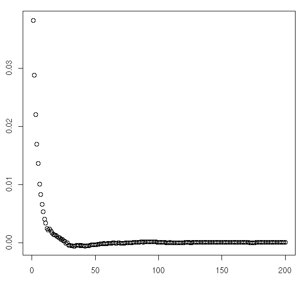
For the front page, it seems there could be something to this notion that earlier comments get more favorites. The same seems to be true of MetaTalk. But the surprise is that in Ask MetaFilter, the effect appears to be reversed!
I then did two more charts to see how this varied during the November Experiment, compared to the month before. I looked at this for the front page and for Ask MetaFilter only. There doesn't appear to have been much of an effect from obscuring favorite counts, although the data for Ask MetaFilter in particular looks pretty noisy. Not many long theads over there, I guess, so a few highly favorited comments make a big spike.
I'm not sure how much of the effects seen in these charts are due to the "earlier comments get more favorites" theory rather than just an effect of the overall thread length. Meaning that perhaps front page posts with short threads more highly "concentrate" the favorites among a few comments, tending to bump up the average for low-numbered comments.
And long threads in Ask MetaFilter might be the really popular ones with some great answers (or just lots of readers), tending to bump up the average for longer threads.
But if those thread length effects are the cause, why do they seem to be different for the blue vs. the green?
posted by FishBike at 5:54 PM on December 8, 2009 [1 favorite]
Specifically, I looked at average favorite count vs. comment number in the thread. The first of these three charts shows how this breaks down by sub-site over the past year. I grouped comments together by rounding their sequence numbers to the nearest 10, otherwise it's hard to spot trends among the noise. I also stopped plotting at 100 comments, because the data is extremely noisy after that.
For the front page, it seems there could be something to this notion that earlier comments get more favorites. The same seems to be true of MetaTalk. But the surprise is that in Ask MetaFilter, the effect appears to be reversed!
I then did two more charts to see how this varied during the November Experiment, compared to the month before. I looked at this for the front page and for Ask MetaFilter only. There doesn't appear to have been much of an effect from obscuring favorite counts, although the data for Ask MetaFilter in particular looks pretty noisy. Not many long theads over there, I guess, so a few highly favorited comments make a big spike.
I'm not sure how much of the effects seen in these charts are due to the "earlier comments get more favorites" theory rather than just an effect of the overall thread length. Meaning that perhaps front page posts with short threads more highly "concentrate" the favorites among a few comments, tending to bump up the average for low-numbered comments.
And long threads in Ask MetaFilter might be the really popular ones with some great answers (or just lots of readers), tending to bump up the average for longer threads.
But if those thread length effects are the cause, why do they seem to be different for the blue vs. the green?
posted by FishBike at 5:54 PM on December 8, 2009 [1 favorite]
That first chart is fascinating, FishBike. Specifically the AskMe difference; the general downward slope for the blue and the grey I would have predicted, but it never occurred to me that it wouldn't apply to the green.
I wonder if the upward slope in AskMe is a sort of raising-the-bar effect—as the thread continues, the threshold an answer needs to cross to be both helpful (a pre-condition of a good answer) and new (i.e. no one else has offered that or put it that way yet) goes up, ergo the quality of the answers that do get provided as the thread proceeds also go up?
Or to state it in a more cynical fashion, it could be that Male Answer Syndrome generates early noise in askme, and so all else aside the knee-jerk-answer quotient tends to decrease over time as threads become less barren looking and so attract fewer answers from folks feeling some species of desire to be first or at least early in answering a question, any question, when the itch presents itself.
Or to put it yet another way, there's in the blue or the grey no requirement that comments have utility, per se, and so it's okay to make jokes. And jokes are a thing that a lot of people have a chance to make and make well, regardless of their specific familiarity with the topic of a given thread. Which means the pool of potential Jokers is big—generally much bigger than the pool of potential Answerers for a given askme—and so the chances of the good jokes all being spoken for early on is a lot higher than that of the good answers being spoken for early in an askme.
In any case, definitely interesting. As evidence of a systemic difference in practices between the subsites, it's striking.
posted by cortex (staff) at 7:45 PM on December 8, 2009
Also, a variation that might be worth looking at, re: the above, is avg favorites by unit time rather than by unit comment—how many favorites does a comment get if it's made within one hour of posting, or two, and so on out over a couple of days. That might give a somewhat different view of the same general phenomenon, since the rate at which comments are given in any given thread wouldn't be a factor.
posted by cortex (staff) at 7:49 PM on December 8, 2009
posted by cortex (staff) at 7:49 PM on December 8, 2009
cortex: "Or to state it in a more cynical fashion, it could be that Male Answer Syndrome generates early noise in askme, and so all else aside the knee-jerk-answer quotient tends to decrease over time as threads become less barren looking and so attract fewer answers from folks feeling some species of desire to be first or at least early in answering a question, any question, when the itch presents itself."
I'd argue that (sample) size matters: how many AskMes reach 80 comments? A thread with 80 comments has at least 80 active viewers capable of favoriting; I'm sure you know more about the relative pageviews than I.
A hypothesis: if you split out ask metafilter questions into two categories, above the popular favorites threshold, and below it, I expect you'd see substantially different results. And to pin it on the feed threshold, you could maybe graph just above the threshold vs just below.
posted by pwnguin at 10:52 PM on December 8, 2009
cortex: "Also, a variation that might be worth looking at, re: the above, is avg favorites by unit time rather than by unit comment—how many favorites does a comment get if it's made within one hour of posting, or two, and so on out over a couple of days. That might give a somewhat different view of the same general phenomenon, since the rate at which comments are given in any given thread wouldn't be a factor"
Yeah, I was going to do that variation yesterday and just ran out of time. So here it is now, Favorites vs. Comment Time Since Post. The surprise here is that the curve for AskMe is now the same shape as the ones for MeFi and MeTa!
That seems so odd that I wonder if there is a technical problem somewhere, only I'm not sure how that could be for just the one sub-site. The whole process I'm following does each step for all sub-sites simultaneously (e.g. one SQL query extracts all the results for all sub-sites), so it's hard to see how it could be doing something different for just one of them. The code is almost identical for the comment number and comment time variations of this chart, too.
I wonder if there is something interesting going on with the correlation between thread length (number of comments) and how quickly those comments are made? Like maybe long threads are also fast threads, and those are the ones that get a lot of readers and thus a lot of favorites?
posted by FishBike at 4:37 PM on December 9, 2009
Huh! That is interesting. It'd be interesting to look at questions bucketed out by number of comments, yeah.
posted by cortex (staff) at 4:47 PM on December 9, 2009
posted by cortex (staff) at 4:47 PM on December 9, 2009
pwnguin: "I'd argue that (sample) size matters: how many AskMes reach 80 comments? A thread with 80 comments has at least 80 active viewers capable of favoriting; I'm sure you know more about the relative pageviews than I.
A hypothesis: if you split out ask metafilter questions into two categories, above the popular favorites threshold, and below it, I expect you'd see substantially different results. And to pin it on the feed threshold, you could maybe graph just above the threshold vs just below"
In the year's worth of data I charted, there were 179 AskMe's that had 80+ comments, so it happens a fair bit, but as a percentage of the total number of AskMe's, yeah, not many get into that territory.
I'd also like to try to analyze the influence of the popular favorites page and/or RSS feed. The trouble is that the "threshold" for inclusion on the page doesn't seem to be a fixed number of favorites. It looks like a top-20 list by number of favorites in the last 7 days. And I'm not sure how the RSS feed is derived from that.
So it might be computationally exciting to figure out which posts and/or comments have appeared in Popular Favorites, and for what period of time. It's at least theoretically possible to figure this out from the data in the Infodump, though.
posted by FishBike at 4:47 PM on December 9, 2009
Another possible explanation for the apparent inconsistency in the AskMe favorites by comment number and time is that when people have really good answers to questions, they post them right away (and maybe a lot of people do that). Whereas when it's one of those questions that's really tough to answer, it gets no comments for some time, and that brings out the "Male Answer Syndrome"1 that causes a few not very good answers to appear.
Anyway, more charts to come. I think it might be worth looking at thread length vs. average favorites per comment to see if there some difference between the blue and the green there.
1: I am also curious to know where cortex first heard this term, because I first heard it from a prolific contributor on rec.bicycles.tech at least a decade ago, who I think made it up.
posted by FishBike at 4:52 PM on December 9, 2009
I'm sort of surprised that people are surprised - for many of the questions, there are a relatively small number of possible answers, and the first few people will probably cover the likely ones. Later visitors favorite the ones they agree with, and then post elaboration if necessary.
posted by restless_nomad at 4:56 PM on December 9, 2009
posted by restless_nomad at 4:56 PM on December 9, 2009
I first encountered "Male Answer Syndrome" on metafilter, in discussions in Metatalk about Askme noise. So not much help antedating it there. You could probably do some site searching on metatalk and contact the folks who were earliest using it here, if you want to do a little research.
posted by cortex (staff) at 4:59 PM on December 9, 2009
posted by cortex (staff) at 4:59 PM on December 9, 2009
It's probably a little confusing what we are surprised about. I expected the earliest comments in the thread to get the most favorites, even in AskMe. So the first surprise was when looking at average favorites/comment by comment number, it was the higher numbered comments that were coming out with the highest average favorites, but only in AskMe.
So having gotten over that surprise, I expected the favorites vs. comment time since the post to look similar. There, the surprise is not that faster comments get more favorites than slower, but that it appears to be the opposite of the earlier curve based on comment numbers.
If I had only done that second chart, there would probably not be any surprise involved.
posted by FishBike at 5:02 PM on December 9, 2009
Ah! Thank you for the explanation. I am now surprised the same way everyone else is surprised (and also suspicious of the sample size for high-comment threads.)
posted by restless_nomad at 5:15 PM on December 9, 2009
posted by restless_nomad at 5:15 PM on December 9, 2009
So here's average favorites per comment vs. thread length, by sub-site. I grouped the data together into ranges 10 comments wide, but even with that the data is looking pretty noisy for AskMe after lengths of about 60-70 comments.
This seems to show very strong evidence for the idea that long threads mean more people involved, and more people involved means more favorites. I'm surprised there's such a strong effect of thread length, though. I thought having more comments to spread out the favorites over would have flattened this out a lot. It looks like I can throw out that theory entirely.
I stopped at 200 comments because the data is very noisy after that. But if anybody wants to see an expanded range to see what happens in the handful of longboat threads, I can do another one without that limitation. Maybe as a scatter plot instead of a line chart.
posted by FishBike at 5:41 PM on December 9, 2009
Did we figure out a way to quantify the bandwagon effect?
posted by restless_nomad at 6:06 AM on December 10, 2009
posted by restless_nomad at 6:06 AM on December 10, 2009
In an effort to get to the bottom of yesterday's surprises, I've posted this thing that shows average favorites against both comment time and comment number. Some notes about this chart:
But I still come back to this question: why don't we see that for the blue or the gray? For comparison, I made a similar chart for the blue and posted it right below the one for the green. The scale is different because there's more data, and thus single highly-favorited comments don't make such high peak values.
posted by FishBike at 4:50 PM on December 10, 2009
- The X-axis is comment number within the thread, grouped into bands 5 comment numbers wide.
- The Y-axis is comment time since the thread was posted, grouped into bands 1 hour wide.
- The Z-axis and colour scheme shows the average number of favorites per comment. Because there are so many low values and few high ones, the scale and colour coding isn't linear, and the legend on the right should give you an idea of just how non-linear it is (there's a cube root involved).
- Since it's Ask MetaFilter data only, the background is, of course, AskMe Green.
But I still come back to this question: why don't we see that for the blue or the gray? For comparison, I made a similar chart for the blue and posted it right below the one for the green. The scale is different because there's more data, and thus single highly-favorited comments don't make such high peak values.
posted by FishBike at 4:50 PM on December 10, 2009
restless_nomad: "Did we figure out a way to quantify the bandwagon effect"
Not so far. I assume you're talking about the proposed effect that a comment showing a lot of favorites encourages even more people to favorite it.
I was thinking of plotting something like "initial number of favorites vs. number of additional favorites in the next hour" to see if favoriting speeds up the more favorites a comment already has. Though obviously this can't continue forever or you get infinite favorites. It must level off, and it levels off at different numbers of favorites for each comment.
So the first problem is how to scale different comments so that differences in total number of favorites, and total time to receive those favorites, don't result in a plot that is overwhelmed by randomness.
The second problem is that even if we do see some increase in favoriting the more favorites a comment already has, up to a point, this is the expected result even without the bandwagon effect.
What I mean is, I assume that graphing favoriting rate vs. time will produce some kind of bell curve that starts off slowly as just the obsessive readers get in early and favorite things. Then the more mainstream bunch comes along and favorites a lot of things during the time lag that is typical for that group. Then a few stragglers come along at increasingly later intervals. So even without a bandwagon effect, I'd expect to see that favoriting starts off slowly, then speeds up, before slowing down again.
The November experiment's opt-out data might help, though. Because with that we can separate favorites between those who opted out (and thus still saw favorite counts), and those who stayed in (and thus didn't see the counts). We could see if this made a difference to existing favorites vs. favoriting rate between the two groups. And then run it again for October to see if it's just selection bias at work (e.g. people who opted out use favorites in a different way, so the stats for them look different even when the site looks the same way for everyone).
posted by FishBike at 5:04 PM on December 10, 2009
FishBike: It's probably a little confusing what we are surprised about. I expected the earliest comments in the thread to get the most favorites, even in AskMe. So the first surprise was when looking at average favorites/comment by comment number, it was the higher numbered comments that were coming out with the highest average favorites, but only in AskMe.
AskMe posts tend to "end" when the right answer shows up and those accrue a lot of favorites. Also, it has the most deleting of all the sites, though I don't know how that affects things directly but I suspect a lot of duff that would get no favorites is deleted.
posted by Kattullus at 10:07 PM on December 10, 2009
Kattullus: "AskMe posts tend to "end" when the right answer shows up and those accrue a lot of favorites. Also, it has the most deleting of all the sites, though I don't know how that affects things directly but I suspect a lot of duff that would get no favorites is deleted"
To explore this idea a little bit, I added another chart that shows average favorites/comment by position relative to the end of the thread. Curiously, this shows that comments farther from the end of the thread get more favorites, even for Ask MetaFilter, which seems to contradict earlier results that said higher-numbered comments get more there.
I thought this might be thread length effects again, but even when I re-ran the numbers to include only threads with more than 30 comments, the curves looked basically the same.
I think what I might have to do is try to scale the comment numbers relative to the total thread length, and plot average favorites vs. percentage of the way through the thread. And maybe limit it to threads with at least 10 comments, or certainly, at least 2, because I don't know where to plot comment 1 of 1 on that relative scale.
Also that dramatic up-tick at the end of MeTa threads is neat. I cynically suspect it's because these are often posted by mods announcing thread closures and/or account bans that people strongly agree with.
posted by FishBike at 11:03 AM on December 12, 2009
So here's the chart showing average favorites/comment by comment position as a percentage of thread length. This is for threads with 5 or more comments, though the curves look about the same (just higher) if I limit it to threads with 50 or more comments.
The averages are grouped into ranges of 5% of thread length, and with that grouping there's at least 10,000 comments for every point for AskMe and MeFi, and at least 2,000 for each point in the MeTa line, so the plots look fairly smooth. Music only has about 200 comments per data point.
So now I'm trying to make sense of the three different ways of looking at the same data. I think it's clear there are two different effects:
This latest chart seems to support that, because the "early comment effect" in MeFi and MeTa is a lot bigger than in AskMe. Whereas the chart showing favorites/comment vs. thread length shows the "long thread effect" looks about the same for all three sub-sites.
posted by FishBike at 11:56 AM on December 12, 2009 [2 favorites]
The averages are grouped into ranges of 5% of thread length, and with that grouping there's at least 10,000 comments for every point for AskMe and MeFi, and at least 2,000 for each point in the MeTa line, so the plots look fairly smooth. Music only has about 200 comments per data point.
So now I'm trying to make sense of the three different ways of looking at the same data. I think it's clear there are two different effects:
- Comments near the beginning of threads get more favorites.
- Longer threads get more favorites per comment.
This latest chart seems to support that, because the "early comment effect" in MeFi and MeTa is a lot bigger than in AskMe. Whereas the chart showing favorites/comment vs. thread length shows the "long thread effect" looks about the same for all three sub-sites.
posted by FishBike at 11:56 AM on December 12, 2009 [2 favorites]
If you want to do yet another iteration, you could try the place-in-time-in-thread as a percentage of the whole lifetime of a thread (e.g. from posting to the datestamp of the last comment), though I'm not sure if that's really all that helpful of a view.
posted by cortex (staff) at 1:21 PM on December 12, 2009
posted by cortex (staff) at 1:21 PM on December 12, 2009
I thought about doing a relative time rather than a relative comment number version of that last one, yeah. The problem I see with that is it only takes one follow-up comment 30 days later (or whatever the limit is) and suddenly the comments vs. relative time of the thread is completely different. Maybe I am imagining that to be a bigger problem than it really is.
A potential solution seemed to be, rather than scaling the time axis by the timestamp of the last comment, scale it to put the mid-point of the thread (by count) at the mid-point by time... or the 90% point by count at the 90% point by time, or some variation of that, so that "long tail" threads get analyzed based on when the main discussion was essentially over.
Anybody have any thoughts on doing it that way, or any other ideas for how to handle the "trailing comment long after the thread is over" issue?
posted by FishBike at 1:31 PM on December 12, 2009
Male Answer Syndrome, observed in comedic form no later than say 1995.
posted by pwnguin at 3:08 PM on December 12, 2009
posted by pwnguin at 3:08 PM on December 12, 2009
Heh, I did actually do a search for "Male Answer Syndrome" earlier, and if I'm reading it right, mathowie was the first person to use it here. Given that I first saw it in a cycling-related newsgroup, now I'm really wondering if he saw it there, too, since it seems likely.
But I'm afraid to ask directly since it seems like he's got more important things to deal with, and he's, you know, MeFite #000001, and therefore 87,842 times more important than me.
posted by FishBike at 3:21 PM on December 12, 2009
But I'm afraid to ask directly since it seems like he's got more important things to deal with, and he's, you know, MeFite #000001, and therefore 87,842 times more important than me.
posted by FishBike at 3:21 PM on December 12, 2009
I ask Matt all kinds of stupid shit. You should probably just send him a mefimail or whatever.
posted by cortex (staff) at 3:57 PM on December 12, 2009
posted by cortex (staff) at 3:57 PM on December 12, 2009
Oh! You know what would be one simple view into the possible "elbow" effect of Contact Activity sidebar 12+ fave announcements? Look at the time delta between favorites 11 and 12, and between 12 and 13. Do this for all favorites assigned before the Contact Activity sidebar was launched vs. those assigned after, look for a change in proportional time.
(Sidebar was launched November 2nd, 2007.)
Probably better to examine more of the curve than JUST that, but it'd be something.
I'm knee deep in Infodump stuff tonight, trying to get some stuff off my TODO list.
posted by cortex (staff) at 6:00 PM on December 12, 2009
(Sidebar was launched November 2nd, 2007.)
Probably better to examine more of the curve than JUST that, but it'd be something.
I'm knee deep in Infodump stuff tonight, trying to get some stuff off my TODO list.
posted by cortex (staff) at 6:00 PM on December 12, 2009
Heh, good thing I had already calculated the favorite sequence numbers (per comment) and elapsed seconds since the previous favorite, in anticipation of trying to run some sort of analysis on the contact activity effect.
The first time around, the numbers were totally crazy, because people can, and do, go back a long way into MeFi history and favorite things. So these numbers below exclude any favorites that were given more than 24 hours after the previous one.
So, average elapsed time between favorites, prior to 11-02-2007:
The same calculation for favorites given after 11-02-2007:
I'd like to plot this against number of incoming contacts the user has (or even better, against the number of contacts the user had on the date their comment was made). However, my graphics program is currently busy working on a top-secret project1. So maybe tomorrow I will try that, and for a wider range of favorite sequence numbers than just two. It might also be interesting to break these out by total number of favorites a comment received.
1: Which, if it's eventually successful, I'll probably post to Projects. It's MeFi and Infodump related, but I think the self-link aspect probably trumps the MeFi-related aspect.
posted by FishBike at 6:24 PM on December 12, 2009
The first time around, the numbers were totally crazy, because people can, and do, go back a long way into MeFi history and favorite things. So these numbers below exclude any favorites that were given more than 24 hours after the previous one.
So, average elapsed time between favorites, prior to 11-02-2007:
11th to 12th: 9896 seconds.Let's call that close enough to 1:1, shall we?
12th to 13th: 9862 seconds.
The same calculation for favorites given after 11-02-2007:
11th to 12th: 9230 seconds.So there is a slight but measurable increase in favoriting speed once a comment reaches the threshold to appear on the contact activity sidebar, and it's only there after that feature was introduced.
12th to 13th: 9052 seconds.
I'd like to plot this against number of incoming contacts the user has (or even better, against the number of contacts the user had on the date their comment was made). However, my graphics program is currently busy working on a top-secret project1. So maybe tomorrow I will try that, and for a wider range of favorite sequence numbers than just two. It might also be interesting to break these out by total number of favorites a comment received.
1: Which, if it's eventually successful, I'll probably post to Projects. It's MeFi and Infodump related, but I think the self-link aspect probably trumps the MeFi-related aspect.
posted by FishBike at 6:24 PM on December 12, 2009
I wonder also if the contacts activity sidebar changed the likelihood of a comment getting more than 12 favorites. Oh, and furthermore, can anyone think of a way to measure the effect of the popular favorites pages? Though the effect of being featured on the sidebar-blog has to be somehow factored out.
FishBike: It's MeFi and Infodump related, but I think the self-link aspect probably trumps the MeFi-related aspect.
MetaTalk has always been laxer about self-links. I think it would be a-okay but that's a modcall.
posted by Kattullus at 8:19 PM on December 12, 2009
FishBike: It's MeFi and Infodump related, but I think the self-link aspect probably trumps the MeFi-related aspect.
MetaTalk has always been laxer about self-links. I think it would be a-okay but that's a modcall.
posted by Kattullus at 8:19 PM on December 12, 2009
I decided to look at how favorite counts on comments grow over time. Specifically, a chart of relative favorite count vs. relative time since the comment was made. This chart includes comments with between 5 and 99 favorites, for all the favorites data in the Infodump.
The favorite count (Y axis) is easy to explain: it's just relative to the comment's total favorite count. The time axis (X axis) is a little stranger. To deal with the situation where someone can come along years later and favorite a comment, I looked instead at when a comment has received 95% of the favorites it's going to get, and made that 1.0 on the relative time axis.
Then just to see how this varies with the number of favorites, I drew separate lines for each increment of 10 favorites.
The curves are remarkably consistent regardless of the absolute number of favorites. The ones for lower favorite counts appear lower on the Y axis just because of a side-effect of the method used to analyze the data. You'd expect all curves to approach .95 relative favorites at 1.0 relative time (since that's the definition of 1.0 relative time).
But think about a comment with 5 favorites, it can never get 95% of that, it goes straight from 80% to 100%, so the relative number of favorites can't gradually approach .95 the way it can for comment with a lot of favorites. The method I'm using always omits the last favorite, so for comments with only a few favorites, the curves approach a lower number instead of .95.
posted by FishBike at 8:18 PM on December 13, 2009
So I don't just repeat myself, check out the Infodump updates.
posted by cortex (staff) at 7:30 AM on December 14, 2009
posted by cortex (staff) at 7:30 AM on December 14, 2009
« Older November Favorites Experience concludes. New... | Comment instead of thread number in Fuzzy... Newer »
You are not logged in, either login or create an account to post comments
The Infodump is up to date as of this morning, for those who want to get at the whole month's data. If there's other non-infodump data folks are interested in seeing or playing with, this is probably the best place to discuss it as well.
posted by cortex (staff) at 4:11 PM on December 1, 2009