The flag button's design is bad enough to be a social justice issue June 21, 2020 11:08 AM Subscribe
I'm serious. I know we've talked before about changing the design of flag button. Let's talk about it again — not because it's ugly or inconvenient on phones, but because it's hostile in a way that's relevant to site conversations about social justice. In threads about bigotry, we hear that people don't flag, they don't feel comfortable flagging, and they often don't even know you can flag. Well, here's one reason: the design of the button doesn't say "We hope you'll use this to contact a kind, professional moderator." Even to highly technical people with decades of social media experience, it says "This is confusing and mysterious, you're dumb for not understanding it already, and if you touch it you'll get in trouble."
I did some "design research" over breakfast this morning.
I live with a Millennial who's worked as a professional social media moderator, a Gen X systems programmer whose been online since Usenet, and a young-Xer early adopter who goes back to the pre-web dialup BBS era. All of them have most of their social life online, and have at least tried most of the big-name social media sites. None of them guessed that [!] would flag a post, or even that it would bring up a menu. All three guessed first that it indicated an HTML error in someone's comment.
When I said it appeared on every comment, one guessed that the website was broken and nothing was displaying right. Another thought it meant their browser wasn't supported. When I added that it was a link, they guessed that it would show you the error message. When I added that it was related to moderation, they got confused. One said "Maybe it's like a downvote?" One said "I guess it deletes spam, but it's really weird that they just let me delete stuff when I'm a random user."
Even after all those hints, nobody guessed that it brought up a menu. Nobody guessed that it would invite any sort of human interaction — much less interaction with a friendly, professional mod. The only one who guessed it had anything to do with deletion said "No" when I asked if she'd ever click it: "I'd be worried I was going to get in trouble."
This is bad.
Like, no wonder people aren't using it in the ways the mods rely on.
I think there are a few changes that have contributed to the problem:
A modern solution would be a link that said "Contact a moderator." If a plain-language label takes up too much front-page real estate, the modern solution is to hide that link in a menu behind a ... icon. Since the thing that happens next is unexpected(ly good), the link should go to a page that sums up what to expect as well as giving flag options.
I did some "design research" over breakfast this morning.
I live with a Millennial who's worked as a professional social media moderator, a Gen X systems programmer whose been online since Usenet, and a young-Xer early adopter who goes back to the pre-web dialup BBS era. All of them have most of their social life online, and have at least tried most of the big-name social media sites. None of them guessed that [!] would flag a post, or even that it would bring up a menu. All three guessed first that it indicated an HTML error in someone's comment.
When I said it appeared on every comment, one guessed that the website was broken and nothing was displaying right. Another thought it meant their browser wasn't supported. When I added that it was a link, they guessed that it would show you the error message. When I added that it was related to moderation, they got confused. One said "Maybe it's like a downvote?" One said "I guess it deletes spam, but it's really weird that they just let me delete stuff when I'm a random user."
Even after all those hints, nobody guessed that it brought up a menu. Nobody guessed that it would invite any sort of human interaction — much less interaction with a friendly, professional mod. The only one who guessed it had anything to do with deletion said "No" when I asked if she'd ever click it: "I'd be worried I was going to get in trouble."
This is bad.
Like, no wonder people aren't using it in the ways the mods rely on.
I think there are a few changes that have contributed to the problem:
- In the old days, square brackets were common visual language for "this link performs an action instead of taking you elsewhere." In 2020, icons represent actions, and square brackets mean "this is for tech geniuses and you won't understand it."
- In the old days, people expected to explore websites by clicking around at random. In 2020, clicking at random is a good way to get in deep financial and social trouble. If a relative of yours, I dunno, bought something expensive by accident by clicking at random, you wouldn't call it an understandable mistake and praise their curiosity — you'd tell them never to explore that way again.
- In the old days, it was common for every action to have an icon or a one-character shortcut, even if it was a cryptic one. You expected to have to read a help page, or just try stuff at random, to find out what the buttons did. In 2020, people expect plain language menu items or button labels for all but the most obvious and innocuous actions. If an unlabeled button isn't obvious to them, they conclude it isn't for them — the lack of a label says "qualified users will find this obvious, so if you don't get it, you're not qualified."
- In the a-bit-more-recent days, it made sense to drive away "unqualified users" with archaic Blog Era shibboleths like this, because people without a background in blogging assumed social websites were graffiti walls to vandalize. In 2020, everyone in the universe knows what posts and threads are and how to have a conversation.
A modern solution would be a link that said "Contact a moderator." If a plain-language label takes up too much front-page real estate, the modern solution is to hide that link in a menu behind a ... icon. Since the thing that happens next is unexpected(ly good), the link should go to a page that sums up what to expect as well as giving flag options.
[ flag ] would honestly be enough for me.
posted by Kitchen Witch at 11:17 AM on June 21, 2020 [27 favorites]
posted by Kitchen Witch at 11:17 AM on June 21, 2020 [27 favorites]
Yes this please. We already have [add to activity] [add to favorites], why can't it say [flag a moderator] or [notify moderator]? The ! is almost impossible for me to click on a touchscreen, too.
The term flag doesn't really make sense on its own and only gains clarity in context alongside moderator or mod, although that is also debatable.
I would very much appreciate a revamp of the flagging options, too, to always include a note. So it would be like "offensive/sexism/racism" and then I could specify the particular brand of wtfery. I don't think I've used a unannotated flag since the advent of noted flags. A small explanation of flagging could show up above the note box.
posted by Mizu at 11:21 AM on June 21, 2020 [45 favorites]
Also for consideration, how does it work with screen readers? I'm not using one, but this recent MeTa thread had had me rethinking how I post and comment.
posted by filthy light thief at 11:25 AM on June 21, 2020 [5 favorites]
posted by filthy light thief at 11:25 AM on June 21, 2020 [5 favorites]
While you're at it, most operations like this have an "undo" option, but this doesn't. Once you've flagged something accidentally as "racist" or "noise" or whatever, there's no way to backtrack and undo it, or explain further - you're stuck with whatever reason you may have accidentally flagged something for.
posted by Umami Dearest at 11:27 AM on June 21, 2020 [50 favorites]
posted by Umami Dearest at 11:27 AM on June 21, 2020 [50 favorites]
I hope this isn't a derail, but one of the flag options is "fantastic comment." I don't have the slightest idea what happens to those, and I would never think to click a flag button to report something positive.
posted by Ampersand692 at 11:50 AM on June 21, 2020 [29 favorites]
posted by Ampersand692 at 11:50 AM on June 21, 2020 [29 favorites]
As one of the previous posters of a "fix the flag button" post, I'm totally for this, and happy to see it being addressed.
Originally I liked just [flag] instead of the !, but after further thought something a little more explicit would probably be better. I know what "flag" means in the context of Metafilter because I've been part of Metafilter for a really long time. N00bs might not find it so clear. Something that clarifies that "flag" means "may need moderator input" would be better, I think.
I'm also ambivalent on the options list - in that "fantastic comment" doesn't really seem to fit in with what the flag is really used for. And isn't that what the favorite button is for, anyway? (and on preview, Ampersand692 beat me to this...)
posted by invincible summer at 11:53 AM on June 21, 2020
Yeah, now that I think about it, I think having "fantastic comment" under "flag" is also pretty weird and breaks expectations pretty strongly. Maybe call it "Nominate for sidebar" and put it someplace independent?
posted by nebulawindphone at 12:01 PM on June 21, 2020 [11 favorites]
posted by nebulawindphone at 12:01 PM on June 21, 2020 [11 favorites]
My understanding is that the fantastic flag is used in best post competitions, but those are like 1/12 of the year and are probably unnecessarily complicating the flag dialog the rest of the time. There is probably a better way to do best post contests.
Removing fantastic flags would allow the dialog to ask “what’s wrong?” or something else more direct.
Similarly it could say “report” instead of “flag”, maybe.
posted by Huffy Puffy at 12:02 PM on June 21, 2020 [9 favorites]
Removing fantastic flags would allow the dialog to ask “what’s wrong?” or something else more direct.
Similarly it could say “report” instead of “flag”, maybe.
posted by Huffy Puffy at 12:02 PM on June 21, 2020 [9 favorites]
I like “nominate for sidebar” as a reason to bring a great post or comment to mod attention. I don’t think we should only use it for negative reasons.
I think the drop down of choices is good for signposting what flagging is for - but being able to annotate would be swell. As would being able to unflag or change categories or maybe have to ‘submit’, as a person who clicks the wrong one accidentally.
posted by janell at 12:13 PM on June 21, 2020 [2 favorites]
I think "nominate for sidebar" is clearer and I love the idea of having flagging be simpler. From a sometimes-mod side of things, flagging isn't so overwhelming that more flags would be an issue, and it's been clear in a lot of discussions that people are not flagging things we know they are really unhappy with so making that easier and signalling properly how the feature works for 2020 and not 2001 is a great idea.
posted by jessamyn (retired) at 12:17 PM on June 21, 2020 [22 favorites]
posted by jessamyn (retired) at 12:17 PM on June 21, 2020 [22 favorites]
I love this, thank you nebulawindphone. I'm a Millennial and most of the websites of my generation use a link labeled "report" for this. Is that an option here?
posted by capricorn at 12:34 PM on June 21, 2020 [13 favorites]
posted by capricorn at 12:34 PM on June 21, 2020 [13 favorites]
Yeah, I also have trouble with a small “[!]” on a touch screen, so I would love to see it changed.
Also, just yesterday I was wondering what Ampersand692 was wondering. I flagged a post as fantastic, and then was wondering what happens after that. Not trying to derail, but I was also thinking it would be nice if there were some way to separately keep track of the stuff we flagged as fantastic, in the same way we can see the stuff we favorite.
posted by holborne at 12:48 PM on June 21, 2020 [4 favorites]
I'm a big believer in buttons always having (at least) a "verb noun" label. So rather than just "report" I would favor "report this post", "report this comment", etc. "Report this post to a moderator" would be even more clear, but at some point repetition might take up a lot of screen real estate.
I don't like the use of an icon by itself. It's not much more informative than a word and can be a problem for screen readers. An icon plus text is okay.
Maybe new users could also be given a banner at the top of each FPP that explains how the reporting feature works and invites them to use it.
posted by jedicus at 12:50 PM on June 21, 2020 [1 favorite]
I've been a member here for 7 years and wasn't until reading this thread that I finally understood what people meant when they talked about flagging something as fantastic. I guess I sort of thought it was an in-joke or metaphor or reference to something you used to be able to do or that people wished they could do. I knew flagging was a thing you could do and if I had ever felt the need to flag something I would have figured out that [!] was the way to do it, but I had no idea that you could use that same method to mark something as fantastic (and it's not clear to me what the point of doing that would be.)
posted by Redstart at 12:53 PM on June 21, 2020 [13 favorites]
posted by Redstart at 12:53 PM on June 21, 2020 [13 favorites]
Also for consideration, how does it work with screen readers? I'm not using one, but this recent MeTa thread had had me rethinking how I post and comment.
Seconding this - part of the redesign should be taking a look at how the buttons behave with screen readers. I mentioned ARIA button roles at the time, but someone who isn't just an interested amateur should weigh in on what's best practice.
I don’t think we should only use it for negative reasons.
Yup. I love that the flag button can be used for positive purposes, and would be sad if that part of the equation went away. There's got to be a way of succinctly explaining that a flag is for saying
While you're at it, most operations like this have an "undo" option, but this doesn't. Once you've flagged something accidentally as "racist" or "noise" or whatever, there's no way to backtrack and undo it, or explain further - you're stuck with whatever reason you may have accidentally flagged something for.
I've occasionally wildly misflagged something, and got a MeMail politely asking me what the deal was, and whether they'd missed something. Flagging is deliberately low bandwidth signaling, with all the pluses and minuses that brings. I think a
posted by zamboni at 12:57 PM on June 21, 2020 [1 favorite]
Seconding this - part of the redesign should be taking a look at how the buttons behave with screen readers. I mentioned ARIA button roles at the time, but someone who isn't just an interested amateur should weigh in on what's best practice.
I don’t think we should only use it for negative reasons.
Yup. I love that the flag button can be used for positive purposes, and would be sad if that part of the equation went away. There's got to be a way of succinctly explaining that a flag is for saying
hey, mod, check this out, and not just
this comment is bad and should feel bad.
While you're at it, most operations like this have an "undo" option, but this doesn't. Once you've flagged something accidentally as "racist" or "noise" or whatever, there's no way to backtrack and undo it, or explain further - you're stuck with whatever reason you may have accidentally flagged something for.
I've occasionally wildly misflagged something, and got a MeMail politely asking me what the deal was, and whether they'd missed something. Flagging is deliberately low bandwidth signaling, with all the pluses and minuses that brings. I think a
whoops, didn't mean it!button would work. Adding multiple flags, undo/redo, or adding stuff like being able to add further notes or metacommentary could be challenging to represent on the back end, adds complexity for mods, and probably overloads functionality that would be better handled by MeMail or the Contact form.
posted by zamboni at 12:57 PM on June 21, 2020 [1 favorite]
I think the trouble with "fantastic post" counting as a flag is that it's so unexpected. If I was looking for a way to praise a post, or nominate it to win a contest, it would never in a million years occur to me to click a "Flag" link or a "Report to a moderator" link.
Sure, yes, it is sweet and poetic and beautifully unexpected to think of flags being good as well as bad. But a UI shouldn't be beautifully unexpected. It should do what you expect it to.
posted by nebulawindphone at 1:04 PM on June 21, 2020 [9 favorites]
Sure, yes, it is sweet and poetic and beautifully unexpected to think of flags being good as well as bad. But a UI shouldn't be beautifully unexpected. It should do what you expect it to.
posted by nebulawindphone at 1:04 PM on June 21, 2020 [9 favorites]
It should do what you expect it to.
posted by zamboni at 1:29 PM on June 21, 2020 [5 favorites]
"Maybe it's like a downvote?"People's expectations of what a comment reporting system should do is driven by a history of +1/-1, upvote/downvote. MeFi's idiosyncratic human-driven ambiguity is what sets it apart. I'm sure we can find a middle ground that preserves some of the
sweet and poetic and beautifully unexpected, while still surfacing things to new users.
posted by zamboni at 1:29 PM on June 21, 2020 [5 favorites]
As a person who frequents a number of Facebook groups, I would like to suggest that the flag option not be renamed to "report". Many groups have a rule about NOT using the report feature (as I believe it reports the group to FB itself which then causes headaches for the admin.) So there has come to be some stigma attached to reporting, with the admins banning people for doing so and posting angry reminders about reporting and 100 people piling on in the comments to agree as to how reporting is a dick move and why don't people just scroll on by stuff they don't like, etc.
Which is to say, there may be a bunch more people out there like me who have been thoroughly socialized to not "report" things that offend or concern them.
I would suggest something like "flag for moderation" or some other verbiage that avoids the word report.
posted by Serene Empress Dork at 1:32 PM on June 21, 2020 [8 favorites]
The byline is getting (justifiably) full of text. Would it be an option to tuck some of the options drop down menu under a clickable [actions] button in the comment bylines?
posted by iamkimiam at 1:35 PM on June 21, 2020 [7 favorites]
posted by iamkimiam at 1:35 PM on June 21, 2020 [7 favorites]
I can see an argument for switching to something like 'favorite/fantastic/report' rather than the current 'favorite/flag', but I don't think we should get rid of 'fantastic' just because it's unexpected that this would be an option.
posted by nangar at 1:43 PM on June 21, 2020 [4 favorites]
posted by nangar at 1:43 PM on June 21, 2020 [4 favorites]
Also, I’ve mentioned this several times before but is there some sort of product backlog for feature development? Eg Gitlab, Prodpad or even a wiki page? It seems like features are considered upon request as and when, which is unsustainable. If features can be documented, labelled, sorted, prioritised etc then there’s a much more productive workflow, which then can be iterated upon in sensible work streams and feature chains. For example, prioritising the easy win of changing the ! label, then scheduling the other improvements as part of a byline review and redesign.
There’s not a lot of transparency about what the dev process or ongoing feature improvements are, but it does seem like MetaFilter has far outgrown whatever product development process is currently in place.
I don’t mean that as a criticism, it’s an observation. Expectations around this are really unclear but it’d be great to have some transparency and updates about the site changes more generally as UX/UI/development is inextricable from site culture and other social change.
posted by iamkimiam at 1:45 PM on June 21, 2020 [12 favorites]
I'm a little angry with myself that I hadn't figured out "flag as fantastic" is something you can literally do and it's not just friendly hyperbole. After flagging Redstart's comment as fantastic and now seeing an ominous-looking [Flagged], may I suggest changing the appearance of that too?
I've never clicked on [!] because I didn't want to accidentally set in motion some punitive process.
posted by theory at 2:25 PM on June 21, 2020 [7 favorites]
I've never clicked on [!] because I didn't want to accidentally set in motion some punitive process.
posted by theory at 2:25 PM on June 21, 2020 [7 favorites]
I like [flag], but for more clarity maybe [flag for a mod] or [needs mod review].
posted by zompist at 2:33 PM on June 21, 2020 [1 favorite]
posted by zompist at 2:33 PM on June 21, 2020 [1 favorite]
[alert moderator]
I also think that if "flag as fantastic"/"nominate for sidebar" is a thing we want to do, it should be either it's own thing, or an option under the "favorite".
I do note, that the [+] isn't that much more descriptive under comments. Should it also be [add to favorites] when a comment doesn't have a favorite yet? (Apologies if this is a tangent, main point remains that this is a great suggestion).
posted by meinvt at 2:40 PM on June 21, 2020 [7 favorites]
Thinking more about concision... the current tagline is an odd mix of over- and under-specification:
posted by zompist at 2:33 PM on March 21 [+] [!]
It's so wordy at the front, then incomprehensible at the back. This would be shorter and eliminate unneeded information:
zompist 2:33 pm Mar 21 [favorite] [alert a mod]
Also, while we've got the bag of 1997 tricks open, maybe change the background color for the [pseudo-buttons] to make it clearer that they're not just text.
posted by zompist at 2:55 PM on June 21, 2020 [27 favorites]
While we're rethinking the posted by line, how's everyone feeling about the different favorite display options?
Given the surprise some folks have expressed about
One of the options in Edit Profile is
While I imagine it's a pain for frimble to deal with, design wise, one of the possible options could be some variation on
Given the surprise some folks have expressed about
Flag as Fantastic, it's probably a good idea to recap.
One of the options in Edit Profile is
Comments Favorite Style, which allows you to choose between
- Show favorite counts (the default)
- Show
has favorites
- Hide favorites
While I imagine it's a pain for frimble to deal with, design wise, one of the possible options could be some variation on
- Show
Add to favorites
andFlag for mod attention
- Show
[+]
and[!]
Is [F] for flag or favorite, polymodus?
posted by brook horse at 4:02 PM on June 21, 2020 [5 favorites]
posted by brook horse at 4:02 PM on June 21, 2020 [5 favorites]
“Flag” is inside-baseball language. I’m a fan of “Report an issue” or something similar.
posted by thejoshu at 4:19 PM on June 21, 2020 [9 favorites]
posted by thejoshu at 4:19 PM on June 21, 2020 [9 favorites]
[Like] [Heart] [Favourite] [Subscribe to newsletter] [Order as t-shirt] [Post as "MetaFilter:" joke] [Needs a hug] [Needs attention] [Dismiss] [Disemvowel] [Someone is wrong on the internet]
posted by oulipian at 4:41 PM on June 21, 2020 [38 favorites]
posted by oulipian at 4:41 PM on June 21, 2020 [38 favorites]
I like "report," personally.
The "post comment" and "preview" buttons below the comment box are big and obvious, both on my laptop and on my phone. They would seem to be the model of what should be the goal here -- both visually distinct, and textually clear.
posted by Dip Flash at 5:28 PM on June 21, 2020
The "post comment" and "preview" buttons below the comment box are big and obvious, both on my laptop and on my phone. They would seem to be the model of what should be the goal here -- both visually distinct, and textually clear.
posted by Dip Flash at 5:28 PM on June 21, 2020
both visually distinct, and textually clear.
Yet not visually disruptive when repeated for every single comment on a post.
posted by zamboni at 5:41 PM on June 21, 2020 [6 favorites]
Yet not visually disruptive when repeated for every single comment on a post.
posted by zamboni at 5:41 PM on June 21, 2020 [6 favorites]
(idle wonder) what if, at the end of this thread, a decision is voted on, by a mod posting several options in separate comments, and then people favorite the ones they like? and then the option with the most votes gets chosen?
posted by suedehead at 5:46 PM on June 21, 2020 [3 favorites]
posted by suedehead at 5:46 PM on June 21, 2020 [3 favorites]
Is [hey mods] too unclear? Pro: nice and short, indicates communication, perhaps isn't too confrontational. Con: mods also means modifications not just moderators.
I think the implicit design change also needs to be tied with explicit education.
posted by freethefeet at 5:49 PM on June 21, 2020 [9 favorites]
I think the implicit design change also needs to be tied with explicit education.
posted by freethefeet at 5:49 PM on June 21, 2020 [9 favorites]
I think the implicit design change also needs to be tied with explicit education.
Respectfully, I think this thinking needs to change here. Sure, people need to be educated on the social norms of a site. But they shouldn't need to be educated on the site's user interface — and the features that keep them safe shouldn't be the ones that require the most education.
Would it be fun and quirky to hide the Post Comment button someplace that people needed education to find? No? Then why would it be fun to do that to the Flag Comment button, which is just as vital to people who want to use the site safely? Both features should be equally obvious, and obfuscated UI you wouldn't accept for one isn't acceptable for the other.
posted by nebulawindphone at 6:04 PM on June 21, 2020 [28 favorites]
the last time I flagged a racist comment my phone lagged and i accidentally flagged it as fantastic so I would also feel better if it was not the first option
posted by avocet at 7:03 PM on June 21, 2020 [21 favorites]
posted by avocet at 7:03 PM on June 21, 2020 [21 favorites]
[Bless your heart]
... should about cover it.
/tongueincheek
I like this idea and look forward to a brave new world.
posted by RolandOfEld at 7:03 PM on June 21, 2020 [5 favorites]
... should about cover it.
/tongueincheek
I like this idea and look forward to a brave new world.
posted by RolandOfEld at 7:03 PM on June 21, 2020 [5 favorites]
i had to flag my comment to remember the design. Good idea. I do like flagging comments as fantastic. I rarely used that but it gave me another fearture to fav a comment/post.
side bar this or some such feature is cool but fantastic in with the not fantastic current system seemed to make the whole idea of flagging less negative. Of course the whole idea, for the most, is helping mods be aware, in a timely manner, of negative/false stuff, positive in a variety of ways.
The term flag is antiquated. A whole new term should be proposed.
posted by clavdivs at 7:08 PM on June 21, 2020
As a user who understood the [!] and how it worked and would actually occasionally use it for both flagging reason such as broken HTML or fantastic or chat filter, etc, I still think this is a good idea to make it clearer. I am one of those people not afraid to click a link on a friendly site like this or to open the site in a sandbox and then click, but I am a Hokey Pokey clicker, find out what it is all about type of internet use. I do get that I am the exception. I just do not see any downside to changing it.
I would suggest as it was suggested above to NOT mimic the verbiage of some of the other sites such as FB. This is a unique and special site. There should be ways to differentiate it from other sites while still being clearer.
posted by AugustWest at 7:37 PM on June 21, 2020 [5 favorites]
I would suggest as it was suggested above to NOT mimic the verbiage of some of the other sites such as FB. This is a unique and special site. There should be ways to differentiate it from other sites while still being clearer.
posted by AugustWest at 7:37 PM on June 21, 2020 [5 favorites]
Even after all those hints, nobody guessed that it brought up a menu.
I think any update needs to somehow indicate that there's a menu. [flag…] vs [flag]? Many sites have a flag button that takes immediate action and I think it's worth indicating that this link requires more input.
Apple, Microsoft, and KDE, among others, have UI guidelines for this sort of thing.
posted by Nonsteroidal Anti-Inflammatory Drug at 8:02 PM on June 21, 2020 [10 favorites]
FOr consideration…
THe current screen reader name is "flag this."
I don't really like it, it's not very clear, but at least it isn't an "!," which the screen reader wouldn't vocalize by default at all.
posted by Alensin at 8:15 PM on June 21, 2020 [5 favorites]
THe current screen reader name is "flag this."
I don't really like it, it's not very clear, but at least it isn't an "!," which the screen reader wouldn't vocalize by default at all.
posted by Alensin at 8:15 PM on June 21, 2020 [5 favorites]
nebulawindphone, I think I was unclear, sorry! I mean that yes I am very pro the affordances of the interface being super clear and how to use them being as implicit as possible, but that also we should make sure there are educational resources available for explicit education.
posted by freethefeet at 8:56 PM on June 21, 2020 [3 favorites]
posted by freethefeet at 8:56 PM on June 21, 2020 [3 favorites]
It should be noted that increasing the length of the by line is going to increase the number of by lines that need two lines to display (specifically on mobile). A quick glance at some threads on Ask on my phones and it looks like more than half a doesn't characters is going to significantly increase the line count which means more scrolling and a decrease in comment to footer page space ratio. Replacing [!] with [Flag] or [Flag ...] is probably fine but using [Report to Moderators] or other lengthy descriptors is going to effect all comments. Especially if [+] gets expanded to [FavouriteBookmark]
Maybe this is happening already? I've got favourite count displays turned off.
It also increases the amount of text within each comment that is clickable which again is a problem on phones.
It's so wordy at the front, then incomprehensible at the back. This would be shorter and eliminate unneeded information:
zompist 2:33 pm Mar 21 [favorite] [alert a mod]
I think we need at a minimum the "posted by" or something similar at the beginning of the line otherwise comments will blend into each other because the end of comment line is different for each poster. The posted by acts as a delimiter.
On a more esthetic note I find the stripped out date/time by structured for writing kind of jarring. If we go this way why not just YY/MM/DD HH:MM. Looks like a time/date not some alphanumeric salad that escaped from twitter. Which would be friendlier for screen readers?
While you're at it, most operations like this have an "undo" option, but this doesn't. Once you've flagged something accidentally as "racist" or "noise" or whatever, there's no way to backtrack and undo it, or explain further - you're stuck with whatever reason you may have accidentally flagged something for.
Wisdom used to be that individual flags don't mean much; moderators were looking at patterns accumulations. So an incorrect flag now or then wasn't a big deal. One can always hit the contact form to issue a correction.
posted by Mitheral at 9:57 PM on June 21, 2020
On a tangent I wonder if we should have some sort of mechanism to educate new users as they progress with their interaction on the site. It would be another mechanism besides plain clicking around for people to discover subsites, procedures and norms of the site. EG: every hundred page loads or every month one of those header banners pops up with a site hint like:
Comments can be reported for excellent or inappropriate content. Do you want to know more? <Hide>
Metwfilter has an internal messaging system for private messages. Do you want to know more? <Hide>
You can mark posts/comments so you can find them later. Do you want to know more? <Hide>
You can follow the posts/comments of other users. Do you want to know more? <Hide>
There is a special section of the site for discussion about the site. Do you want to know more? <Hide>
posted by Mitheral at 10:16 PM on June 21, 2020 [7 favorites]
Do you want to know more?
Someone check with Neil Patrick Harris’s agent to see if he’s available. (CW: violence, late 1990s CGI bug ichor)
posted by zamboni at 10:23 PM on June 21, 2020 [3 favorites]
Someone check with Neil Patrick Harris’s agent to see if he’s available. (CW: violence, late 1990s CGI bug ichor)
posted by zamboni at 10:23 PM on June 21, 2020 [3 favorites]
Yeah, to me, the [!] thing has strong connotations of "THIS IS BAD, OMIGOD, REPORT THIS TO A MOD NOW," so it's completely nonintuitive that: A), this is actually a menu with multiple options; B) that at least one of those multiple options is a *positive* option among a host of negative ones.
Because of that, I agree that "flag as fantastic" needs to be pulled out of that menu of negative options into its own place, and that it ought to be renamed for clarity. "Flag" and "Report" both read negative to me. So I'd want very clear positive wording explaining the Functionality-Formerly-Known-As-Flag-As-Fantastic, whether that ends up being "nominate for sidebar," or "highlight as fantastic," or some other even more concise and clear wording that makes it obvious and intuitive that this is a Very Positive thing.
posted by Pandora Kouti at 11:16 PM on June 21, 2020 [3 favorites]
I came in as a hard no, read nebulawindphone's post, and now I'm a begrudging "yeah that would probably be best."
Also depressed that just randomly clicking around is apparently now a bad thing. That's why none of my students know how to actually use any of their technology for anything more sophisticated than instagram. But you're not wrong, it is in many cases a bad idea. Sigh.
posted by Wretch729 at 11:36 PM on June 21, 2020 [12 favorites]
While we’re at it we might as well kill voting for projects, as it appears to mean nothing and to be essentially redundant with favoriting and flagging as fantastic.
posted by Going To Maine at 12:03 AM on June 22, 2020 [2 favorites]
posted by Going To Maine at 12:03 AM on June 22, 2020 [2 favorites]
Also depressed that just randomly clicking around is apparently now a bad thing.
It's also that we lost the expectation that people would or could see the roll-over text once enough switched to mobile/tablets. It's a real loss.
posted by nobody at 12:25 AM on June 22, 2020 [4 favorites]
It's also that we lost the expectation that people would or could see the roll-over text once enough switched to mobile/tablets. It's a real loss.
posted by nobody at 12:25 AM on June 22, 2020 [4 favorites]
Speaking of mobile, now the + and ! are on their own new line, (I think this is a recent change) so we could have longer/wordier buttons.
posted by freethefeet at 12:43 AM on June 22, 2020 [1 favorite]
posted by freethefeet at 12:43 AM on June 22, 2020 [1 favorite]
I always knew what the [!] meant but this (excellent) MeTa brings up a very good point, and I support changing it to something more intuitive. While the MeFi reporting process is fairly unique, we should probably look at other sites to get an idea what's commonly understood to by users.
Facebook group post: Report to group admins
Facebook group comment: Report comment to group admins and Give feedback or report this comment (I assume the difference is the second one goes to FB admins)
Facebook status update: Find support or report post (I'm concerned about this post)
Twitter: Report Tweet
Meetup event: Report this event
Meetup comment: 🏳️Report
TikTok: ⚠️Report
Snapchat: Report a safety concern
Definitely seems like "report" is standardised across most social sites.
Maybe something on the new user page can address reporting/flagging ("what to do if a post or comment is offensive") and explain that reporting/flagging a) is not a downvote, b) will result in a real person checking out the report, and c) it's OK if you click it accidentally. In addition a "how to report offensive comments" link could be put in the notification header to let all users know about the process and point to the FAQ.
posted by EndsOfInvention at 2:09 AM on June 22, 2020 [3 favorites]
I do not like "report" because I would not want to "report" someone for a derail. Report implies to me that the user could be removed. I "report" anti-Semitic comments on Twitter. I don't want to do the same thing to my friends on Metafilter who got too excited about some side topic or have a broken link or HTML error.
I do like the idea mentioned above that there is something to indicate that it brings up a menu. A small hamburger or down arrow icon next to the text might do the trick. [Flag for mods v] ?
posted by tofu_crouton at 5:23 AM on June 22, 2020 [5 favorites]
I do like the idea mentioned above that there is something to indicate that it brings up a menu. A small hamburger or down arrow icon next to the text might do the trick. [Flag for mods v] ?
posted by tofu_crouton at 5:23 AM on June 22, 2020 [5 favorites]
Now I want to know how many times Redstart's comment has been flagged as fantastic.
Oh and in passing and probably not a pressing issue, but at least on an android tablet once you click the ! icon and get the drop-down menu, no other ! icon will work until you do something with the dropdown box. So one instance of flagging at a time, which I suppose is quite fine.
posted by Pyrogenesis at 5:46 AM on June 22, 2020
I really only use "offensive/sexism/racism" or "breaks the guidelines" or the open one with a note to mods. Because if it's even slightly unclear why I'm flagging, I want to explain. And this idea to make flagging more clear than an exclamation point is long overdue .
posted by tiny frying pan at 6:29 AM on June 22, 2020 [1 favorite]
posted by tiny frying pan at 6:29 AM on June 22, 2020 [1 favorite]
I like [add note] as more neutral call to action.
Then the dropdown is headlined by "Pick a reason to note this comment"
There's no reason to remove "fantastic comment" from the menu. It should stay where it is, first in the list.
posted by Brandon Blatcher at 6:40 AM on June 22, 2020 [4 favorites]
Then the dropdown is headlined by "Pick a reason to note this comment"
There's no reason to remove "fantastic comment" from the menu. It should stay where it is, first in the list.
posted by Brandon Blatcher at 6:40 AM on June 22, 2020 [4 favorites]
Well, ACTUALLY... change the dropdown verbiage to "Pick a general reason to note this comment or select "explain note" give a specific reason.
posted by Brandon Blatcher at 6:43 AM on June 22, 2020
posted by Brandon Blatcher at 6:43 AM on June 22, 2020
add note to me sounds like a way for me to tag something with a personal remark, not a way to notify others of a problem.
posted by meinvt at 6:46 AM on June 22, 2020 [17 favorites]
posted by meinvt at 6:46 AM on June 22, 2020 [17 favorites]
I'd just like to put in a vote for shortness on account of
1) any complete sentence or phrase will take more effort for my (non-neurotypical) brain to parse as a comment boundary
2) the longer the phrase, the more specific it's likely to be, and therefore the more likely it is to be inaccurate.
I understand that flag isn't used in typical places, but I think it's not too obscure. Looking at Google n-grams (which is print-only, so not great for actual web uses, but the best we've got), flag as a verb seems to be about as common as mod, but flag as a noun is 20 times as common as either.
I'm very much not fond of the implications of report.
posted by ambrosen at 6:46 AM on June 22, 2020 [4 favorites]
I would prefer the verbs alert, flag or notify, paired with a noun. So, either
[alert a mod]
[flag for moderator]
[notify a moderator] or
[notify a mod]
Something like that. And yes, in my ideal world the wordy version would be the default but there would be a preference we could set to change it to [!]
Same with [favourite] and [+].
posted by Too-Ticky at 6:53 AM on June 22, 2020 [8 favorites]
Now I want to know how many times Redstart's comment has been flagged as fantastic.
Me too. And now for the first time I find myself wondering if I've ever had another comment flagged as fantastic. (Seems unlikely, but who knows?) Maybe the person who wrote the fantastic thing ought to get some kind of notification.
posted by Redstart at 7:18 AM on June 22, 2020 [5 favorites]
Me too. And now for the first time I find myself wondering if I've ever had another comment flagged as fantastic. (Seems unlikely, but who knows?) Maybe the person who wrote the fantastic thing ought to get some kind of notification.
posted by Redstart at 7:18 AM on June 22, 2020 [5 favorites]
Anecdotal: I really love Flag For Fantastic. I think I've flagged way, way more as fantastic than as all of the negatives over the years. It's one of my favorite parts of the site. Would absolutely love for it to stay on in a different capacity or whatever if that's easier/more understandable.
posted by thivaia at 7:50 AM on June 22, 2020 [4 favorites]
posted by thivaia at 7:50 AM on June 22, 2020 [4 favorites]
[😠]
posted by phunniemee at 8:38 AM on June 22, 2020 [5 favorites]
posted by phunniemee at 8:38 AM on June 22, 2020 [5 favorites]
Why not use the now ubiquitous "hamburger" button [☰], with a reorganized drop down list?
posted by Ahmad Khani at 9:09 AM on June 22, 2020 [10 favorites]
posted by Ahmad Khani at 9:09 AM on June 22, 2020 [10 favorites]
I understand that flag isn't used in typical places, but I think it's not too obscure. Looking at Google n-grams (which is print-only, so not great for actual web uses, but the best we've got), flag as a verb seems to be about as common as mod, but flag as a noun is 20 times as common as either.
Just because people are familiar with the word doesn't mean it's the right word in this instance. "Used frequently" and "appropriate for this use" are two different things. Google tells me that "flag" and "sheep" are equally common, with "sheep" slightly in the lead, but that doesn't mean it's helpful to make the button say Sheep.
posted by nebulawindphone at 9:10 AM on June 22, 2020 [4 favorites]
To clarify, that's the verb ‘flag’. Obviously, it's a very common noun. That's why I put the non-negligible effort in to find how often it was used in that sense.
posted by ambrosen at 9:19 AM on June 22, 2020 [1 favorite]
posted by ambrosen at 9:19 AM on June 22, 2020 [1 favorite]
And 'in that sense' matters here, I would like to add.
posted by Too-Ticky at 9:25 AM on June 22, 2020
posted by Too-Ticky at 9:25 AM on June 22, 2020
I'm sorry. That snark was unhelpful, and the corpus frequency of "flag" as a verb is definitely relevant — if it was extremely rare as a verb, it would be worth rejecting outright.
But there's another factor besides frequency that's relevant, and that's appropriateness for this particular use. And I do think that "report" is the more appropriate verb, simply because it's far and away the most widely used one in this particular context.
As an analogy, "preserve," "hang onto," "stockpile," and "put away" are all reasonably commonly used, and are all valid synonyms for the relevant sense of "save." But you wouldn't replace a Save button with a Preserve button or a Hang Onto button, because people have so overwhelmingly come to expect the word Save in this context that using a different one would confuse things. (Of course, eventually someone would figure out what was meant. But even momentary confusion is a problem when people are clicking around quickly.)
I don't think the momentum behind Report is as strong as the momentum behind Save. But it's still pretty substantial — enough that I think we might as well do the expected thing rather than risk momentarily confusing people.
And I understand the urge to be like "Well, we shouldn't do the expected thing, because we're not an ordinary website." But I think we already do enough to indicate that we're not ordinary. We have a quirky retro visual design, an all-text format (something TOTALLY UNHEARD-OF anymore), subsites with unusual names, etc. I think it is safe for us to design the fine points of our UI in the most immediately comprehensible way, and trust people to recognize our extraordinariness based on our big-picture design and our content.
Anyway, those are my actual thoughts. Sorry again for taking a cheap shot instead of taking the time to spell them out.
posted by nebulawindphone at 9:49 AM on June 22, 2020 [6 favorites]
One thing I'll say as I read through this and think about possible verbiage changes: "flag" doesn't exist here in a vacuum, and so there's more of an argument for retaining that as the key word than there would be if we were picking it from a hat during MeFi's pre-launch design phase. A lot of on-site documentation and a lot of discussion over the years in MetaTalk and within threads has been built on that specific bit of shared language.
That's not to say other options are off the table, I just want to not let the idea of "flag" as a label become too abstracted. Semantically speaking it's yards clearer than !, all else aside, and attaches that existing two decades of shared site language to the item in a more direct way.
posted by cortex (staff) at 10:40 AM on June 22, 2020 [11 favorites]
there's more of an argument for retaining that as the key word than there would be if we were picking it from a hat during MeFi's pre-launch design phase. A lot of on-site documentation and a lot of discussion over the years in MetaTalk and within threads has been built on that specific bit of shared language.
"I'm looking through some search results... what does 'flag it and move on" mean? What is 'flag'?"
In other words, such a change will have long lasting ramifications and confusion to both new and old members, which I think is what cortex said above.
posted by terrapin at 10:46 AM on June 22, 2020 [1 favorite]
This could be handled by professional UX designers who solve these kinds of problems all day long, and I bet they'd do it for free. If we try to crowd-source and make guesses here, it's not going to be an improvement.
posted by bleep at 11:00 AM on June 22, 2020 [8 favorites]
posted by bleep at 11:00 AM on June 22, 2020 [8 favorites]
And that's not to say that community feedback here in this thread isn't useful or shouldn't be done, but professional UX designers know how to take this raw information and sculpt it into something.
posted by bleep at 11:01 AM on June 22, 2020 [7 favorites]
posted by bleep at 11:01 AM on June 22, 2020 [7 favorites]
I still like the idea of calling it [flag] and giving appropriate options.
posted by blurker at 11:19 AM on June 22, 2020 [2 favorites]
posted by blurker at 11:19 AM on June 22, 2020 [2 favorites]
I like [hey, Mod!] with some indicator that there will be a menu of options.
posted by daisyace at 11:33 AM on June 22, 2020 [3 favorites]
posted by daisyace at 11:33 AM on June 22, 2020 [3 favorites]
[hey, mod!] and [!] have a pleasing symmetry.
posted by zamboni at 12:09 PM on June 22, 2020 [2 favorites]
posted by zamboni at 12:09 PM on June 22, 2020 [2 favorites]
With daisyace's suggestion, [Flag a mod!] came to mind.
Getting a UX expert would also be good [paging any UX experts].
And for the anecdotes, my most common use of flags has been HTML/display error, to get plain-text links linkafied, followed by Fantastic and Breaks Guidelines, with a few written comments to mods.
Thinking on general functionality, a (long, long) while ago, I asked about getting flags expanded upon use, because I've browsed through discussions and have seen my flags, only to have no idea why I flagged a comment. I still like the idea of whatever the [flag] button becomes turning into [flagged as fantastic] or whatever I used.
As a bonus bit of mod-to-user transparency (and probably a lot more coding), it would be nice to know that the flag has been seen, like [flagged as fantastic] ✔ In my mind, this is a private note, only seen by the user who initiated the flag, as a way to know that a mod has seen and noted the comment. I also like the idea of being able to review your private history of flags.
But as jessamyn noted back in 2009, "Flags are really something that aren't supposed to have a lot of individual value, they're useful to us [mods], in the aggregate, but they're not really intended to be a personal thing that belongs to a specific user." So all my daydreaming sounds like a LOT of back-end work to change the function, whereas making it something other than [!] is probably a quicker fix, as long as the (initial) change is only cosmetic.
posted by filthy light thief at 12:25 PM on June 22, 2020
Is there any data on actual use of flagging over the years? Has it changed in any notable fashion?
posted by computech_apolloniajames at 12:33 PM on June 22, 2020
posted by computech_apolloniajames at 12:33 PM on June 22, 2020
I'm happy to support greater accessibility/usability and look forward to where this conversation lands. In the meantime...
[Like] [Heart] [Favourite] [Subscribe to newsletter] [Order as t-shirt] [Post as "MetaFilter:" joke] [Needs a hug] [Needs attention] [Dismiss] [Disemvowel] [Someone is wrong on the internet]
Google tells me that "flag" and "sheep" are equally common, with "sheep" slightly in the lead, but that doesn't mean it's helpful to make the button say Sheep.
Y'all have a great resource for next April Fool's.
posted by solotoro at 1:02 PM on June 22, 2020 [5 favorites]
I've done UX design, and worked closely with UX designers. One thing I learned from meetings of UX designers: things don't get designed in meetings of UX designers. Meetings (and this is one!) are great for finding problems, not great at finding the best solution to them. The practice of our designers was for someone to process all the feedback outside the meeting.
Which is to say, it's OK if people are suggesting a bunch of ideas, and reporting from a wide variety of viewpoints. From an UX design standpoint, that's invaluable input.
posted by zompist at 1:29 PM on June 22, 2020 [8 favorites]
Which is to say, it's OK if people are suggesting a bunch of ideas, and reporting from a wide variety of viewpoints. From an UX design standpoint, that's invaluable input.
posted by zompist at 1:29 PM on June 22, 2020 [8 favorites]
I’m a UX professional and I completely agree with zompist. Also I’d like to add that if there isn’t a sensible development process and feature pipeline in place, all the UX advice won’t matter. You can’t improve the user experience with random feature updates and silo’d discussions. The whole thing is a process and it takes lots of well planned baby steps toward a measurable goal, especially when there are dev constraints on the inside and larger community issues on the outside. This is part of why I’ve been pushing for years on more transparency around dev processes and roadmaps, etc. I want to offer help but I can’t even see what we’re dealing with here, it’s a mystery.
posted by iamkimiam at 1:42 PM on June 22, 2020 [17 favorites]
posted by iamkimiam at 1:42 PM on June 22, 2020 [17 favorites]
[hey mods...]
The ellipsis is the UI hint that this is the beginning of a process.
The friendly wording should help with click anxiety.
It communicates that you're starting a human interaction.
posted by dbx at 2:40 PM on June 22, 2020 [12 favorites]
The ellipsis is the UI hint that this is the beginning of a process.
The friendly wording should help with click anxiety.
It communicates that you're starting a human interaction.
posted by dbx at 2:40 PM on June 22, 2020 [12 favorites]
I don't have a dog in this hunt, but when I see [!], I just assume it means you want to say, "Hey!" for the purposes of alerting/reporting/praising something, so it's always made sense to me. I'm sure you'll figure out something dandy, but I'll always think of [!] as "Hey!"
posted by The Wrong Kind of Cheese at 4:58 PM on June 22, 2020
posted by The Wrong Kind of Cheese at 4:58 PM on June 22, 2020
I'd prefer a single word over a phrase since repeated phrases are very noisy for screen readers. I think if we can get over our aversion to reddit-isms, "report" is more descriptive than "flag".
posted by Space Coyote at 5:29 PM on June 22, 2020 [1 favorite]
posted by Space Coyote at 5:29 PM on June 22, 2020 [1 favorite]
I don't like the use of an icon by itself. It's not much more informative than a word and can be a problem for screen readers. An icon plus text is okay.
I'd discourage people from making statements about screen readers that come from their own intuition. Icons that are properly marked-up with the correct HTML attributes are better for a lot of reasons than the old fashioned textual decorations MetaFilter uses. For one thing, they don't clutter text selection and copy and paste operations when implemented correctly. And they can scale much better on mobile interfaces.
posted by Space Coyote at 5:32 PM on June 22, 2020 [9 favorites]
On a more esthetic note I find the stripped out date/time by structured for writing kind of jarring. If we go this way why not just YY/MM/DD HH:MM. Looks like a time/date not some alphanumeric salad that escaped from twitter. Which would be friendlier for screen readers?
Verbosity and repetition are very unfriendly for screen readers. Overly-precise timestamps are a common source of delay between hearing the end of one comment and the beginning of the next one.
posted by Space Coyote at 5:45 PM on June 22, 2020 [6 favorites]
Verbosity and repetition are very unfriendly for screen readers. Overly-precise timestamps are a common source of delay between hearing the end of one comment and the beginning of the next one.
posted by Space Coyote at 5:45 PM on June 22, 2020 [6 favorites]
I like that "report" is familiar and consistent with many other sites, but yeah, its connotations don't quite seem right for Mefi. I'm leaning towards something like "[flag...]"; it doesn't break the established terminology, and it makes it look less like a drastic, irrevocable action.
Anyway, as a couple people have already mentioned: after someone clicks the flag button, the drop-down they currently see is pretty opaque and intimidating without context. I think it would make sense to replace it with something like a modal pop-over box that contains the same options, but has room for some explanatory text. (Assuming it can be done in a way that plays nicely with screen readers, of course.)
I'm picturing something like this:
posted by teraflop at 6:23 PM on June 22, 2020 [3 favorites]
Anyway, as a couple people have already mentioned: after someone clicks the flag button, the drop-down they currently see is pretty opaque and intimidating without context. I think it would make sense to replace it with something like a modal pop-over box that contains the same options, but has room for some explanatory text. (Assuming it can be done in a way that plays nicely with screen readers, of course.)
I'm picturing something like this:
Flag this comment if you'd like to ask a moderator to take a look at it because:Similarly, there could be a brief description of the flagging system somewhere in the sign-up, just to make it a bit less intimidating to click it for the first time:Your report will only be visible to the moderation team, and they won't necessarily take action solely on the basis of a single flag. This is just a quick way to bring their attention to something they might have missed. You can also contact the moderators directly if you'd like a response.
- It's worth highlighting on the sidebar
- The formatting is messed up
- It's derailing the discussion
- It's racist, sexist, homophobic, transphobic, or otherwise objectionable
- Something else: ____
[Flag] [Cancel]
Metafilter employs a team of professional moderators to help keep discussions running smoothly. If for any reason you think a thread or comment needs particular attention, feel free to flag it by clicking the "[flag...]" link. Your flag will only be visible to moderators, and is just a way to get their attention; they'll review it before taking action.Finally, if we want to keep the "flag" terminology, perhaps it would be better to reframe it as "flagging down a moderator to take a look at this", rather than "flagging a comment"?
posted by teraflop at 6:23 PM on June 22, 2020 [3 favorites]
I think it would make sense to replace it with something like a modal pop-over box that contains the same options, but has room for some explanatory text.
Hopefully we can come up with a way to acclimatize folks to flagging comments without reinventing Clippy.
I also have a suspicion that more people than we think are familiar with the idea of flagging an issue.
posted by zamboni at 8:26 PM on June 22, 2020 [5 favorites]
Hopefully we can come up with a way to acclimatize folks to flagging comments without reinventing Clippy.
I also have a suspicion that more people than we think are familiar with the idea of flagging an issue.
posted by zamboni at 8:26 PM on June 22, 2020 [5 favorites]
I like this pony very much.
I don't like "flag" or "report", though.
Flag is problematic for people who do not have English as a first language. It is too idiomatic. As a standalone word, it would probably not be clear to many people. "Flag for moderation" is okay, maybe, but still not very straightforward. (Is it moderation like "eat in moderation?")
If the button said "report" I straight-up wouldn't use it, except in cases where I think the content is so bad the user should be banned. Because that would be my expectation for what is likely to happen to a user who gets reported.
While it's too wordy, something like "ask a moderator to look at this comment" is kind of what we are looking for. Is there a succinct way to say that?
posted by lollusc at 1:43 AM on June 23, 2020 [1 favorite]
While it's too wordy, something like "ask a moderator to look at this comment" is kind of what we are looking for. Is there a succinct way to say that?[Please Look] ?
[Problem?]
posted by freethefeet at 2:50 AM on June 23, 2020
[huzzah!] [this vexes me]
posted by Huffy Puffy at 5:49 AM on June 23, 2020 [18 favorites]
posted by Huffy Puffy at 5:49 AM on June 23, 2020 [18 favorites]
[Flag for review]?
posted by Jeanne at 6:16 AM on June 23, 2020 [4 favorites]
posted by Jeanne at 6:16 AM on June 23, 2020 [4 favorites]
I think [notify a mod] is a bit friendlier than report, considering also it's used for derails or technical issues etc. I like [contact a mod] or similar too. Most of the places that use "report" also have barely any modding so only truly egregious stuff gets attention, I don't know if you want that association.
I was never confused by the concept of flagging but I know I'm not everyone.
posted by stillnocturnal at 6:29 AM on June 23, 2020 [3 favorites]
I was never confused by the concept of flagging but I know I'm not everyone.
posted by stillnocturnal at 6:29 AM on June 23, 2020 [3 favorites]
[notify a mod]
I like this. If space allows, maybe use the full word "moderator" rather than the shorthand since that is going to be clearer.
posted by Dip Flash at 6:58 AM on June 23, 2020 [4 favorites]
I like this. If space allows, maybe use the full word "moderator" rather than the shorthand since that is going to be clearer.
posted by Dip Flash at 6:58 AM on June 23, 2020 [4 favorites]
If the flag button stays as text, could it default to "long-form" [notify a moderator...] or something like that, and then the user could change the appearance to [!] if the format and appearance works for them? Make the beginning experience as user-friendly as possible, but for old-timers or people who get used to the interface and want a more compact view, they could opt to go back to the old format.
This could be like the Favorites options we have*, which are Show Favorites, flatten down to "Has Favorites" without a total, or hiding favorites all-together.
"Spelled out" could also be an option for favorites, too, which would aid mobile use, providing a bigger target to tap.
* I first wrote "like the Favorites options we have now," but I think those options have been available for a while. I went looking for the MeTa where that option was added, but I couldn't find it.
posted by filthy light thief at 7:47 AM on June 23, 2020 [2 favorites]
Hah, thanks for pulling that up, and more clearly writing the things I was thinking, before I thought them ;)
posted by filthy light thief at 10:17 AM on June 23, 2020 [1 favorite]
posted by filthy light thief at 10:17 AM on June 23, 2020 [1 favorite]
What about [Attention⁉️] with an interrobang?
posted by ApathyGirl at 10:41 AM on June 23, 2020 [2 favorites]
posted by ApathyGirl at 10:41 AM on June 23, 2020 [2 favorites]
[Problem?]
This sounds like the website is picking a fight with me.
Here, I'll save folks some time:
Metafilter: the website is picking a fight with me.
posted by zamboni at 12:46 PM on June 23, 2020 [5 favorites]
This sounds like the website is picking a fight with me.
Here, I'll save folks some time:
Metafilter: the website is picking a fight with me.
posted by zamboni at 12:46 PM on June 23, 2020 [5 favorites]
Verbosity and repetition are very unfriendly for screen readers. Overly-precise timestamps are a common source of delay between hearing the end of one comment and the beginning of the next one.
Would it be helpful to drop either the time or the date as appropriate? IE: comments made during the current day would just have the time and comments made on previous days would only have the date. Maybe both for comment not made today but made within 36 hours of the current time.
posted by Mitheral at 1:07 PM on June 23, 2020 [2 favorites]
[Feedback?] could preserve the 'f' in flag, allow a range of responses (& I agree the fantastic/side bar option should drop to the bottom of the menu or be its own separate animal), and may have less-fraught associations (vs. !, or flag, or report, or problem) for the average user.
posted by Iris Gambol at 2:04 PM on June 23, 2020 [2 favorites]
posted by Iris Gambol at 2:04 PM on June 23, 2020 [2 favorites]
FWIW, I like "alert a mod" or "hey mods..." They keep things low-key and seem more consistent with site culture than alternatives like "flag" or "report".
I think they're also relatively consistent with existing site usage of "flag," since they don't slot another verb into phrases like "flag it and move on". That "hey mods..." flags a post might not be 100% clear, but it doesn't seem any less clear than that "[!]" flags a post.
posted by Not A Thing at 7:58 PM on June 23, 2020 [1 favorite]
I’d like a user preference to display [!] if the default is changed.
posted by michaelh at 8:03 PM on June 23, 2020 [8 favorites]
posted by michaelh at 8:03 PM on June 23, 2020 [8 favorites]
replace flag with(census) keep [!] it's accurate though primarily an American English punctuation.
posted by clavdivs at 8:20 PM on June 23, 2020 [1 favorite]
posted by clavdivs at 8:20 PM on June 23, 2020 [1 favorite]
I love this pony, thank you for writing it out nebulawindphone! I feel like (in the distant past) the response to requests to improve the flag button were a relatively hostile "just use it", so I'm really happy that this is getting taken seriously.
Without claiming to have any UX credentials – the biggest button is the button that people will press. It doesn't need to be the biggest thing on the byline, but making it not physically difficult to use would help.
Just to plug myself, in one of the previous discussions about this scrump suggested using the ! as a flagpole, and I had a go at making this icon.
posted by lucidium at 10:45 PM on June 23, 2020 [3 favorites]
Without claiming to have any UX credentials – the biggest button is the button that people will press. It doesn't need to be the biggest thing on the byline, but making it not physically difficult to use would help.
Just to plug myself, in one of the previous discussions about this scrump suggested using the ! as a flagpole, and I had a go at making this icon.
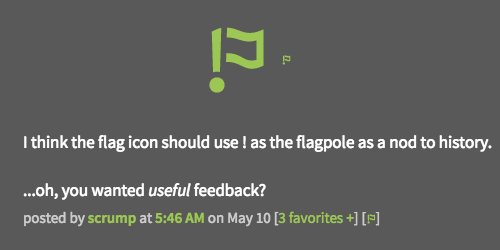
posted by lucidium at 10:45 PM on June 23, 2020 [3 favorites]
(Actually looking back it was pretty gentle and I'm just sensitive.)
posted by lucidium at 3:33 AM on June 24, 2020 [1 favorite]
posted by lucidium at 3:33 AM on June 24, 2020 [1 favorite]
I would be sad to lose the term “flag“ because it would mean losing a chunk of sight culture. There really aren’t a ton of activities that don’t require people learning some new terminology. Look at your favorite sport, for example.I am totally fine with replacing [!] with [Flag].
Maybe there could be a brief primer on controls during sign-up?
posted by GenjiandProust at 3:34 AM on June 24, 2020 [1 favorite]
Maybe there could be a brief primer on controls during sign-up?
posted by GenjiandProust at 3:34 AM on June 24, 2020 [1 favorite]
Actually, a triangular flag like a little bit of bunting would be quite nice, I think. [+] [⧩]
To me, it implies a menu as well as the action of sending a message, it's not directly positive or negative, it's still a flag, and we could make them nice colours on special days.
posted by lucidium at 3:42 AM on June 24, 2020 [2 favorites]
To me, it implies a menu as well as the action of sending a message, it's not directly positive or negative, it's still a flag, and we could make them nice colours on special days.
posted by lucidium at 3:42 AM on June 24, 2020 [2 favorites]
To me that icon does not look like a flag, lucidium. If I had to guess I'd think, maybe it's a stemless cocktail glass?
I think a symbol of a flag, even if more identifiable, is much worse than even the text "flag", because it requires the reader to make two connections successfully:
1. This image represents a flag
2. "Flag" represents metaphorically waving a flag to attract attention > notifying moderators.
posted by lollusc at 4:12 AM on June 24, 2020 [4 favorites]
Could we add a [🍸] that sends the user a drink?
posted by lucidium at 4:40 AM on June 24, 2020 [7 favorites]
posted by lucidium at 4:40 AM on June 24, 2020 [7 favorites]
So at first I came in here and loved report but then cortex made a strong case for flag and I was swayed. But then stoneweaver mentioned [Call a Mod], which I think works great, but I like keeping the flag terminology so how about:
[Call a Mod ⧩]
posted by Literaryhero at 6:43 AM on June 24, 2020 [1 favorite]
[Call a Mod ⧩]
posted by Literaryhero at 6:43 AM on June 24, 2020 [1 favorite]
Hi, non-US user and non-native speaker here, I think "Report" is universal and sounds very clear for the function in question. It's used by most comment sections on other websites. I understand it has a negative connotation for those used to FB groups but to me this site is less like social media and more similar (in format, not content!) to the comment section of an online newspaper or any discussion forum or disqus etc. And if they have moderation they all seem to use the term "Report".
I'm ok with "Flag" too as second choice, but that requires a bit more familiarity already with the language used here and might be confusing to new users. Or you could have "Flag" as the link and then "Report this post/comment to a moderator for this reason" with the different options in the popup. Just a suggestion.
PS on preview - I was wrong, disqus doesn't use the term "report" but "flag as inappropriate" . So it's not just a MeFi thing, using "flag" in this sense. Disqus is used by international websites too, so they must have deemed "flag" clear enough for non-native English speakers too... Hmm.
One last thing: I don't particularly like the "flag as fantastic" option to be included in with the other negative flagging options, it's confusing and can lead to accidents; it seems to me it should be separate or like someone suggested above should be an extra option under "favourite".
posted by bitteschoen at 7:45 AM on June 24, 2020 [3 favorites]
Anything too obvious, and it will quickly become overused; adding to the modload.
Alternatively, a rollover that brings up a plate of beans gif; now that's a mefi universal.
Instead of a cartoon thought bubble; fill in the plate of beans with your thoughts, and ideas!
posted by Afghan Stan at 9:38 AM on June 24, 2020
Alternatively, a rollover that brings up a plate of beans gif; now that's a mefi universal.
Instead of a cartoon thought bubble; fill in the plate of beans with your thoughts, and ideas!
posted by Afghan Stan at 9:38 AM on June 24, 2020
[Call a Mod ⧩]
Calling the mods triangles might be considered fighting words in some jurisdictions.
posted by GenjiandProust at 10:52 AM on June 24, 2020 [3 favorites]
Calling the mods triangles might be considered fighting words in some jurisdictions.
posted by GenjiandProust at 10:52 AM on June 24, 2020 [3 favorites]
Calling the mods triangles might be considered fighting words in some jurisdictions.
q.v. Particle v. Triangle, 1990.
posted by zamboni at 12:39 PM on June 24, 2020 [9 favorites]
q.v. Particle v. Triangle, 1990.
posted by zamboni at 12:39 PM on June 24, 2020 [9 favorites]
Disqus is used by international websites too, so they must have deemed "flag" clear enough for non-native English speakers too... Hmm.
I suppose the usage is more closely related to things like Post-It Note Flags but my headcanon has always been thinking about the American football penalty flag.
posted by Nonsteroidal Anti-Inflammatory Drug at 1:32 PM on June 24, 2020 [1 favorite]
I suppose the usage is more closely related to things like Post-It Note Flags but my headcanon has always been thinking about the American football penalty flag.
posted by Nonsteroidal Anti-Inflammatory Drug at 1:32 PM on June 24, 2020 [1 favorite]
The first modern signal flag code recorded was introduced by the British Navy in 1817; undoubtedly signal flags were in use before that even if only of the one-by-sea two-by-land variety. Probably the most directly comparable IRL flag to the Metafilter usage is the flag on American mailboxes.
posted by Mitheral at 2:12 PM on June 24, 2020 [1 favorite]
posted by Mitheral at 2:12 PM on June 24, 2020 [1 favorite]
Wait do we really think the term “flag” used to mean “notify someone that there is a problem” is MeFi specific? I definitely did not learn the concept from Metafilter. Google “flag for review” and you’ll see it used by loads of other sites, including Google itself, Trustpilot, Glassdoor...
I thought this was common internet parlance. I could be wrong, but I did ask a bunch of teens and 20 somethings on a Discord server what they thought a button that said “flag” on a comment would do, and they all said, “Report the comment and/or user.” To quote one person, after I explained why I was asking: “That’s what most sites use but okay.” Obviously, very unscientific polling, but there’s some datapoints.
posted by brook horse at 2:59 PM on June 24, 2020 [6 favorites]
Per my partner: “‘Flag as inappropriate’ is super common and a very well known use of the word ‘flag.’”
posted by brook horse at 3:01 PM on June 24, 2020 [3 favorites]
posted by brook horse at 3:01 PM on June 24, 2020 [3 favorites]
I suspect it's not just used in internet parlance, but good ole speaking. And for a long time now. Here's a nice little google ngram comparison of 'flag it', 'flag as', and 'flag flying' in texts over the last twenty decades.
posted by iamkimiam at 3:09 PM on June 24, 2020 [2 favorites]
posted by iamkimiam at 3:09 PM on June 24, 2020 [2 favorites]
Flag as a verb, meaning
A few examples of usage around the web:
Google:
to mark or identify with or as if with a flag(M-W), or
To mark with a small flag or tag so that relevant items may be readily found(OED) is well established - the debate seems to be over how obscure it is, and whether it is understood by the hypothetical
youth of today.
A few examples of usage around the web:
Google:
Flag a place for reviewDiscourse:
You can flag business or place names for impersonation or offensive, fake, spam or inappropriate content.
What happens when you flag something?Apple:
When a user flags a post, it appears in the review queue. Staff, as well as category moderators, can then review the flagged content to decide what to do. Options may include agreeing with the flag, disagreeing with the flag, and ignoring the flag.
DeviceCheckposted by zamboni at 3:25 PM on June 24, 2020 [2 favorites]
For example, you might use this data to identify devices that have already taken advantage of a promotional offer that you provide, or to flag a device that you’ve determined to be fraudulent.
The concept of a flag meaning "report this" seems familiar to me as an oldish person and equally familiar to my teenage kids. When I showed them the flag symbol that appears on Yahoo Answers posts and asked what they thought it would do, they each said that obviously it was to report the post and incredulously asked, "Are there people that don't know that?"
posted by Redstart at 3:35 PM on June 24, 2020 [3 favorites]
posted by Redstart at 3:35 PM on June 24, 2020 [3 favorites]
[notify a mod 🛵] [notify a rocker 🏍️]
posted by maxwelton at 4:59 PM on June 24, 2020 [17 favorites]
posted by maxwelton at 4:59 PM on June 24, 2020 [17 favorites]
(If I had waited a few minutes I could have posted it at 5:15. My life is a wasteland.)
posted by maxwelton at 5:01 PM on June 24, 2020 [2 favorites]
posted by maxwelton at 5:01 PM on June 24, 2020 [2 favorites]
You know, writing out “flag for review” (as mentioned above) is still pretty short but is also pretty clear.
posted by Huffy Puffy at 6:01 PM on June 24, 2020 [3 favorites]
posted by Huffy Puffy at 6:01 PM on June 24, 2020 [3 favorites]
I wasn't suggesting that "flag" was metafilter specific. I was saying it's an idiom in English that second language learners may not pick up on until they are quite advanced. In the interests of social justice, I think it's important to not add unnecessary difficulties for people for whom English is not a native language.
Those of you who have learned a second language: is the equivalent of "flag" in that language a vocabulary item you have learned? Because I speak five languages relatively fluently, yet I only know that word in English. It's pretty specialised. And as an English word, if a learner looks it up in a dictionary, they will see about five different meanings for "flag", which means it's not the simplest thing to find out if you don't already know it.
posted by lollusc at 6:46 PM on June 24, 2020
(And by "equivalent of that word" I don't mean the word for the physical object of a flag. I mean the word for "alert someone to a problem" as used when referring to this specific action on a website. Of course I know how to say this using circumlocution or a general term for "notify" but if there is a specialised term that would be a better translation of "flag" I do not know it in these other languages.)
posted by lollusc at 6:48 PM on June 24, 2020
posted by lollusc at 6:48 PM on June 24, 2020
Anyway, I could be wrong, but it's easy to test. Grab a bunch of people who speak English well enough to participate on metafilter, but not perfectly enough to have mastered all the idioms. Ask them what they think it would mean to "flag a post" on the internet. Maybe none of them have any problems understanding it.
posted by lollusc at 6:53 PM on June 24, 2020
posted by lollusc at 6:53 PM on June 24, 2020
Sorry, to clarify, my comment was a reaction to earlier comments talking about familiarity and wondering if people would know the term from football etc. I definitely agree that we should be considering non-native English speakers and it would be helpful to reach out and do some polling if possible.
(Also... and maybe this is for another MeTa, but... is there a reason MeFi doesn’t have language options for site functions? Is it a labor/money issue in regards to translation or a coding one or both? Has it ever been considered?)
I still feel like “report” has the wrong connotations, and would lead both native and non-native to underutilize it. What about a link that says “[something wrong?]” with flagging options in the drop down? I feel like I’ve seen that before.
Also, for the perusal of someone with more linguistic experience than me, this Google page uses “flag” in English. Maybe looking at various languages (drop down at the bottom) could help us get a sense of how this problem has been approached before? Might generate some ideas.
posted by brook horse at 7:08 PM on June 24, 2020
(Also... and maybe this is for another MeTa, but... is there a reason MeFi doesn’t have language options for site functions? Is it a labor/money issue in regards to translation or a coding one or both? Has it ever been considered?)
Basically we don't have the resources required to make good on a suggestion of being able to support multiple languages. Adding a language option for the interface and then being able to provide next to no support for questions or conversation in those other languages would be setting folks up for pretty nasty frustration.
posted by cortex (staff) at 7:18 PM on June 24, 2020 [4 favorites]
A while back I expanded the MeFi wiki page about flags and flagging in case there is anything there to integrate into revised official documentation, or any policies documented there that ought to be changed.
posted by brainwane at 8:23 PM on June 24, 2020 [2 favorites]
posted by brainwane at 8:23 PM on June 24, 2020 [2 favorites]
Thanks, brainwane! I want to particularly call attention to the historical version of the flagging page that that the wiki article mentions. It looks like it originally took you to a separate page where Matt explained what flags were for:
You've just clicked on a 'flag this post' link. This feature helps me weed out the bad stuff from MetaFilter and note the best parts (please limit the good comments to the truly amazing stuff I should note on the sidebar). Please state a reason why and press Flag this post to record it. If you clicked this by mistake, simply hit your back button. Thanks.posted by zamboni at 8:42 PM on June 24, 2020 [1 favorite]
Also, for the perusal of someone with more linguistic experience than me, this Google page uses “flag” in English. Maybe looking at various languages (drop down at the bottom) could help us get a sense of how this problem has been approached before? Might generate some ideas.
Thanks brook horse that's interesting! I quickly checked a few other languages and for flagging for instance the Spanish version uses "marcar" which is like mark/label, Italian version has "segnalare" which is like report (signal literally), similarly the Portuguese version has "sinalizar" and the French has "signaler"... And German has "melden" which is also similar to "report".
sorry, I had incorrectly assumed "report" was a lot more widely used than "flag", because in other languages the terms are indeed closer to "report". But in English it looks like "flag" in this sense is just as widely used so I amend my vote, since many people don't like "report" I would also prefer "flag" at this stage, maybe with the extended "flag as inappropriate", which sounds a lot clearer.
my headcanon has always been thinking about the American football penalty flag.
then maybe we should use yellow cards as symbols to make it all more international ;)
posted by bitteschoen at 6:33 AM on June 25, 2020 [1 favorite]
zamboni: Glad the wiki page expansion was helpful!
I did this because of stuff that came up in the disability & ableism threads. A few times in those threads, people have said "I have never flagged a comment" or similar statements. For some people, it's scary to click on something they've never clicked on before, especially something that might lead to an interaction with authority figures. And some people appreciate a step-by-step guide to an unfamiliar process. I am not going to speak on behalf of the other people in those threads, but I think it's safe to share that those fears, worries, and concerns get magnified for anxious MeFites, and for MeFites with PTSD or other trauma histories.
And I second the accessibility questions about how well the current and proposed controls come across on screenreaders. I hope blind and seeing-impaired MeFites, and MeFites with fine motor control problems, can test out the next iteration of the "flag this" button/link/etc.
posted by brainwane at 10:03 AM on June 25, 2020 [3 favorites]
🚩
posted by Sockdown at 9:47 PM on June 26, 2020 [3 favorites]
posted by Sockdown at 9:47 PM on June 26, 2020 [3 favorites]
If [!] becomes [flag...], should [+] become [favorite] or [fav]? If people tend to click the big buttons, then expanding only the former will probably lead to more accidental flagging, and a future Meta post complaining that favoriting a post has become difficult.
posted by klausman at 8:37 AM on June 28, 2020 [1 favorite]
posted by klausman at 8:37 AM on June 28, 2020 [1 favorite]
The one minor complication with favorites is that it's not a fixed display. If there are no favorites (or the user has "hide favorites" as their setting), then [+] is the display setting. But if there are favorites, and the user has "show favorites" or "has favorites" as their setting it'll show [has favorites +] or [x favorites +]
A simple fix would be to add some character after "x favorites," like a dot, dash, slash or bar:
[has favorites - fave]
[has favorites · fave]
[has favorites | fave]
I personally like "fave" because I read it as a long a like "favorite", where as I read "fav" with a short a, like "fava beans." or "lava" :)
Alternatively, we could spell out favorite:
[has favorites - favorite]
[has favorites · favorite]
[has favorites | favorite]
which looks a bit repetitive, or use a new word:
[has saves - save]
[has saves · save]
[has saves | save]
but that's changing a bit of long-standing MetaFilter culture, and is back to being repetitive.
posted by filthy light thief at 1:59 PM on July 3, 2020
I think of it as "adding" a favourite so maybe 'add' as the action?
posted by EndsOfInvention at 22:44 on July 3 [1 favorite | add] [flag comment]
posted by EndsOfInvention at 2:48 PM on July 3, 2020 [1 favorite]
posted by EndsOfInvention at 22:44 on July 3 [1 favorite | add] [flag comment]
posted by EndsOfInvention at 2:48 PM on July 3, 2020 [1 favorite]
« Older Friend me on Fitbit or MyFitnessPal? | Should we redirect "but my case is special"... Newer »
You are not logged in, either login or create an account to post comments
We talked about it a little this morning at our weekly team meeting, and we're going to sort out some details and implementation stuff. The sketch I have right now is this:
1. Changing the [!] glyph to something textually explicit. Possibly [flag], possibly something more verbose. Bigger, easier click target; screen-reader friendly; semantically straightforward.
2. Adding an explicit link and prompt for the contact form near the comment box. It's in the footer of every page, but right there is where folks are much of the time going to be thinking/feeling about wanting mod awareness on something.
3. Adding an explicit link to the guidelines page in that same spot, something we have been meaning to do for a while and should get done while we're in there.
Happy to hear thoughts on tweaks or variations on the above; one trick with all of this is being mindful of the limited screen real estate on mobile in particular, so worth factoring that into any brainstorming.
posted by cortex (staff) at 11:14 AM on June 21, 2020 [22 favorites]