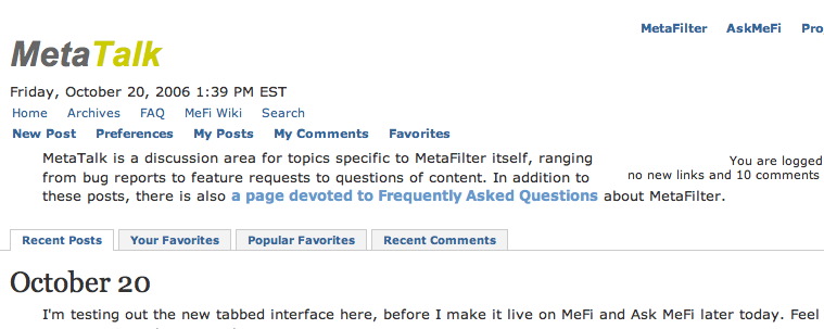
new tabbed interface testing here October 20, 2006 9:27 AM Subscribe
I'm testing out the new tabbed interface here, before I make it live on MeFi and Ask MeFi later today. Feel free to post reactions, bugs, etc. here.
The "Requesting Content" throbber is right up to the edge of the browser space in Firefox. Needs some
posted by brownpau at 9:32 AM on October 20, 2006
margin-left: 55px.posted by brownpau at 9:32 AM on October 20, 2006
Interesting. It's a good idea, I can see the functionality of it, I'm not sure if I like it, yet, though. It'll take a little getting used to.
posted by The Great Big Mulp at 9:32 AM on October 20, 2006
posted by The Great Big Mulp at 9:32 AM on October 20, 2006
"Popular Favorites" for Metatalk generates a weird sort of cognitive dissonance. Not so much because it isn't useful, but because I hate to admit it.
Regardless of which, I am vibrating with broomly excitement!
posted by cortex at 9:35 AM on October 20, 2006
Regardless of which, I am vibrating with broomly excitement!
posted by cortex at 9:35 AM on October 20, 2006
Pretty slick and fast, workable. Startled the hell out of me, though, on first load. Thought my browser was mis-rendering.
And what brownpau said. I didn't even notice the throbber until he said something about it, but then again my pageloads are superfast.
posted by loquacious at 9:35 AM on October 20, 2006
And what brownpau said. I didn't even notice the throbber until he said something about it, but then again my pageloads are superfast.
posted by loquacious at 9:35 AM on October 20, 2006
"Recent posts" tab isn't highlighted when it's in use.
posted by thirteenkiller at 9:39 AM on October 20, 2006
posted by thirteenkiller at 9:39 AM on October 20, 2006
Me likey!
posted by ThePinkSuperhero at 9:45 AM on October 20, 2006 [1 favorite]
posted by ThePinkSuperhero at 9:45 AM on October 20, 2006 [1 favorite]
In plaintext: it highlights to white on rollover but does not actually stay looking "selected" when you've clicked through it, unlike the other three tabs.
posted by cortex at 9:45 AM on October 20, 2006
posted by cortex at 9:45 AM on October 20, 2006
I've been using it on AskMe since you sneak previewed the link a few days ago and I really like it.
posted by Lyn Never at 9:46 AM on October 20, 2006
posted by Lyn Never at 9:46 AM on October 20, 2006
Could there be a (cookie-related?) way to have it remember which tab you like to start on? Otherwise, hella cool.
posted by gleuschk at 9:48 AM on October 20, 2006
posted by gleuschk at 9:48 AM on October 20, 2006
Apparently it stays highlighted in firefox but not in IE
re: recent post tab
posted by thirteenkiller at 9:49 AM on October 20, 2006
re: recent post tab
posted by thirteenkiller at 9:49 AM on October 20, 2006
Are the four boxes supposed to extend a little below the horizontal line? They do in FF but I'm not sure if that is intentional or a bug.
posted by octothorpe at 9:49 AM on October 20, 2006
posted by octothorpe at 9:49 AM on October 20, 2006
"Recent Posts" also doesn't have a bottom line and stays highlighted in Camino on Mac OSX.
posted by keijo at 9:51 AM on October 20, 2006
posted by keijo at 9:51 AM on October 20, 2006
The only thing I noticed in the earlier mockup was the throbber having a background color, which looked bad on plain-text. I see you fixed that. Looks good.
posted by prostyle at 9:52 AM on October 20, 2006
posted by prostyle at 9:52 AM on October 20, 2006
I personally although would somehow highlight them more to distinguish them from the main content data, now if you they would kind of fade a way IMHO compared to how the current top bar is different from the rest.
posted by keijo at 9:55 AM on October 20, 2006
posted by keijo at 9:55 AM on October 20, 2006
Hawts!!
I don't get the order of my favorites though. Is it the order in which I favorited it? Backwards chronological by post date seems the most intuitive to me.
posted by If I Had An Anus at 9:57 AM on October 20, 2006
I don't get the order of my favorites though. Is it the order in which I favorited it? Backwards chronological by post date seems the most intuitive to me.
posted by If I Had An Anus at 9:57 AM on October 20, 2006
Looking good.
posted by goodnewsfortheinsane at 9:58 AM on October 20, 2006
posted by goodnewsfortheinsane at 9:58 AM on October 20, 2006
Looking good.
Only thing that I have a gripe with is the design kills the back/forward button functions when navigating between tabs.
posted by squeak at 10:03 AM on October 20, 2006
Only thing that I have a gripe with is the design kills the back/forward button functions when navigating between tabs.
posted by squeak at 10:03 AM on October 20, 2006
Woah. New hotness.
I like it. It will need some load testing, as I assume it's AJAX-based. My (limited) experince with Ajax apps is that they work great until there's a slow connection or a lot of requests, when they begin to choke and die in an unpleasant way.
But it's working fine now.
posted by GuyZero at 10:18 AM on October 20, 2006
I HAVE HAD SIMILAR USABILITY EXPERIENCES WITH YOUR MOTHER!
posted by cortex at 10:20 AM on October 20, 2006 [4 favorites]
posted by cortex at 10:20 AM on October 20, 2006 [4 favorites]
It might be too much work for too little reward, but if you'd like to make the back button works with the tabs, it looks like it can be done with some JavaScript and frames trickery.
(Also a victory for the LazyWeb. I knew there was a trick like that for Flash movies, so, on a hunch, I googled for the Ajax equivalent, and sure enough, someone had written a tutorial.)
posted by moss at 10:25 AM on October 20, 2006
(Also a victory for the LazyWeb. I knew there was a trick like that for Flash movies, so, on a hunch, I googled for the Ajax equivalent, and sure enough, someone had written a tutorial.)
posted by moss at 10:25 AM on October 20, 2006
I think it should be above the "MetaTalk is a discussion area for topics specific to MetaFilter itself..." blurb - it looks odd now.
posted by muddgirl at 10:28 AM on October 20, 2006
posted by muddgirl at 10:28 AM on October 20, 2006
My (limited) experince with Ajax apps is that they work great until there's a slow connection or a lot of requests, when they begin to choke and die in an unpleasant way.
It shouldn't be that bad. The tab change is instant and not Ajax, and then it shows the spinning icon while it's doing the request. So if it's down, that would just never return a result.
posted by smackfu at 10:29 AM on October 20, 2006
It shouldn't be that bad. The tab change is instant and not Ajax, and then it shows the spinning icon while it's doing the request. So if it's down, that would just never return a result.
posted by smackfu at 10:29 AM on October 20, 2006
I really like it.
A+++ tabbed experience! Would click again!
Also, cortex made me really laugh. Overall an excellent thread for me to start Friday with.
posted by routergirl at 10:33 AM on October 20, 2006
A+++ tabbed experience! Would click again!
Also, cortex made me really laugh. Overall an excellent thread for me to start Friday with.
posted by routergirl at 10:33 AM on October 20, 2006
I would suggest lightening the background color of the unselected tabs. The high contrast makes them look like web 1.0 buttons.
posted by eddydamascene at 10:56 AM on October 20, 2006
posted by eddydamascene at 10:56 AM on October 20, 2006
I think it would be cool if the tabs... had little tabs on them.
posted by Krrrlson at 11:01 AM on October 20, 2006
posted by Krrrlson at 11:01 AM on October 20, 2006
The header looks kinda squinchy and weird with the simple stylesheet and a 1024x678 monitor resolution. I love the tabs, but I'd like it if it didn't look all block and weird above it. My suggestion: remove the line about the FAQ and end the first sentence after "itself" people will get the rest or they can read the FAQ for more.
posted by jessamyn (staff) at 11:03 AM on October 20, 2006
And I cut down the first sentence. That does look a lot better.
The "My Favorites" tab does order posts in the order that you saved them as favorites. So if you mark a three year old post as a favorite right now, it'll show up at the top of your favorites tab.
posted by mathowie (staff) at 11:17 AM on October 20, 2006
The "My Favorites" tab does order posts in the order that you saved them as favorites. So if you mark a three year old post as a favorite right now, it'll show up at the top of your favorites tab.
posted by mathowie (staff) at 11:17 AM on October 20, 2006
Religious Singularity is evil,
Academic Singularity is evil.
Singularity is damnable lie
...but this new tabbed interface is pretty neat.
posted by Gamblor at 11:17 AM on October 20, 2006
Academic Singularity is evil.
Singularity is damnable lie
...but this new tabbed interface is pretty neat.
posted by Gamblor at 11:17 AM on October 20, 2006
Even though the functionality wouldn't be transposed, now that I think about it I find it a little strange that the tabbed header isn't on the in-thread view as well.
posted by prostyle at 11:19 AM on October 20, 2006
posted by prostyle at 11:19 AM on October 20, 2006
pretty, slick, and unobtrusive.
posted by By The Grace of God at 11:20 AM on October 20, 2006
posted by By The Grace of God at 11:20 AM on October 20, 2006
If I click on "Your Favorites", and then click my user name, I get an error page.
posted by monju_bosatsu at 11:25 AM on October 20, 2006
posted by monju_bosatsu at 11:25 AM on October 20, 2006
Yeah, the URL is incorrect on the part monju_bosatsu mentions.
posted by mr_crash_davis at 11:29 AM on October 20, 2006
posted by mr_crash_davis at 11:29 AM on October 20, 2006
It looks like there's too many lines of navigational stuff between my browser's tabs and the actual content of MetaTalk. Maybe compress the navigational bar and the "MetaTalk is a place..." line and the MeFi tabs into something less tall?
posted by rxrfrx at 11:32 AM on October 20, 2006
posted by rxrfrx at 11:32 AM on October 20, 2006
For whatever reason, I command-click on the tabs which does its in-page magic but also opens a new browser tab (which is what I was expecting). That new browser tab doesn't have any style.
I realize this probably isn't how you expect the feature to be used, but it seemed intuitive to me to command-click the tabs.
posted by sohcahtoa at 11:40 AM on October 20, 2006
I realize this probably isn't how you expect the feature to be used, but it seemed intuitive to me to command-click the tabs.
posted by sohcahtoa at 11:40 AM on October 20, 2006
Thats cool. When it makes it to the main page, it would be a great place to add a "recently deleted threads" tab.
Yes, I know about the greasemonkey script and yada yada now SHUT YER YAP!
posted by poppo at 11:49 AM on October 20, 2006
Yes, I know about the greasemonkey script and yada yada now SHUT YER YAP!
posted by poppo at 11:49 AM on October 20, 2006
When I clicked on "your favorites" and then my username, it gave me an error:
"File not found: /user.mefi"
Also the text seemed ginormous.
posted by routergirl at 11:54 AM on October 20, 2006
"File not found: /user.mefi"
Also the text seemed ginormous.
posted by routergirl at 11:54 AM on October 20, 2006
I command-click on the tabs which does its in-page magic but also opens a new browser tab (which is what I was expecting). That new browser tab doesn't have any style.
That was the first thing I did, too. Ctrl-click, in firefox.
What advantage are these fancy tabs supposed to have that would make them better than normal links that look sort of like tabs?
posted by sfenders at 12:07 PM on October 20, 2006
That was the first thing I did, too. Ctrl-click, in firefox.
What advantage are these fancy tabs supposed to have that would make them better than normal links that look sort of like tabs?
posted by sfenders at 12:07 PM on October 20, 2006
It doesn't degrade very well with JavaScript off, or if you try to open the tabs in a new browser tab, of anything that follows the actual href portion of the links. That all takes me to what appears to be the HTML fragment being loaded by the AJAX script.
posted by scottreynen at 12:08 PM on October 20, 2006
posted by scottreynen at 12:08 PM on October 20, 2006
What advantage are these fancy tabs supposed to have that would make them better than normal links that look sort of like tabs?
They are normal links that sort of look like tabs. The advantage is that they are actually loading new pages inline, without leaving the page you are on. So basically I've made 4-5 new front page views for each site, and you click on the tabs to switch between them.
It doesn't degrade very well with JavaScript off, or if you try to open the tabs in a new browser tab
Yeah, I'm using this script to do the loading of sub-pages and it could use some sprucing up in the backwards-compatible department. I'd be willing to pay a js jedi to do it if they have some good ideas on how to hide all tabs them completely on non-js browsers and make control-clicks work better.
posted by mathowie (staff) at 12:13 PM on October 20, 2006
First reaction (vocalized and involuntary): Whoa baby!
Second reaction: Excellent!
posted by jamjam at 12:14 PM on October 20, 2006
Second reaction: Excellent!
posted by jamjam at 12:14 PM on October 20, 2006
The "My Favorites" tab does order posts in the order that you saved them as favorites. So if you mark a three year old post as a favorite right now, it'll show up at the top of your favorites tab.
It would great to have other ordering options for favourites (posting date, recent comments, etc.).
posted by timeistight at 12:15 PM on October 20, 2006
It would great to have other ordering options for favourites (posting date, recent comments, etc.).
posted by timeistight at 12:15 PM on October 20, 2006
In looking at the top of the page more carefully, it's obvious you should let a good designer tighten up the headers/top navigation bar across the board. It's a little busy, somehow inelegant in its alignment, and the lettering isn't kerned correctly.
I do like the tabs though. Yay tabs.
posted by _sirmissalot_ at 12:16 PM on October 20, 2006
I do like the tabs though. Yay tabs.
posted by _sirmissalot_ at 12:16 PM on October 20, 2006
It would great to have other ordering options for favourites
Sure, once you start spelling it correctly.
In looking at the top of the page more carefully, it's obvious you should let a good designer tighten up the headers/top navigation bar across the board. It's a little busy, somehow inelegant in its alignment, and the lettering isn't kerned correctly.
Yeah, now that the tabs are there, I have visual clean-up work to do, to make it look more cohesive. I wanted to get the functionality out in the open as soon as possible, because I found the site much more useful with them.
It seems like MetaFilter and Ask Mefi are ready to go as well, so I'll be switching those live momentarily.
posted by mathowie (staff) at 12:18 PM on October 20, 2006
Yeah, I'm using this script to do the loading of sub-pages and it could use some sprucing up in the backwards-compatible department. I'd be willing to pay a js jedi to do it if they have some good ideas on how to hide all tabs them completely on non-js browsers and make control-clicks work better.Well, I'd put the non-js controls square in the page in some arbitrary div, then have a javascript function rewrite the contents of that div with the ajaxy tabs. If that sounds complicated, drop me an email and we can hash out the details.
posted by boo_radley at 12:21 PM on October 20, 2006
I like it overall, but even with your shortened "Metafilter is a ..." I think it's weird to have non-menu text breaking up three menus.
On my screen I have:
MetaTalk
Date
menu 1 (Home, Archives, etc...)
menu 2 (New Post, Preferences, etc...)
MetaTalk is a discussion area for topics specific to MetaFilter itself.
menu 3 (tabs)
I find the "MetaTalk is" to be somewhat disruptive in its current location. I don't know if it could be right justified or placed above or below the date so that it's not surrounded by menus.
posted by croutonsupafreak at 12:26 PM on October 20, 2006
"That new browser tab doesn't have any style."
Confirmed, Safari 2.0.4 (419.3). Opening those fancy links in new tabs doesn't work quite right.
posted by majick at 12:29 PM on October 20, 2006
Confirmed, Safari 2.0.4 (419.3). Opening those fancy links in new tabs doesn't work quite right.
posted by majick at 12:29 PM on October 20, 2006
Holy pantalones...
MeFi is becoming all Web 1.5 or something now.
posted by twiggy at 12:35 PM on October 20, 2006
MeFi is becoming all Web 1.5 or something now.
posted by twiggy at 12:35 PM on October 20, 2006
Another vote for a working back button here. That's just obnoxious.
posted by nebulawindphone at 12:44 PM on October 20, 2006
posted by nebulawindphone at 12:44 PM on October 20, 2006
The stories listed under "Popular Favourites" have "x answers" instead of "x comments", despite the fact that they were posted to MeFi rather than AskMe.
posted by claudius at 12:44 PM on October 20, 2006
posted by claudius at 12:44 PM on October 20, 2006
Sure, once you start spelling it correctly.
That's how your neighbours spell it.
While your at it, could you make it more colourful? And maybe centre the text, eh?
posted by timeistight at 12:46 PM on October 20, 2006
That's how your neighbours spell it.
While your at it, could you make it more colourful? And maybe centre the text, eh?
posted by timeistight at 12:46 PM on October 20, 2006
Nice and tabby! For me the "Ask MetaFilter is a discussion area for sharing knowledge among members of MetaFilter." is weirdly tabbed in on the first line (making it run to 3 lines and leaving lots of blankspace).
posted by langeNU at 12:47 PM on October 20, 2006
posted by langeNU at 12:47 PM on October 20, 2006
It's all MetaFilter 2.0 and shit!
Can you convert the whole thing to Flash ya think?
Nice work.
posted by Mister_A at 12:52 PM on October 20, 2006
Can you convert the whole thing to Flash ya think?
Nice work.
posted by Mister_A at 12:52 PM on October 20, 2006
It makes the site a bit busy. You've got the site sections row of navigation, then all the my comments/my posts nav links, and then a bunch of tabs -- by the time you get to the text, you're a third of the way down the page.
I think you'd do well to consider that simplicity was what made the original Mefi design so great, but you're gradually chipping away at that simplicity.
posted by reklaw at 12:56 PM on October 20, 2006
I think you'd do well to consider that simplicity was what made the original Mefi design so great, but you're gradually chipping away at that simplicity.
posted by reklaw at 12:56 PM on October 20, 2006
Oh, and please don't use the word 'content' in the interface. Say 'loading' or something.
posted by reklaw at 12:58 PM on October 20, 2006
posted by reklaw at 12:58 PM on October 20, 2006
I dunno how it looks with the default stylesheet, but it's definitely gangbusters in the plain text one. I especially like the AskMe tabs. What a pony!
posted by muddgirl at 12:59 PM on October 20, 2006
posted by muddgirl at 12:59 PM on October 20, 2006
I just saw it on the blue. It frightened me. So I crawled under my desk and sobbed for a bit. Then after fortifying myself with about a fifth of Jack Daniels, I started using them. They worked! This pleased me so much, I stripped naked and ran around screaming! WHOOO! I said.
Needless to say, my co-workers were not pleased.
posted by quin at 1:02 PM on October 20, 2006
Needless to say, my co-workers were not pleased.
posted by quin at 1:02 PM on October 20, 2006
Two nitpicks:
1. Reloading a page always resets me to the first tab.
2. The use or "My" and "Your" in the interface is inconsistent.
posted by Armitage Shanks at 1:19 PM on October 20, 2006
1. Reloading a page always resets me to the first tab.
2. The use or "My" and "Your" in the interface is inconsistent.
posted by Armitage Shanks at 1:19 PM on October 20, 2006
It looks great! I especially love the Unanswered Questions tab in AskMe; hope can now spring eternal.
posted by witchstone at 1:33 PM on October 20, 2006
posted by witchstone at 1:33 PM on October 20, 2006
Isn't "popular favorites" redundant? Are there unpopular favorites?
posted by mattbucher at 1:34 PM on October 20, 2006
posted by mattbucher at 1:34 PM on October 20, 2006
"Popular" is used to differentiate this listing from what you might call "personal" favorites. It's fine.
posted by Mister_A at 1:42 PM on October 20, 2006
posted by Mister_A at 1:42 PM on October 20, 2006
I have converted "popular favorites" to engrish. I now endorse using the label "the taste which spreads".
posted by Mister_A at 1:46 PM on October 20, 2006
posted by Mister_A at 1:46 PM on October 20, 2006
The "page rendered in: 1516 ms" line hangs around, laughing at us, while the page is "requesting content". Maybe stash it at the bottom of the sidebar or something?
posted by gleuschk at 1:49 PM on October 20, 2006
posted by gleuschk at 1:49 PM on October 20, 2006
"Favorite Cloud"
posted by boo_radley at 2:04 PM on October 20, 2006
posted by boo_radley at 2:04 PM on October 20, 2006
On the Favorites tabs, can there be a link to remove links from the list? Otherwise you have to go around back through your profile.
posted by ThePinkSuperhero at 2:09 PM on October 20, 2006 [1 favorite]
posted by ThePinkSuperhero at 2:09 PM on October 20, 2006 [1 favorite]
ThePinkSuperhero, you can scroll down to the bottom to get to your favorites page too.
I'm playing with right-aligning them on MetaTalk at the moment.
posted by mathowie (staff) at 2:15 PM on October 20, 2006
I'm playing with right-aligning them on MetaTalk at the moment.
posted by mathowie (staff) at 2:15 PM on October 20, 2006
Ah, cool!
posted by ThePinkSuperhero at 2:28 PM on October 20, 2006 [1 favorite]
posted by ThePinkSuperhero at 2:28 PM on October 20, 2006 [1 favorite]
Once this whole tabbed view thing is firmly instilled into the public's mind, "Topical" and "Editorial" tabs at the top of the thread will be be a snap! Talk pages at last!
posted by team lowkey at 2:28 PM on October 20, 2006
posted by team lowkey at 2:28 PM on October 20, 2006
1. This is really cool.
2. monju and routergirl are right: the username links in the "your favorites" and "popular favorites" are wrong. "x" in "posted by x at..." points to
www.metafilter.com/1234
rather than
www.metafilter.com/user/1234
as it ought to.
posted by koeselitz at 2:35 PM on October 20, 2006
2. monju and routergirl are right: the username links in the "your favorites" and "popular favorites" are wrong. "x" in "posted by x at..." points to
www.metafilter.com/1234
rather than
www.metafilter.com/user/1234
as it ought to.
posted by koeselitz at 2:35 PM on October 20, 2006
arg. "...in the 'your favorites' and 'popular favorites' tabs."
posted by koeselitz at 2:37 PM on October 20, 2006
posted by koeselitz at 2:37 PM on October 20, 2006
Something else that might be worth looking into; under the Popular Favorites tab, instead of showing what time of day it was posted, show the date. It seems to my, the time of day loses relavance when I don't know if it was from yesterday or a couple of weeks ago.
posted by quin at 2:53 PM on October 20, 2006
posted by quin at 2:53 PM on October 20, 2006
Ack, I just saw the 'within the last 24 hours' qualification. Nevermind.
posted by quin at 2:55 PM on October 20, 2006
posted by quin at 2:55 PM on October 20, 2006
hmm, the tabs on the front of metatalk don't seem to be aligning right in IE/Win.
posted by mathowie (staff) at 2:58 PM on October 20, 2006
posted by mathowie (staff) at 2:58 PM on October 20, 2006
looks cool, even if I don't know if I like it: it looks busier to me, not as clean.
but then I'm always very conservative design-wise, I don't even know if I like the "new" MeFi logo we've had since, what, last year?
so feel free to disregard
posted by matteo at 3:06 PM on October 20, 2006
but then I'm always very conservative design-wise, I don't even know if I like the "new" MeFi logo we've had since, what, last year?
so feel free to disregard
posted by matteo at 3:06 PM on October 20, 2006
The advantage is that they are actually loading new pages inline, without leaving the page you are on.
Yeah I see that, just can't guess what advantage it's supposed to have. Lots of people here seem to like it, so I must be missing something. The tabs other than the main front page one seem to reload every time you click them which removes the one theoretical advantage I could think of.
That the default tab is the only one that doesn't reload when you click it seems an odd inconsistency, as does the fact that clicking "reload" from any of the others takes you back to it.
posted by sfenders at 3:07 PM on October 20, 2006
I'll give you $10 to kick each of the Metas into accordioned divs. That shit would be *HOT*.
posted by boo_radley at 3:14 PM on October 20, 2006
posted by boo_radley at 3:14 PM on October 20, 2006
If the idea is to let people refresh the content of each page (except the "recent posts" one), that could be done more easily with a button that does that on each page.
posted by sfenders at 3:19 PM on October 20, 2006
posted by sfenders at 3:19 PM on October 20, 2006
I love it. Just a couple of days ago I was clicking around looking for something like "popular favorites"; I don't know if it was somewhere and I missed it, but I really like having it so handy now.
posted by taz at 3:20 PM on October 20, 2006
posted by taz at 3:20 PM on October 20, 2006
If the idea is to avoid loading all the static bits for each page, you could just use index.html or whatever for all tabs, let the browser cache it, and use a URL parameter that loads the dynamic part. I guess that's getting almost as complicated as using tabs, but it avoids all the problems.
posted by sfenders at 3:29 PM on October 20, 2006
posted by sfenders at 3:29 PM on October 20, 2006
I miss being able to "sort" the front page by way of "my comments," so as to be able to follow recent threads. I know the alternative is to mark threads as favorites or to go to one's user page, but hey, I miss the feature.
posted by ericb at 3:49 PM on October 20, 2006
posted by ericb at 3:49 PM on October 20, 2006
On metatalk, you need a little more headroom between the tab line and the first message in the "Recent Comments" view.
posted by crunchland at 3:53 PM on October 20, 2006
posted by crunchland at 3:53 PM on October 20, 2006
I use the "my comments" thingy on the front page all the time. Can it please be brought back? The "recent comments" tab isn't really all that useful.
posted by interrobang at 3:56 PM on October 20, 2006
posted by interrobang at 3:56 PM on October 20, 2006
The "recent comments" tab isn't really all that useful.
Although having it in metatalk will make longboating a lot easier to detect...
posted by dersins at 3:58 PM on October 20, 2006
Although having it in metatalk will make longboating a lot easier to detect...
posted by dersins at 3:58 PM on October 20, 2006
"Most favorited posts in the past 24 hours:"
I'm not sure, but is this the best way to say that? It sounds like bad english, I immediately thought of a ten year old going "it's my most favoritest thing" - if you'll welcome the criticism.
Great new look though! Awesome man.
I think the "recent comments" tab is great, and will keep some threads alive beyond the two or three days they're ever on the FP.
posted by Peter H at 4:11 PM on October 20, 2006
The right alignment is much better. I might poke through some of the javascript this weekend to see if I can fix the downgrading issues that some people have mentioned.
Looks great in Firefox and IE7 on Windows. Excellent work. The unanswered questions tab is a pony long in coming, but well worth the wait.
posted by purephase at 4:16 PM on October 20, 2006
Looks great in Firefox and IE7 on Windows. Excellent work. The unanswered questions tab is a pony long in coming, but well worth the wait.
posted by purephase at 4:16 PM on October 20, 2006
this is so cool! Thank you!
I would prefer "community favorites" over "popular favorites." Popular favorites is a mite redundant anyway.
Maybe we could give the contacts feature some teeth by putting "posts by your contacts" as one of the tabs. I know we can access it from our profiles, but I would love to have it on my front page.
posted by whatnot at 4:21 PM on October 20, 2006
Initially I think it looks great. Thanks, mathowie.
While I agree that questions that have zero answers/comments deserve some extra attention they really aren't more important than questions that have comments but remain unanswered. They are just easier to identify with code.
posted by geekyguy at 4:25 PM on October 20, 2006
While I agree that questions that have zero answers/comments deserve some extra attention they really aren't more important than questions that have comments but remain unanswered. They are just easier to identify with code.
posted by geekyguy at 4:25 PM on October 20, 2006
I would prefer "community favorites" over "popular favorites." Popular favorites is a mite redundant anyway.
Maybe we could give the contacts feature some teeth by putting "posts by your contacts" as one of the tabs. I know we can access it from our profiles, but I would love to have it on my front page.
Those are both great ideas. Posts by contacts would be cool (as would favorites by contacts) which are both totally buried on the contacts page.
While I agree that questions that have zero answers/comments deserve some extra attention they really aren't more important than questions that have comments but remain unanswered.
jessamyn came up with a good idea: add the "stumped" tagged questions to that tab as well.
posted by mathowie (staff) at 4:48 PM on October 20, 2006
Is the "Unanswered" tab supposed to be on a second line of tabs, underneath "Recent Posts"? It looks wrong and there's still plenty of room to the right of "Answered" where it ought to go, if it's just wrapping.
(Screenshot if you want it.)
posted by majick at 5:10 PM on October 20, 2006
(Screenshot if you want it.)
posted by majick at 5:10 PM on October 20, 2006
This looks really good, especially with the right alignment. Excellent!
posted by gsteff at 5:11 PM on October 20, 2006
posted by gsteff at 5:11 PM on October 20, 2006
I had to remove a sortby recent comments cookie in order to get the tabs to load on the Metafilter page (until I did that I was stuck on the old recent comments view, without neither tabs nor the old drop-down).
posted by sheila t at 5:46 PM on October 20, 2006
posted by sheila t at 5:46 PM on October 20, 2006
Thank you very much Mr. Haughey.
For what it's worth, here's my two-cents:
I would move up the tabs on MetaTalk just a smidge. Or generate them in the equivalent location of the other page tabs (but still right aligned).
· Ponies:
moss : “It might be too much work for too little reward, but if you'd like to make the back button works with the tabs...”
This isn't a necessarry feature for me, but it would be nice for the page tabs to work with the UA's back button.
reklaw : "It makes the site a bit busy. You've got the site sections row of navigation, then all the my comments/my posts nav links, and then a bunch of tabs -- by the time you get to the text, you're a third of the way down the page.
"I think you'd do well to consider that simplicity was what made the original Mefi design so great, but you're gradually chipping away at that simplicity."
I would have to concur with reklaw. (Though I don't think the change is that bad; certainly Metafilter is made better by the page tabs.) But I would like to see—once you've worked out the functionality and ironed out all the bugs—a completely unified style across all of Metafilter. For instance, the side bar on MeFi Jobs would be the same width as all the other side bars. Just small changes to the details to make the interface really slick.
boo_radley : "I'll give you $10 to kick each of the Metas into accordioned divs. That shit would be *HOT*."
I completely agree and second this motion.
posted by Colloquial Collision at 6:22 PM on October 20, 2006
Nice, very nice. Thanks!
posted by Alvy Ampersand at 6:43 PM on October 20, 2006
posted by Alvy Ampersand at 6:43 PM on October 20, 2006
Amazing! Now we can see unanswered questions much more easily!
Matt is a genius! All hail the Matt. (or the Jess, or whoever is responsible for this)
posted by tiamat at 7:06 PM on October 20, 2006
Matt is a genius! All hail the Matt. (or the Jess, or whoever is responsible for this)
posted by tiamat at 7:06 PM on October 20, 2006
That's kind of cool, but I don't think I'll ever use it.
But, you know. Onward and upward.
posted by blacklite at 7:15 PM on October 20, 2006
But, you know. Onward and upward.
posted by blacklite at 7:15 PM on October 20, 2006
jessamyn came up with a good idea: add the "stumped" tagged questions to that tab as well.
brilliant !
excellent all around, in fact. I am constantly in awe at how well this community is managed*.
thank you for all you do, mathowie.
*rides pony into sunset*
* including you, jessamyn. =)
posted by carsonb at 7:16 PM on October 20, 2006
brilliant !
excellent all around, in fact. I am constantly in awe at how well this community is managed*.
thank you for all you do, mathowie.
*rides pony into sunset*
* including you, jessamyn. =)
posted by carsonb at 7:16 PM on October 20, 2006
It makes the site a bit busy.
Ditto. Doesn't seem like a priority change at all, and makes the front page more annoying with little benefit. Overall, it's ok, but my initial reaction is still "meh." And the "Your Favorites" tab is completely redundant to the "Favorites" link at the top of the page.
posted by mediareport at 8:41 PM on October 20, 2006
Hmmm. Not crazy about the right alignment here. The navigation on the right is broad all-site navigation; the navigation on the left is within subsite navigation. The tabs fall into the latter category, and seem more logical aligned left to be closer to the other within subsite navigation.
posted by booksherpa at 8:59 PM on October 20, 2006
posted by booksherpa at 8:59 PM on October 20, 2006
the "Your Favorites" tab is completely redundant to the "Favorites" link at the top of the page.
Actually, they're different. The favorites tab filters your favorites for just posts on that section of mefi. The Favorites link at the top of the page intermingles all of your favorites from all sites and comments.
posted by mathowie (staff) at 9:26 PM on October 20, 2006
Actually, they're different. The favorites tab filters your favorites for just posts on that section of mefi. The Favorites link at the top of the page intermingles all of your favorites from all sites and comments.
posted by mathowie (staff) at 9:26 PM on October 20, 2006
moss : “It might be too much work for too little reward, but if you'd like to make the back button works with the tabs...”
Agreed. Since we've lost the ability to sort the front page by "My Comments," one can click on "My Favorites" tab to track threads of interest. After you click on the first thread in "My Favorites" and read that initial thread, it would be nice to be able to hit the back button and return to the summary "My Threads" page and not back to the default MetaFilter homepage.
posted by ericb at 9:43 PM on October 20, 2006
The “Recent Comments” tab on MetaTalk needs a <h2> title like the others. In Safari, the first item ends up wrapping around the tabs and it looks like poop.

Totally poop, like from a butt.
posted by blasdelf at 2:57 AM on October 21, 2006
Totally poop, like from a butt.
posted by blasdelf at 2:57 AM on October 21, 2006
There's a weird bug in ask.metafilter - browser firefox, os linux. Doesn't seem to happen in either of the other sites.
posted by handee at 4:29 AM on October 21, 2006
posted by handee at 4:29 AM on October 21, 2006
There isn't enough room in various parts of the page headings to fit the text that goes in them for me. The tabs make this more noticeable. Ubuntu 6.06, Firefox 1.5.0.7, 133dpi laptop screen. Screenshot.
posted by flabdablet at 5:17 AM on October 21, 2006
posted by flabdablet at 5:17 AM on October 21, 2006
Actually, they're different.
Still fairly redundant, though.
posted by mediareport at 5:37 AM on October 21, 2006
Still fairly redundant, though.
posted by mediareport at 5:37 AM on October 21, 2006
The tabs themselves I think are cool but like a few other people have said I think the navigation is now a bit busy and to me it looks messy. It just looks like random links are scattered all over the place with no rhyme or reason. There doesn't seem to be any immediately obvious hierarchy or logic to the way the links and things are laid out. I'm sure there is but it's not immediately apparent, the area is too confusing to take in at once and understand with just a glance where to look for things. I think it would be an improvement to remove or rearrange all the Home... FAQ... New Post... Preferences links.
posted by mokey at 6:13 AM on October 21, 2006
posted by mokey at 6:13 AM on October 21, 2006
>>>the "Your Favorites" tab is completely redundant to the "Favorites" link at the top of the page.
>>Actually, they're different. The favorites tab filters your favorites for just posts on that section of mefi. The Favorites link at the top of the page intermingles all of your favorites from all sites and comments.
>Still fairly redundant, though.
The tab version is more useful, though. If you're going to kill one, keep the tab.
posted by timeistight at 7:55 AM on October 21, 2006
It'd be great to get "recent comments" functionality on Music. More than other areas, a fair chunk of the conversation is time-independent.
posted by cortex at 10:06 AM on October 21, 2006
posted by cortex at 10:06 AM on October 21, 2006
Ok, I right-aligned all the tabs on all sites, and I de-emphasized them a bit to clear the clutter.
posted by mathowie (staff) at 7:26 PM on October 21, 2006
posted by mathowie (staff) at 7:26 PM on October 21, 2006
I second this comment to make Favorites removable from the tabs, as they are on the regular Favorites page. I like to cull my Favorites with nerdy frequency, and this makes the tabbed version much less useful.
posted by exogenous at 1:18 PM on October 24, 2006
posted by exogenous at 1:18 PM on October 24, 2006
I cannot see Metafilter or AskMe main page posts at all, just the header and footer.
MeTa, visible as ever.
I drive Safari 1.2.2.
posted by Sallyfur at 9:12 PM on October 24, 2006
MeTa, visible as ever.
I drive Safari 1.2.2.
posted by Sallyfur at 9:12 PM on October 24, 2006
I have no idea if this has come up before (and am too lazy to search all that hard) but the My Favorites tab on MeFi does not display the whole post. as far as I can tell, it doesn't include the URL and Link Title fields.
also, when did we get the new spell check?
posted by carsonb at 7:21 PM on November 5, 2006
also, when did we get the new spell check?
posted by carsonb at 7:21 PM on November 5, 2006
« Older Your comment appears to be blank, go back and try... | dmd and miagaille got married! Newer »
You are not logged in, either login or create an account to post comments
*head asplodes*
posted by mr_crash_davis at 9:30 AM on October 20, 2006